Language Selector (Desktop and Tablet)
This content element is used in the webstore header only for the desktop and tablet layouts, including desktop and tablet sticky headers.
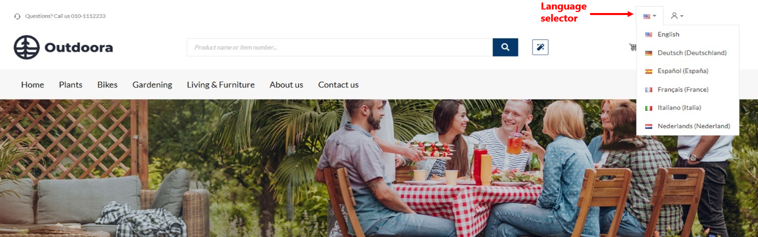
The Language selector content element is used to add language dropdown to the webstore header for the desktop and tablet layouts. It is needed if you have a multi-lingual webstore and you provide content in different languages. Customers can select the necessary language from the dropdown list to see webstore content in the selected language.
Although you can add the Language selector content element to any page, we recommend to use it in your webstore header.
You can change the name of any installed webstore language using the in-site editor. If you don't like the default language name, you can easily change it.
Content Tab
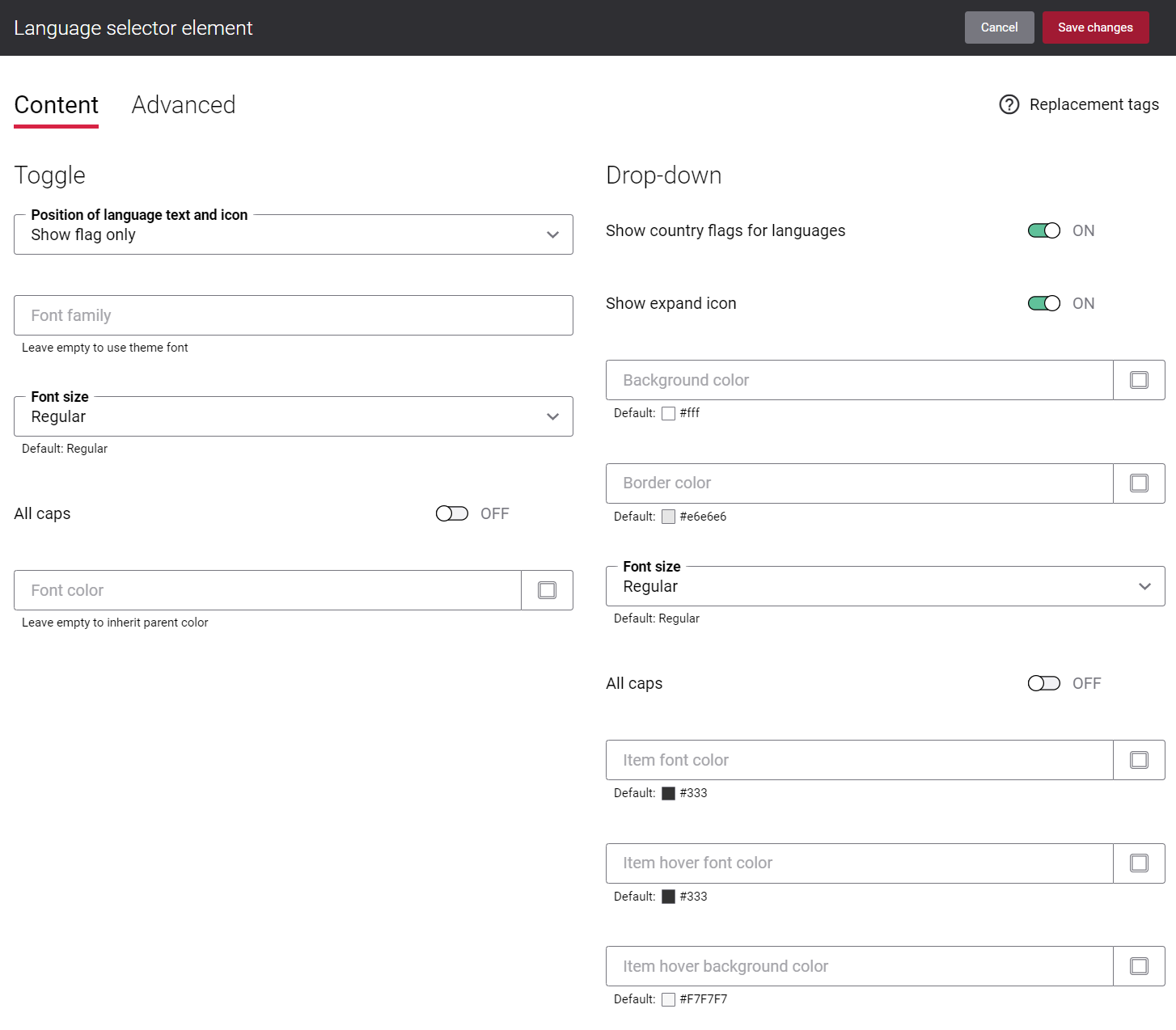
The table below provides description of the Language selector content element settings on the Content tab.
| Setting | Description |
|---|---|
| Toggle | |
|
Position of language text and icon |
Use this setting to specify how the language name and the country flag icon should be presented in the webstore header. The following options are available:
|
|
Font family |
Enter the name of the font family for the language name shown near the icon. |
|
Font size |
Enter the necessary font size for the language name shown near the icon. |
|
All caps |
Enable this option, if you need all language name letters to be capitalized. |
|
Font color |
Specify the font color for the language name shown near the icon. You can change it using the color picker, or by entering the color hex code, RGB or HSL values. If you leave this field empty, the default value will be used. |
| Drop-down | |
|
Show country flags for languages |
Use this option to show or hide country flag icons for languages in the language dropdown in the webstore header. |
|
Show expand icon |
Enable this option if you want to show the expand icon in the language selector. |
|
Background color |
Specify the background color of the language dropdown. You can change it using the color picker, or by entering the color hex code, RGB or HSL values. If you leave this field empty, the default value will be used. |
|
Border color |
Specify the language dropdown border color. You can change it using the color picker, or by entering the color hex code, RGB or HSL values. If you leave this field empty, the default value will be used. |
|
Font size |
Enter the necessary font size for the language names in the dropdown. |
|
All caps |
Enable this option, if you need all language name letters in the dropdown to be capitalized. |
|
Item font color |
Specify the font color for the language names in the dropdown. You can change it using the color picker, or by entering the color hex code, RGB or HSL values. If you leave this field empty, the default value will be used. |
|
Item hover font color |
Specify the hover font color for the language names in the dropdown. When a user hovers over the language name in the language dropdown in the Sana webstore, the font color changes to the one specified in this field. You can change it using the color picker, or by entering the color hex code, RGB or HSL values. If you leave this field empty, the default value will be used. |
|
Item hover background color |
Specify the hover background color for the language names in the dropdown. When a user hovers over the language name in the language dropdown in the Sana webstore, the background color changes to the one specified in this field. You can change it using the color picker, or by entering the color hex code, RGB or HSL values. If you leave this field empty, the default value will be used. |
The country flag icons shown in the webstore header are retrieved from the language packs. For more information, see Languages.
Advanced Tab
On the Advanced tab of the Language selector content element, you can configure height, width and spacing settings.
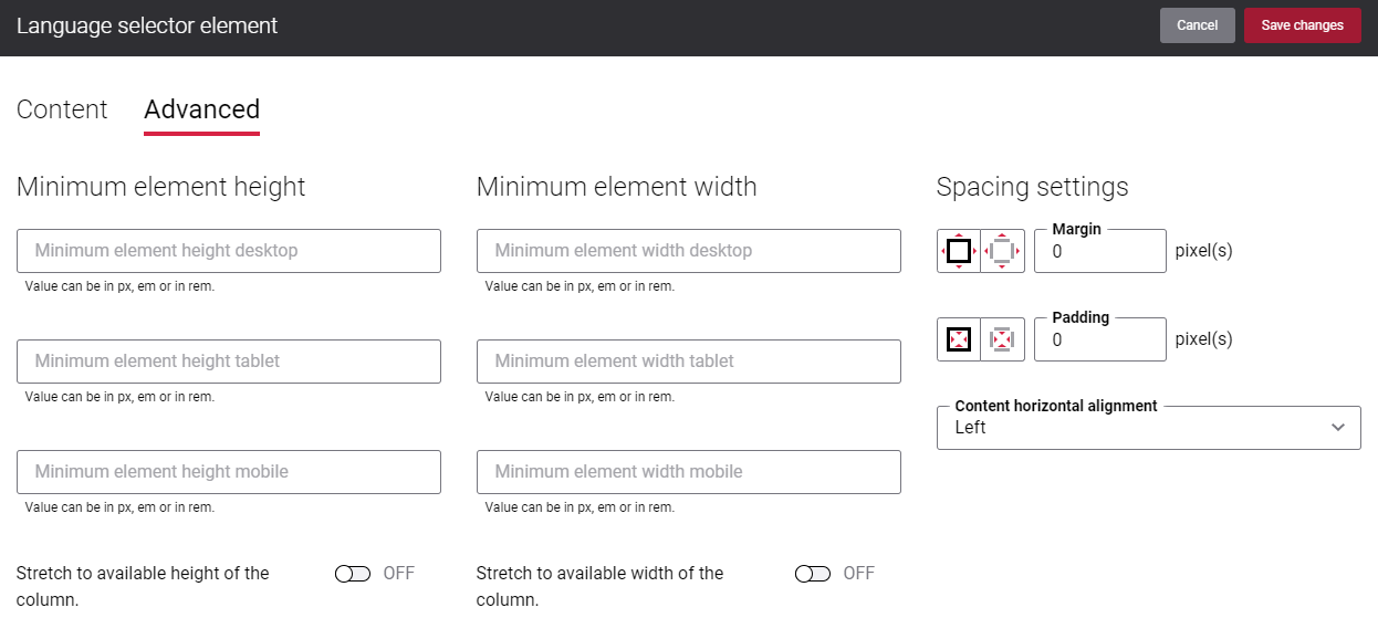
For more information about advanced settings, see Content Elements.