Add Guided Product Finder Content Element
The Guided product finder content element is available as an app. It can be installed from the Sana App Center.
In Sana Admin click: App Center > Apps > Apps Explorer. When the Guided product finder app is installed, you can configure it.
The Guided product finder content element can be added to the product list system page, in which case it will apply to all product list pages. Alternatively, it can be added to specific product list pages. Similarly, it can be added to the product group details system page, applying to all product group pages, or to any specific product group page. Additionally, the content element can be added to content pages and the search system page within the Sana webstore.
For more information about adding, searching, and filtering content elements on pages, see Content Elements.
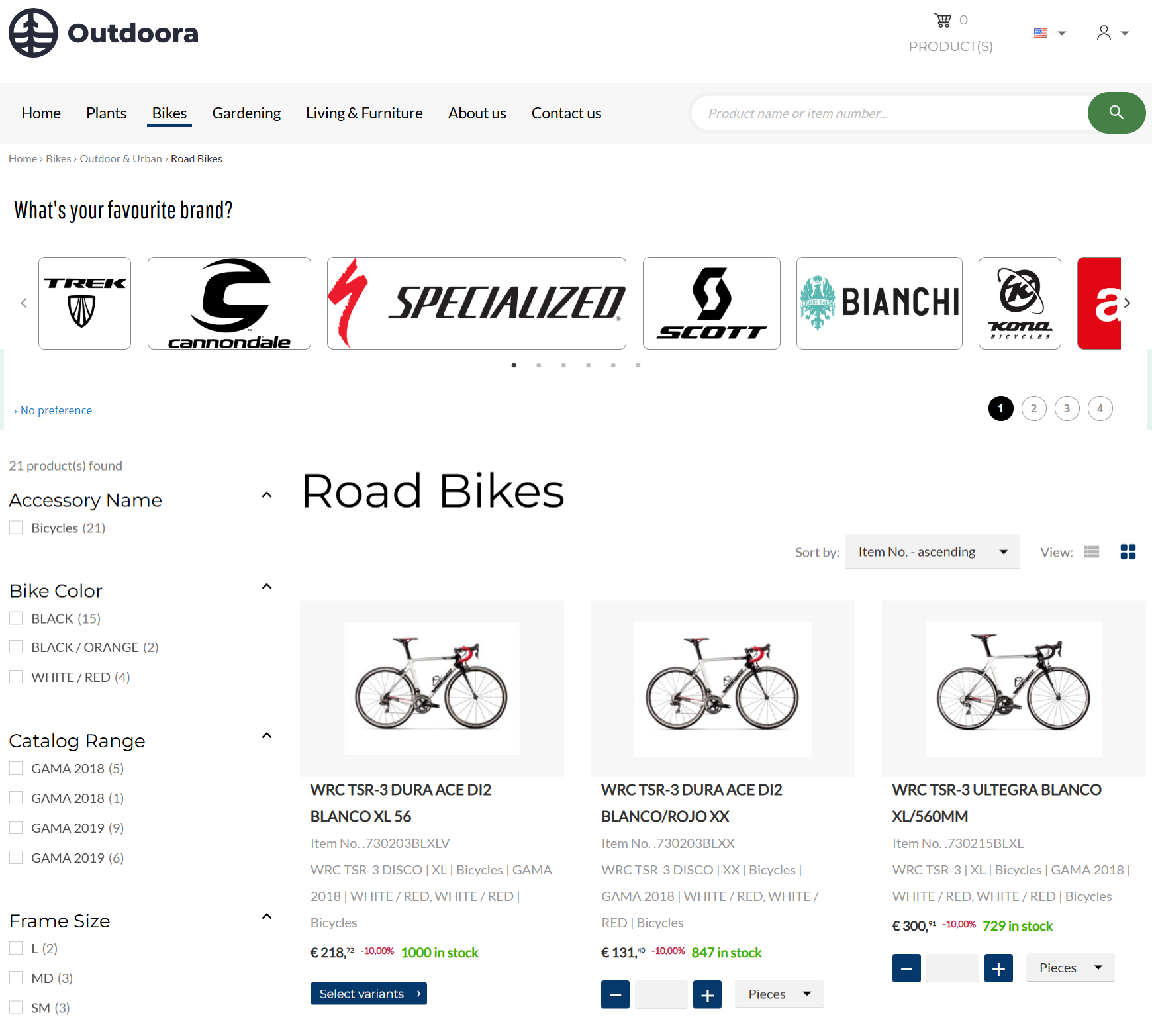
Using the Guided product finder content element on the product list page will allow users to filter out products on this particular product list page.
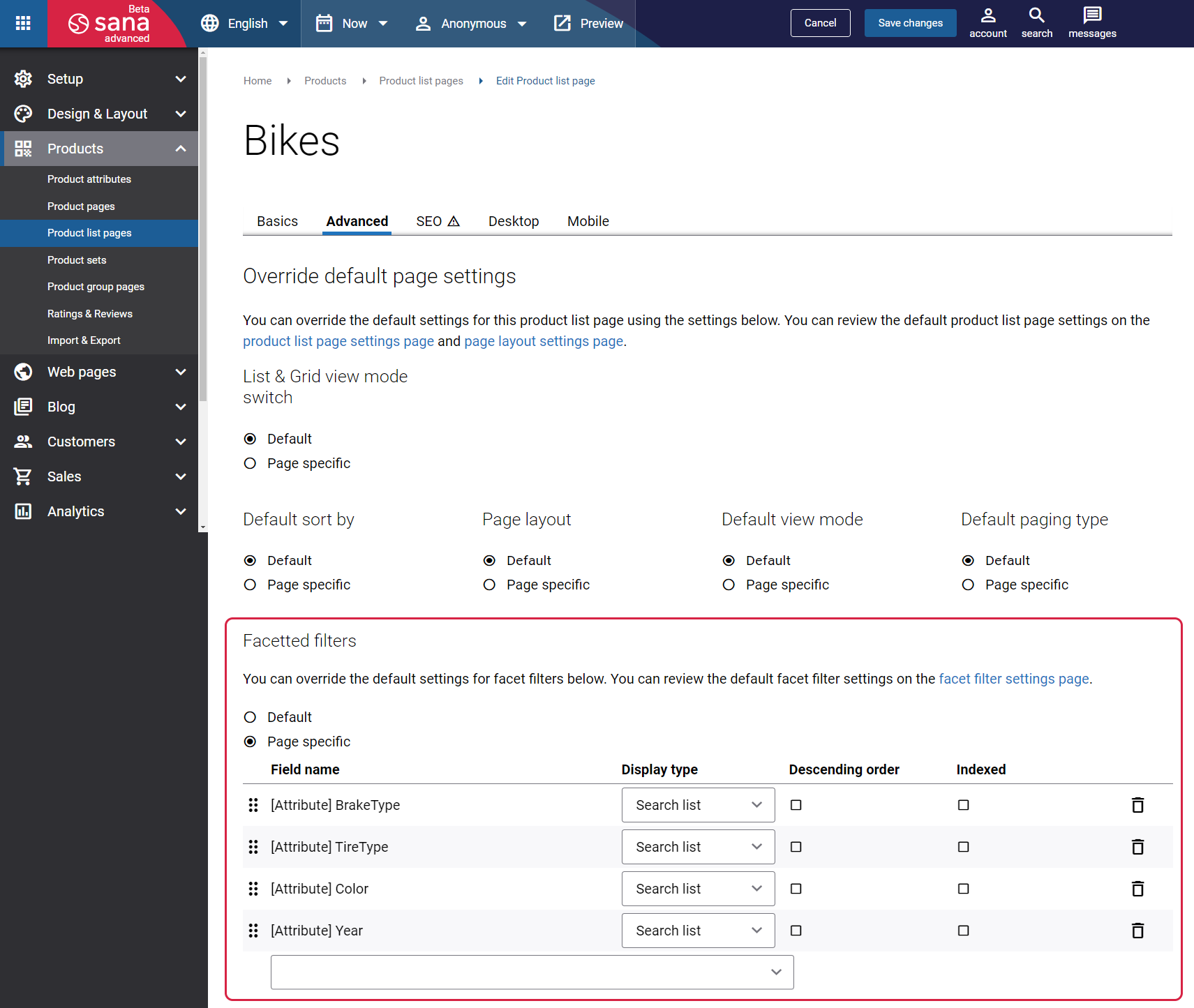
If you configure the Guided product finder content element for the particular product list page, you can use either the default facetted filters configured on the Search & filters page, on the Facetted filters tab, or you can set up the page specific facetted filters in the settings of the product list page.
If you use the default facetted filters, then while configuring the Guided product finder content element you will be able to select any facetted filters that have been configured on the Search & filters page, on the Facetted filters tab.
If you use the page specific facetted filters for the product list page, then while configuring the Guided product finder content element for this product list page, you will be able to use only the page specific facetted filters. For more information, see Advanced Settings.
Content Tab
Some settings of the Guided product finder content element are different for the search results pages, product list pages, content pages and product group pages.
Search and Product List Pages Specific Guided Product Finder Settings
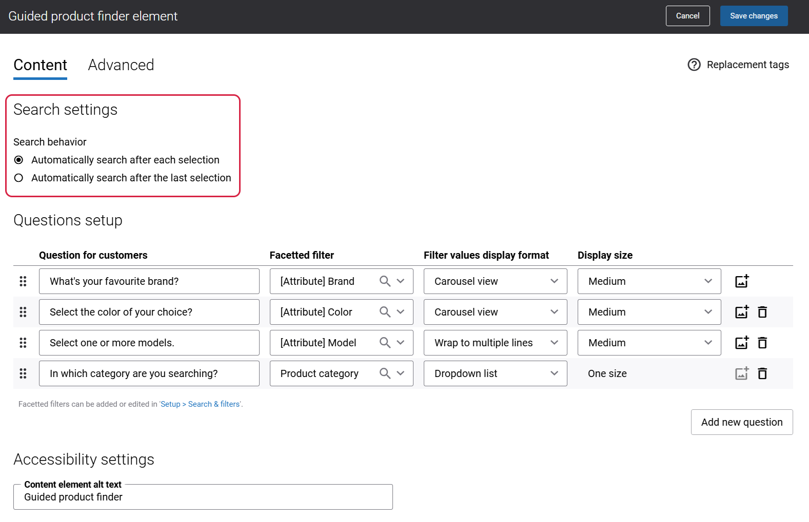
Search Settings
In the Search settings section, you can specify the search behavior. The available options are:
- Automatically search after each selection: When this option is selected, users can perform the search and view the results after answering each question.
- Automatically search after the last selection: When this option is selected, users can perform the search and view the results only after answering the last question.
Content Pages Specific Guided Product Finder Settings
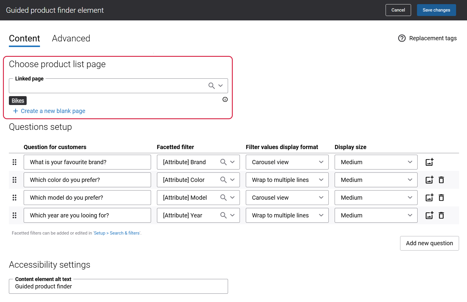
When adding the Guided product finder content element to a content page, you need to specify a product list page. You can select either an existing product list page or create a new one using the Create a new blank page link.
After users finish filtering products via Guided product finder content element on a content page, they will be redirected to the specified product list page for further exploration.
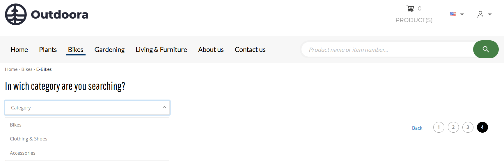
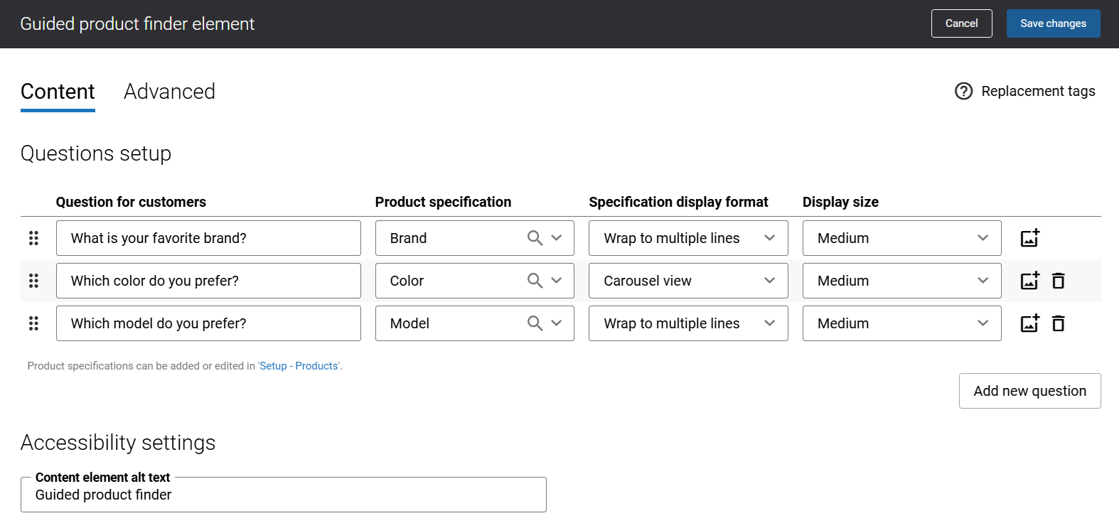
Questions Setup for Product List, Content and Search Pages
In the Questions setup section, you can create questions that will help to narrow down product options for customers. To start creating questions, click Add new question.
All three fields that are used to create questions are mandatory. You should use accurate data to create questions.
You can add, remove and change the order of the questions. Also, using the Add images button in the Questions setup section, you can add images to the filter values.
The table below provides the description of the fields that are used to create questions.
| Field | Description |
|---|---|
| Question for customers |
Enter a question.
Each question should help filter out products that do not match the customer’s preferences. Aim for the questions that cover the most critical aspects of the customer's needs. For example, in a fashion store, questions could include preferred style, size, color, occasion, etc. |
| Facetted filter |
Select the facetted filter relevant to the question. For example, brand, color, size, type, model, occasion, style, etc.
The facetted filters which are configured on the Search & filters page in Sana Admin or the product list page specific facetted filters can be selected in this field. |
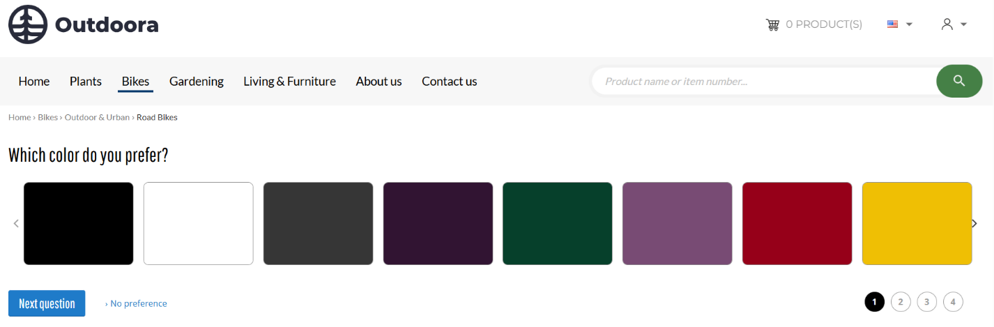
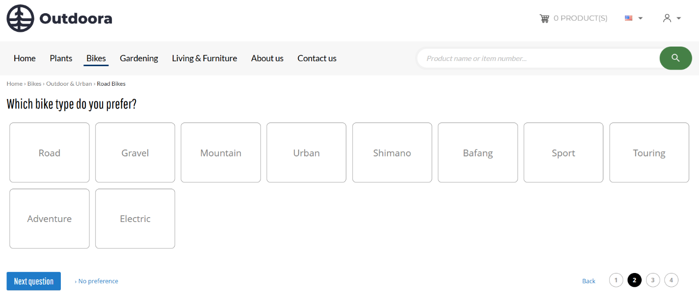
| Filter values display format | Select how the facetted filter values should be presented.
When you select the filter values display format, we recommend selecting the format that corresponds to the available number of facetted filter values. The available options are:
Below the table see the presentation of different filter values display formats in the webstore. |
| Display size | Choose the size of the images that will be displayed in Guided product finder. The following options are available:
The default image size is set to Medium. |
Presentation of the Filter Values Display Formats in the Webstore
-
Dropdown list
-
Carousel view
-
Wrap to multiple lines
Good to Know
-
When a user answers the questions in the webstore, the order in which the filter tags appear on the page is determined by the order of facetted filters configured in the settings of the Guided product finder content element. However, when the user triggers the search, the order of the filter tags adjusts to match the order of facetted filters configured on the Search & filters page in Sana Admin.
-
If there will be no facetted filter values available for all created questions, then the Guided product finder content element will not be shown in the webstore. Similarly, if there are no facetted filter values available for a certain question, then this question will not be shown in the webstore.
-
If you add the Guided product finder content element to a content page and a product list page selected in the settings of the content element does not contain any products that match the specified faceted filters, the Guided product finder will not be displayed on the content page.
Product Group Pages Specific Guided Product Finder Settings
The Guided product finder content element can be added to product group pages, and it enables filtering based on product specifications.
Guided product finder used on the product group pages simplifies the process of finding the right product, even in a long list of options that only differ in specific attributes, making it faster and easier to make a well-informed purchase decision.
Before adding the Guided product finder app, you must first configure the product group page.
Up to five additional product specifications can be displayed on the product group pages, alongside the default product information. As a result, if multiple attributes are configured in the Guided product finder app Questions setup section, users may not see the matching values in the Variants table on the product group page. However, the filtering results will still be accurate.
Questions Setup for Product Group Pages
| Field | Description |
|---|---|
| Questions for customers |
Enter a question.
Each question should help filter out products on the product group page that do not match the customer’s preferences. Aim for the questions that cover the most critical aspects of the customer's needs. For example, in a fashion store, questions could include preferred style, size, color, occasion, etc. |
| Product specification | Select the product specification relevant to the question. For example, brand, color, size, type, model, occasion, style, etc.
The product specifications which are configured on the Products page in Sana Admin can be selected in this field. |
| Specification display format |
Select how the product specifications should be presented.
When you select the product specification display format, we recommend selecting the format that corresponds to the available number of product specifications. The available options are:
Below the table see the presentation of different product specification display formats on the product group page in the webstore. |
| Display size | Choose the size of the images that will be displayed in Guided product finder. The following options are available:
The default image size is set to Medium. |
Presentation of the Specification Display Formats on the Product Group Page in the Webstore
-
Dropdown list
-
Carousel view
-
Wrap to multiple lines
Redirection From the Product List and Search Results pages to the Product Group Page
When filtering on the product list or search results pages, if a user selects a product group that redirects them to the product group page, there is a discrepancy in the filtering process. On the product list and search results pages, the Guided product finder add-on uses facetted filters, while on the product group pages, it applies filters based on product specifications. If the questions configured on the product group page differ from those on the product list/search results page, a mismatch may occur when displaying the selected answers.
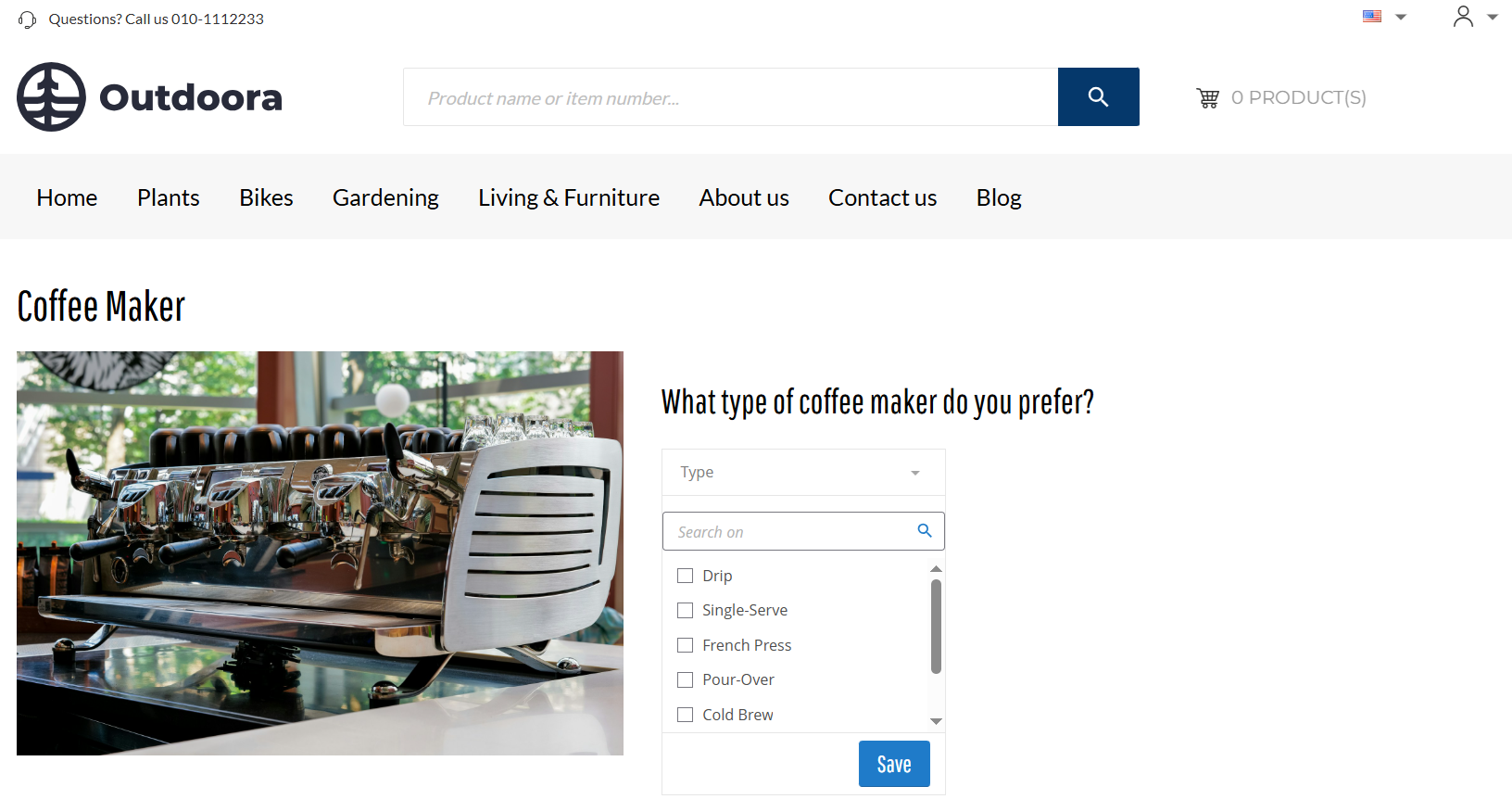
Scenario
Questions configured on the product list/search results page:
-
What type of coffee maker do you prefer?
-
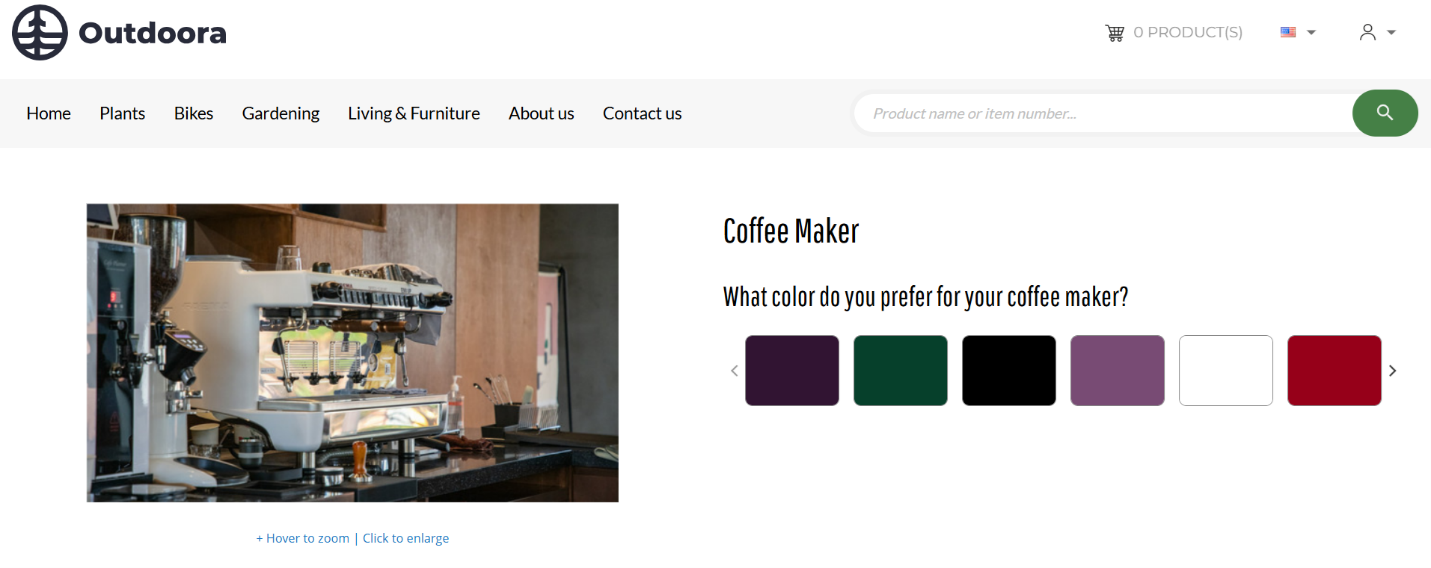
What color do you prefer for your coffee maker?
Filter values selected on the product list/search results page:
-
Coffee Maker Type: Drip Coffee Maker
-
Coffee Maker Color: Black
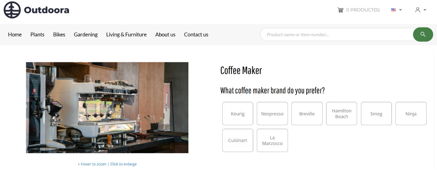
A user selects a product group from the filtered results and is redirected to the product group page.
Questions configured on the product group page:
-
Which coffee maker brand do you prefer?
Result: When a user navigates to the product group page, the products are already filtered according to the selections made on the product list/search results page. This means that only black drip coffee makers will be displayed on the product group page. The user can then answer a question available on the product group page, such as selecting the Nespresso coffee maker brand, to further refine the results. As a result, only black drip coffee makers from the Nespresso brand will be shown.
However, since the questions related to Coffee maker type and Coffee maker color are not configured on the product group page, the user will not see the selected values for these attributes on the product group page.
Accessibility settings
Enter the Guided product finder content element alt text.
Alt (alternative) text is used to describe the function and content of the Guided product finder content element on a page. Visually impaired users using screen readers can read an alt text to better understand the content shown in the Guided product finder content element.
Advanced Tab
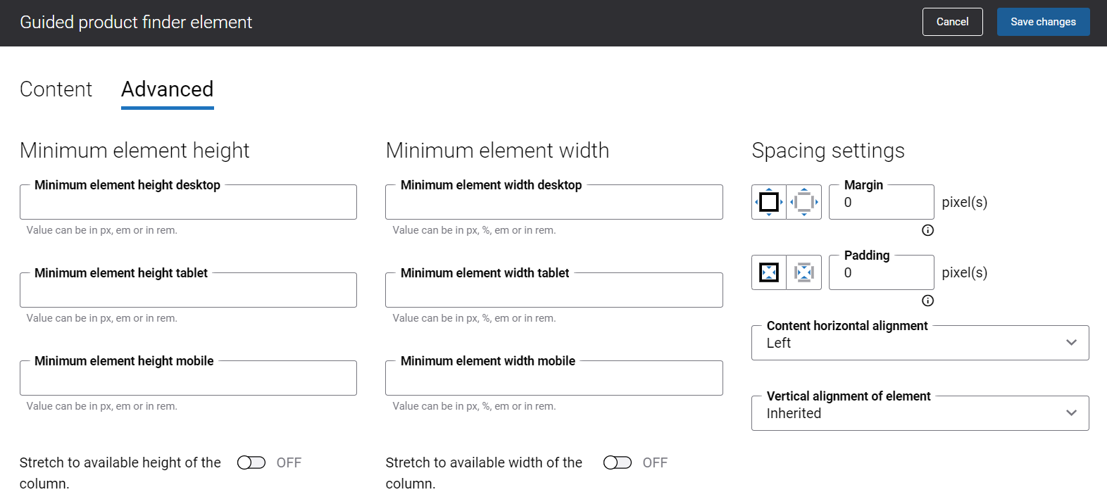
On the Advanced tab of the Guided product finder content element, you can configure height, width, and spacing settings.
For more information about advanced settings, see Content Elements.