Add Lookbook Content Element
The Lookbook content element is available as an app. It can be installed from the Sana App Center. In Sana Admin click: App Center > Apps > Apps Explorer.
The Lookbook content element can be added to the web pages (content pages, product and product list pages) and system pages of the Sana webstore.
For more information about adding, searching, and filtering content elements on pages, see Content Elements.
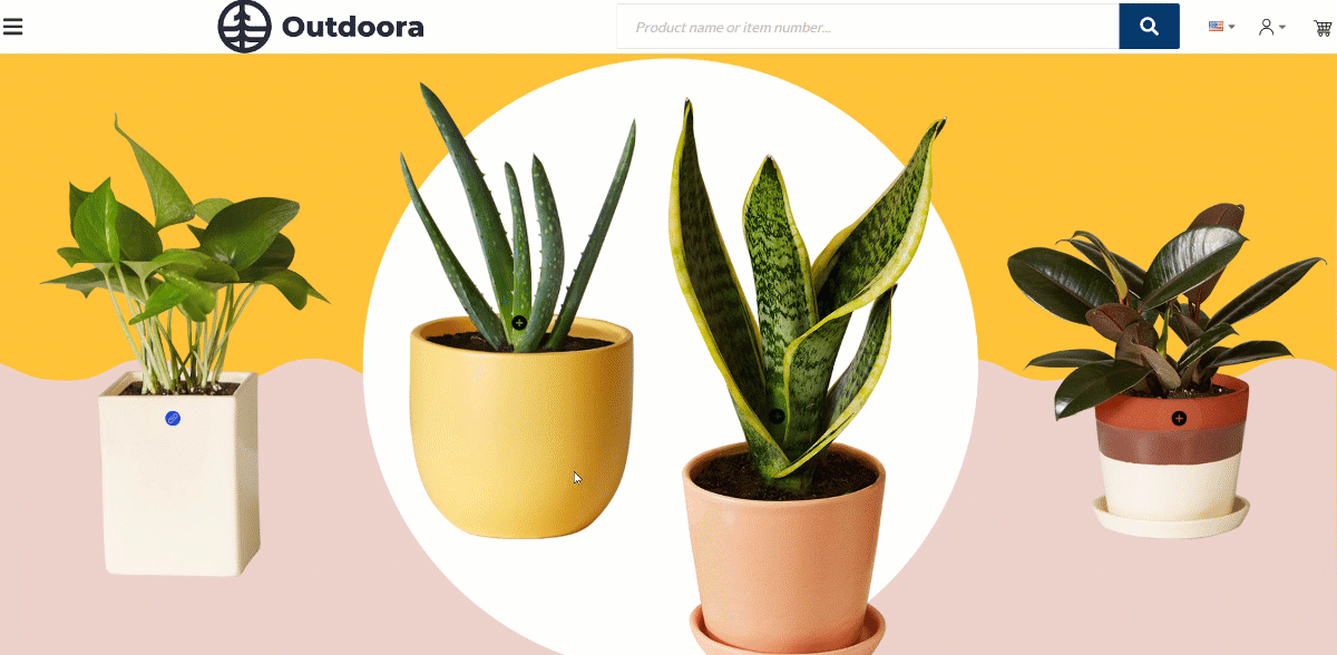
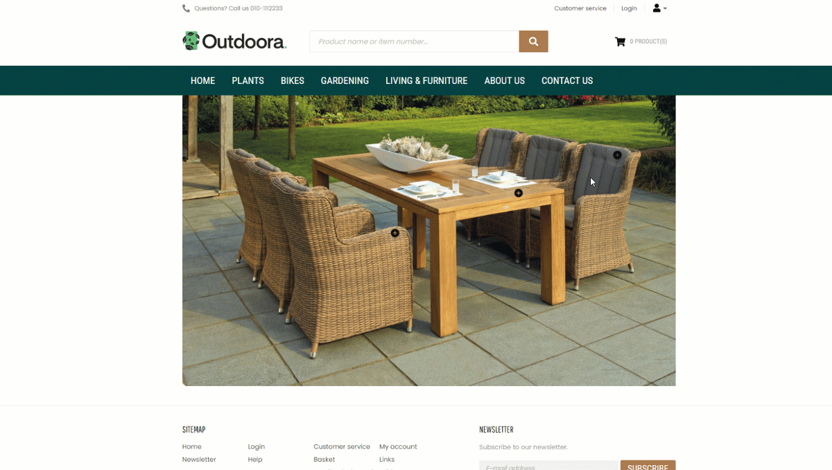
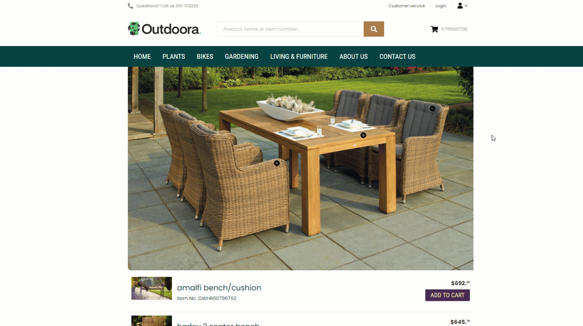
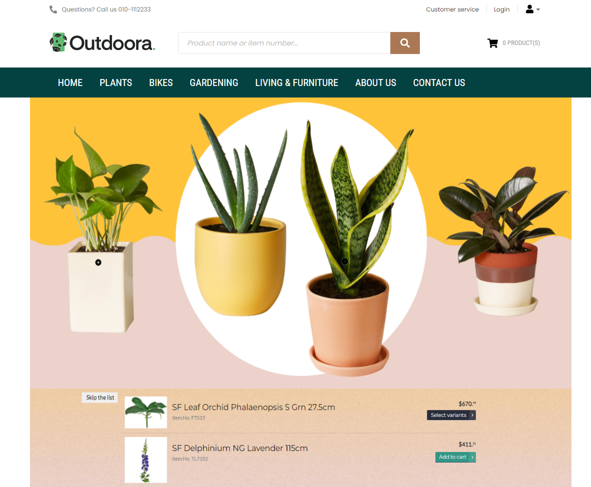
The Lookbook content element is a good solution for those who prefer cross-selling approach. For example, if you are selling clothes, you can make a lookbook image of outfits on people, and create hotspots or regions for each clothing item such as dress, shoes, handbag, and link these hotspots or regions to your products. When your customers click on the hotspot or region, they can see a product title, a product ID, a product price, an Add to cart button and a link to the product details page.
Content Tab
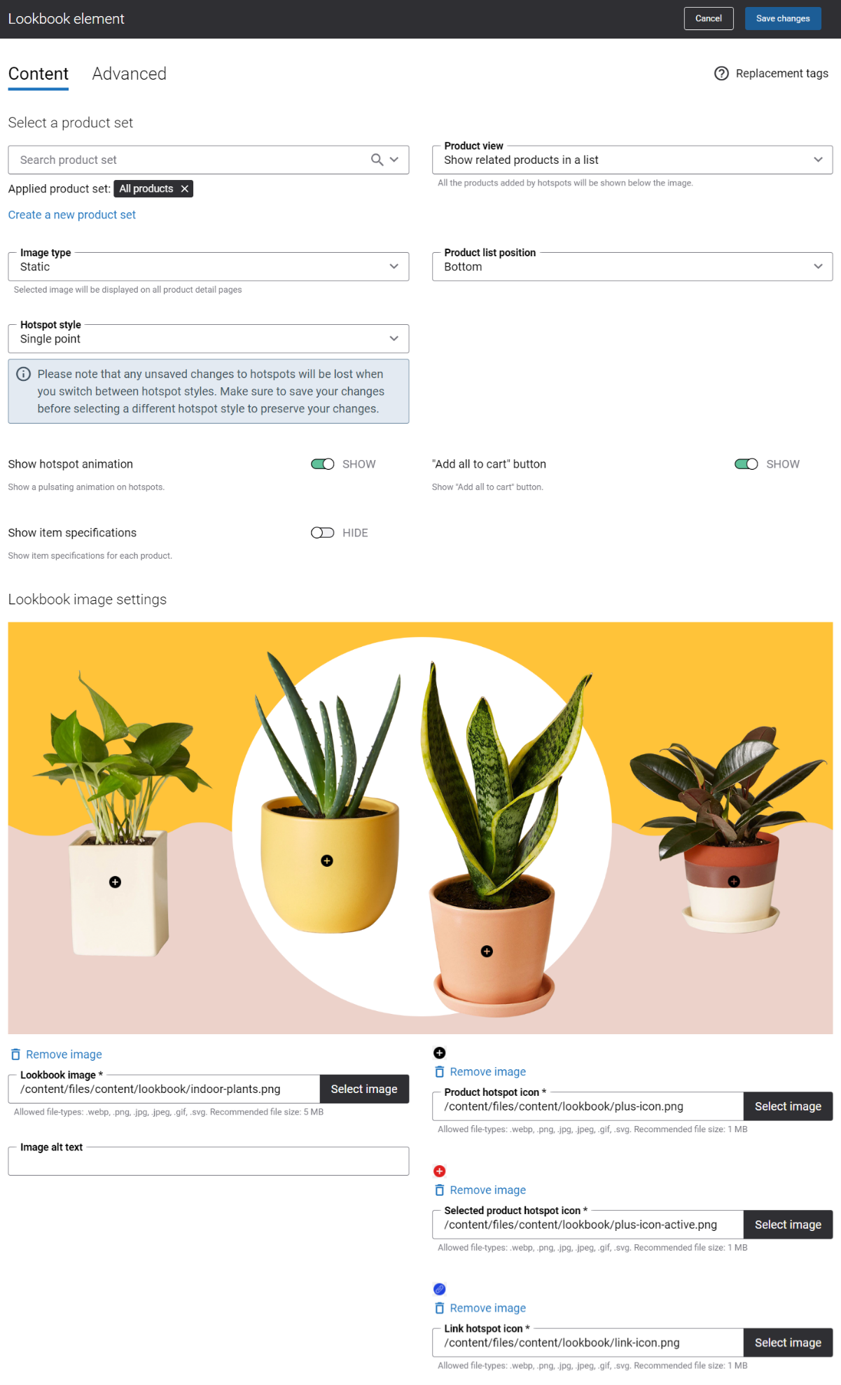
The table below provides the detailed description of the Lookbook content element settings.
| Field | Description |
|---|---|
| Select a product set | Use this field to select the existing product set or create a new product set. You can select products from this product set and link them to hotspots. You cannot use the product set Suggested products for the Lookbook content element. You can also select a product set with a product group. In this case, when you add the hotspot to an image, you will see individual products which are a part of a product group and you can link a product from a product group to the hotspot. It is not possible to add the whole product group with its contents to the hotspot. |
| Image type | Select the image type. The available options are:
|
| Hotspot Style | This setting is available only for the Static image type. If you select Page specific in the Image type field, this setting will not be shown.
Select the hotspot style. The following options are available:
To learn how to create regions, see the section Create a Region below the table. Good to Know
|
| Show hotspot animation | Enable this option to add a pulsating effect to a hotspot icon that changes its shape and opacity. |
| Show item specifications | Enable this option to show product specifications in lookbook. Up to 6 specifications per product can be shown in lookbook.
To use the Show item specifications option, you need to select the Show related products in a list value in the Product view field and the Bottom value in the Product list position field. Otherwise, the Show item specifications option will not be available. Product specifications are shown in lookbook only if they are configured in the ERP system and are made visible in Sana Admin. To manage product specifications, in Sana Admin click: Setup > Products > Product specifications. Make sure that the necessary specifications are made visible on the product list pages. For more information, see Product Specifications. |
| Product view | Use this field to select how the products linked to the hotspots will be shown on a page. The available options are:
For more information, see Product View Behavior. |
| Product list position | The Product list position field is shown only if in the Product view field, you select the option Show related products in a list. Use this field to select the product list position. The available options are:
|
| “Add all to cart” button | Enable this option to add Add all to cart button to lookbook. The Add all to cart button is shown only in list view. Using this button a customer can add all lookbook products in the list to the shopping cart in one click. |
| Lookbook image settings | |
| Lookbook image | Use this field to select a background lookbook image.
|
| Image alt text | Use this field to enter the background image alt text.
Alt (alternative) text is used to describe the appearance and function of an image on a page. Visually impaired users using screen readers can read an alt text to better understand what is shown on the image. |
| Product hotspot icon | Use this field to select an image for product hotspot icons. There is a default product hotspot icon which you can use or you can add another icon.
|
| Selected product hotspot icon | The Selected product hotspot icon field is shown only when the option Show related products in a list is selected in the Product view field.
Use this field to select an image for the selected hotspot icons. There is a default hotspot icon which you can use or you can add another icon.
|
| Link hotspot icon | Use this field to select an image for link hotspot icons. There is a default link hotspot icon which you can use, or you can add another icon.
|
Interaction with Regions
Create a Region
To draw a region on the lookbook image, follow the steps below:
-
Identify the area on an image where you want to draw a region.
-
Move the mouse cursor to the starting point within the chosen area and press the left button of the mouse.
-
Drag the mouse cursor without holding the left mouse button around the area where a region should be, creating a shape.
-
To finish drawing a region, continue dragging the mouse cursor to the starting point, then press and release the left mouse button. This action will close the shape, making it a complete region.
-
Once a region is created, click on the hotspot and in the Hotspot type field, select the Product option, in case you need to link a product to the region, or select the Link option, in case you need to add a link to some page.
In the webstore the regions are not immediately shown. A customer needs to hover over an image, specifically over an area where a region is located. Then, a customer will see an opacity on top of an image. This is how a region is presented in the webstore. When a customer clicks on the region a product will be shown either in a pop-up or in a list, depending on the option selected in the Product view field.
Remove a Region
There are two ways to remove regions: you can either remove all regions at once or you can remove each region separately. If you need to remove all regions at once, use the Clear all button at the top right corner of the lookbook image. To remove a specific region, click on the necessary hotspot and use the Delete hotspot link in the pop-up.
Hotspot Type
You can link products or some pages to the lookbook hotspots or regions. When you add the hotspot or region to an image, in the Hotspot type field, select the Product option, in case you need to link a product to the hotspot, or select the Link option, in case you need to add a link to some page.
Product Hotspot Type
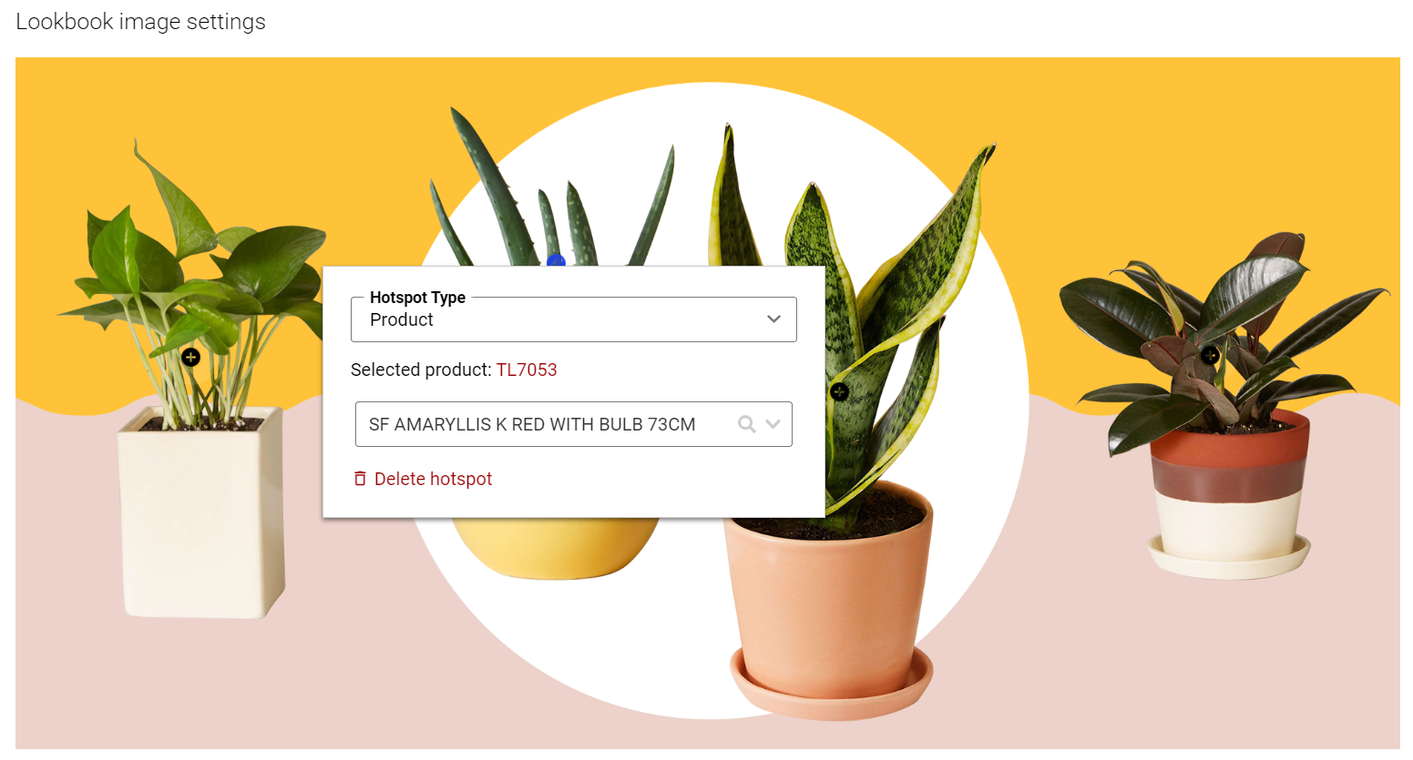
Select a product which should be linked to the hotspot or region.
Link Hotspot Type
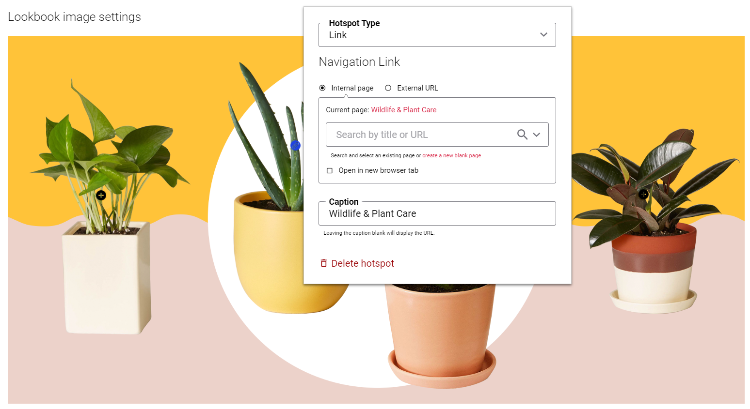
You can add a link to the hotspot / region either to the internal webstore page or to the external website. Clicking on the link will open the linked page.
To add a link to the internal webstore page, you can search for it by title or URL.
If you add an external URL, specify the full URL of the page.
Also, you can provide the title for the link in the Caption field. The title will be shown in the pop-up when a customer clicks on the hotspot on the lookbook image. Clicking on the title will open the linked page. If you leave the Caption field empty, the URL itself will be shown in the pop-up.
Product View Behavior
In the Product view field, there are 2 options which control how the products linked to the hotspots or regions can be shown in the webstore. When a customer clicks on the hotspot or region on the lookbook image, the products can be shown either in a list or in a pop-up.
If you select the option Show related products in a pop-up, a product and its product details will be shown in a pop-up when you click on the hotspot / region. This option is selected by default.
If you select the option Show related products in a list, you can select where all products linked to the hotspots or regions will be shown. In the Product list position field, the available options are:
- Bottom
- Right
- Left
When a customer clicks on the hotspot or region on the lookbook image, it automatically highlights the selected product in gray.
Accessibility Feature: Skip the List
The Skip the list feature works with both hotspot styles: region and single point.
If the products linked to the hotspots are shown on a page in a list below the lookbook image, the keyboard-only users can jump from hotspot to hotspot pressing the Tab key.
-
When the hotspot receives the keyboard focus, a user can press the Enter button to navigate from the hotspot to the product shown in the list.
-
When the hotspot receives the keyboard focus, and users do not press the Enter button, they will jump from hotspot to hotspot.
When a user navigates through all the hotspots, the Skip the list button appears below the lookbook image.
-
When the Skip the list button receives the keyboard focus, a user can press the Enter button to skip the Lookbook content element and navigate to the next content element on a page.
The Skip the list button is useful to give screen reader and keyboard users the same capability of navigating directly to the content they are interested in. -
When the Skip the list button receives the keyboard focus, and users do not press the Enter button, they will jump from hotspot to hotspot on the lookbook image.
Advanced Tab
On the Advanced tab of the Lookbook content element, you can configure height, width, and spacing settings.
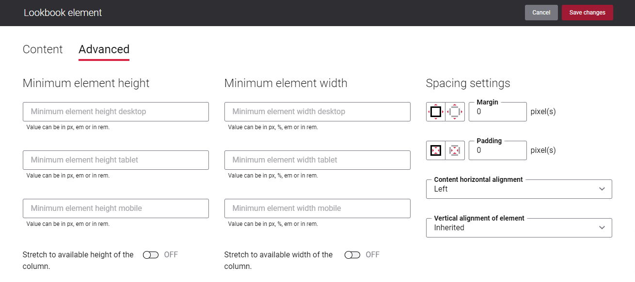
For more information about advanced settings, see Content Elements.