Content Elements on the Basket Page
Below you can see the description of all standard content elements that are shown on the Basket page.
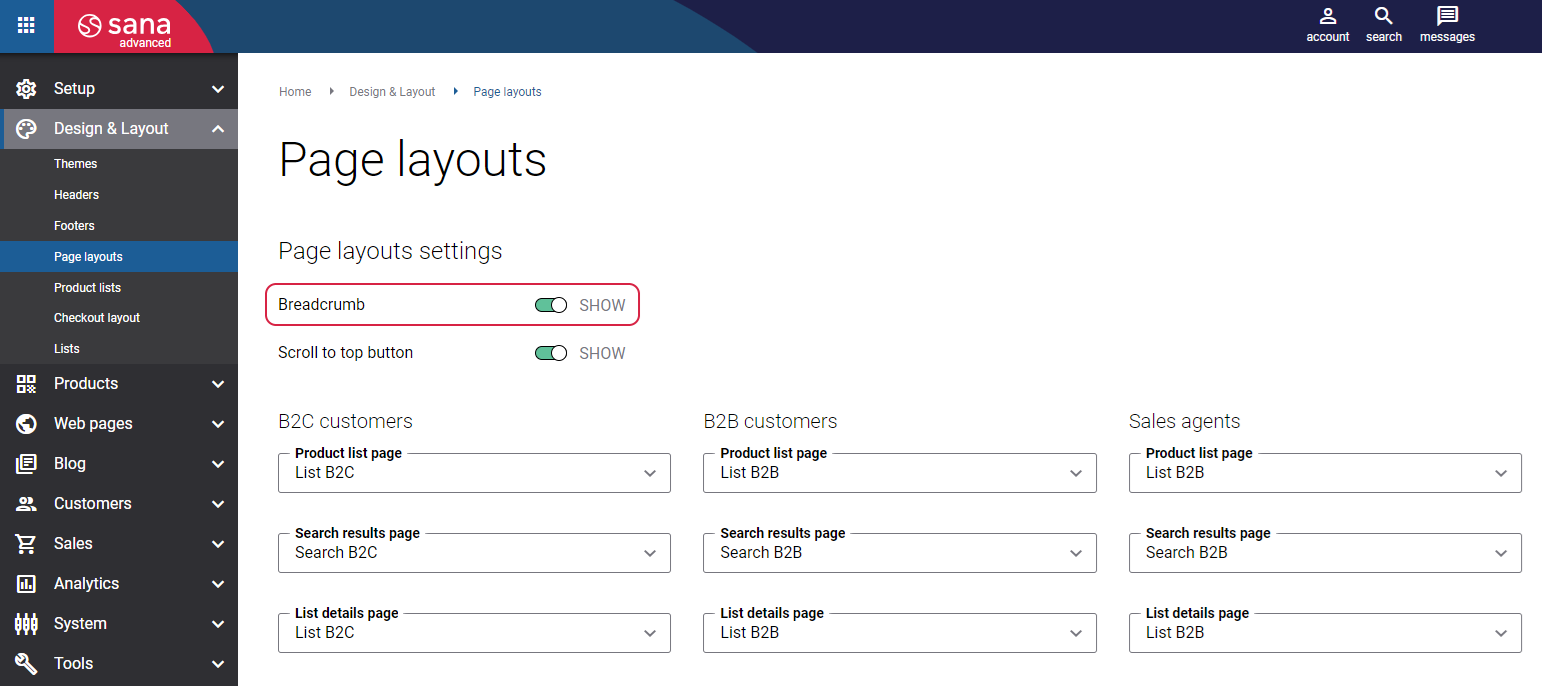
Breadcrumb
The Breadcrumb content element is used to show a breadcrumb on the Basket page. It is used to provide the customers with the path on where a customer navigates within the webstore.
To enable the Breadcrumb option, in Sana Admin click: Design & Layout > Page layouts.
Quick Order
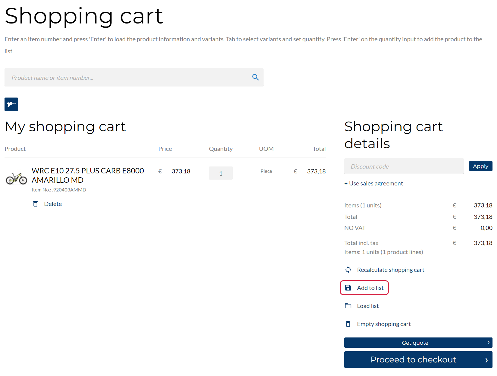
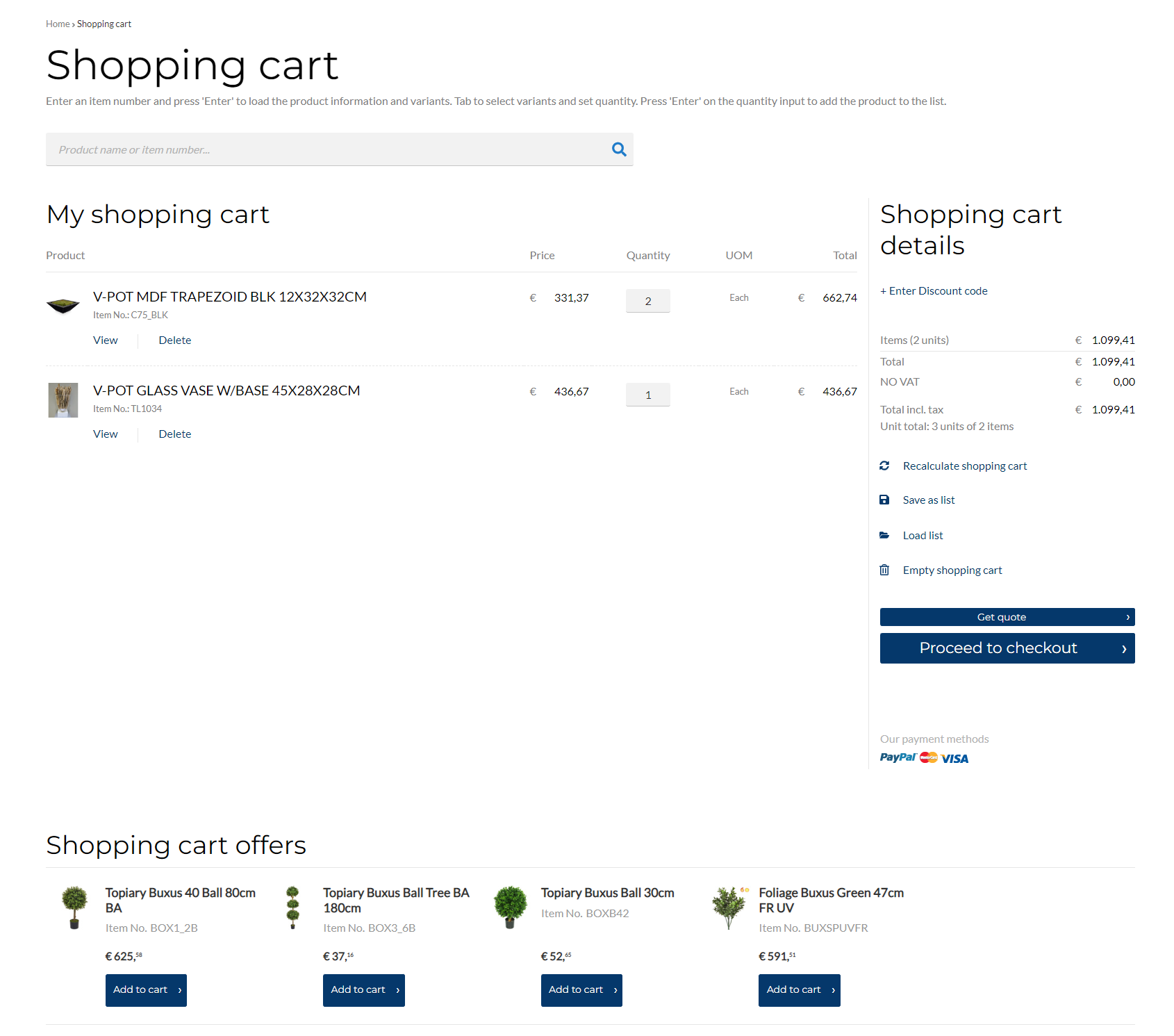
The Quick order content element is used to show a search box on the Basket page. It is useful for customers who know the product name or ID they want to order, because quick order reduces the order process to several clicks.
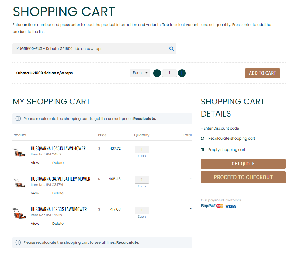
On the Basket page, a customer can search for a necessary product by entering a product name or number. A customer can also select product variants if there are any, set quantity, select a unit of measure and add a product to the shopping cart.
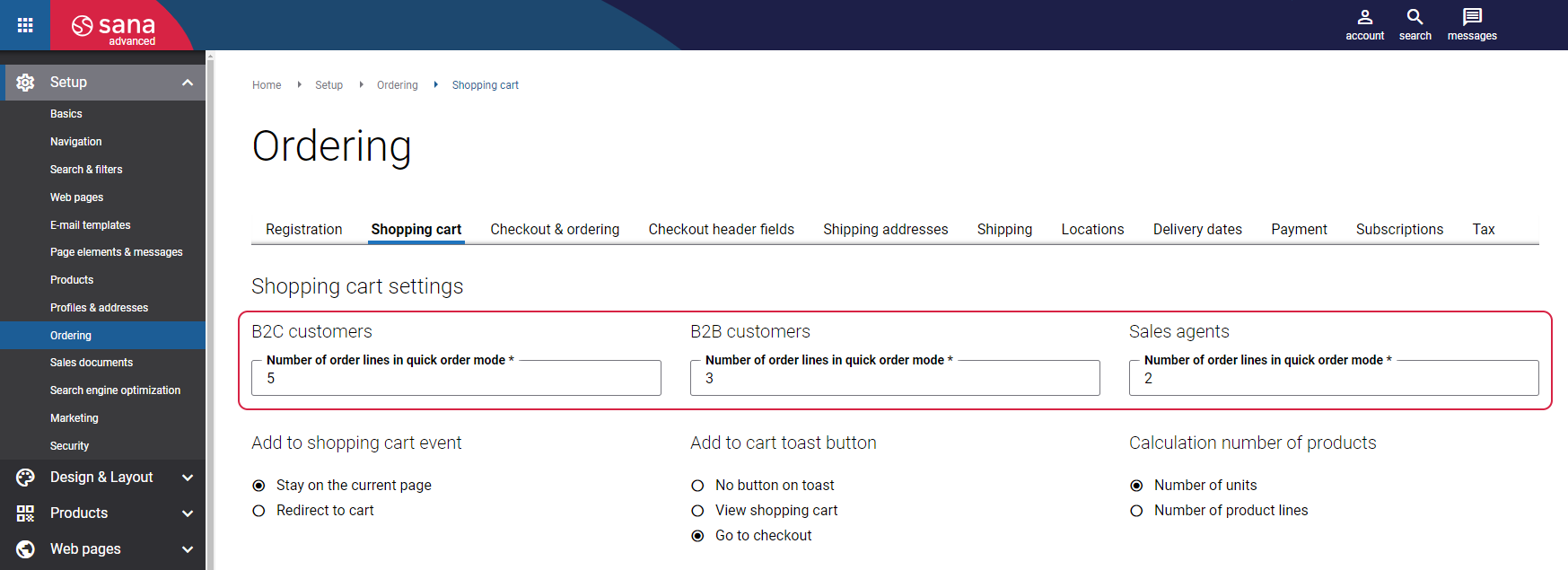
In Sana Admin click: Setup > Ordering > Shopping cart. In the field Number of order lines in quick order mode, you can set the number of lines which is visible when a customer adds products directly from the Shopping cart page and recalculates the shopping cart. For more information, see Shopping Cart Settings.
Edit Order Message
The Edit order message content element is used to show a message in the shopping cart when a customer edits an existing order.
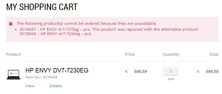
Non Orderable Lines
The Non orderable lines content element is used to show a message in the shopping cart informing a customer about unavailable products. If a product is out of stock, it will be replaced by the alternative item in the shopping cart. In this case, a customer will see a message in the shopping cart.
Credit Limit Message
The Credit limit message content element is used to show a warning or an error message in the shopping cart if customers place an order which exceeds their credit limit set in the ERP system.

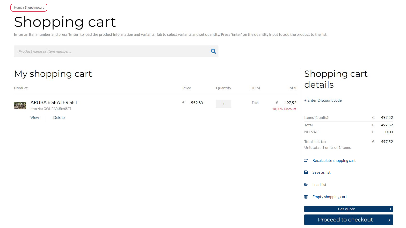
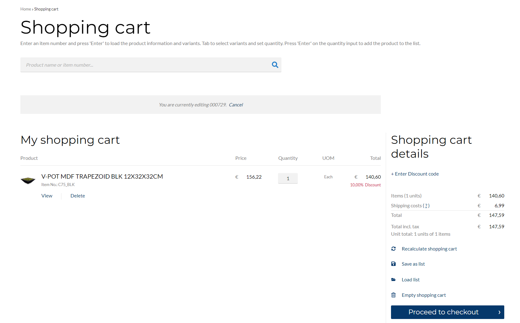
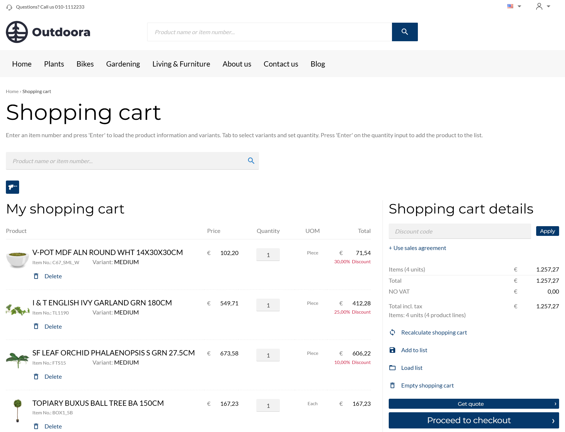
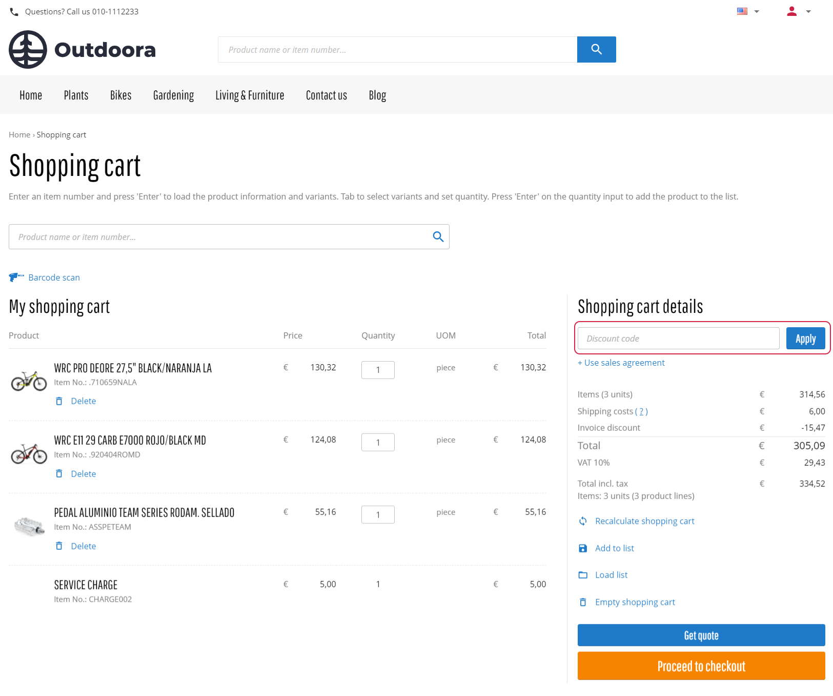
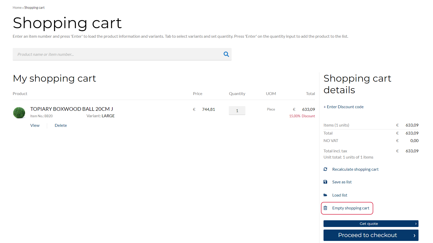
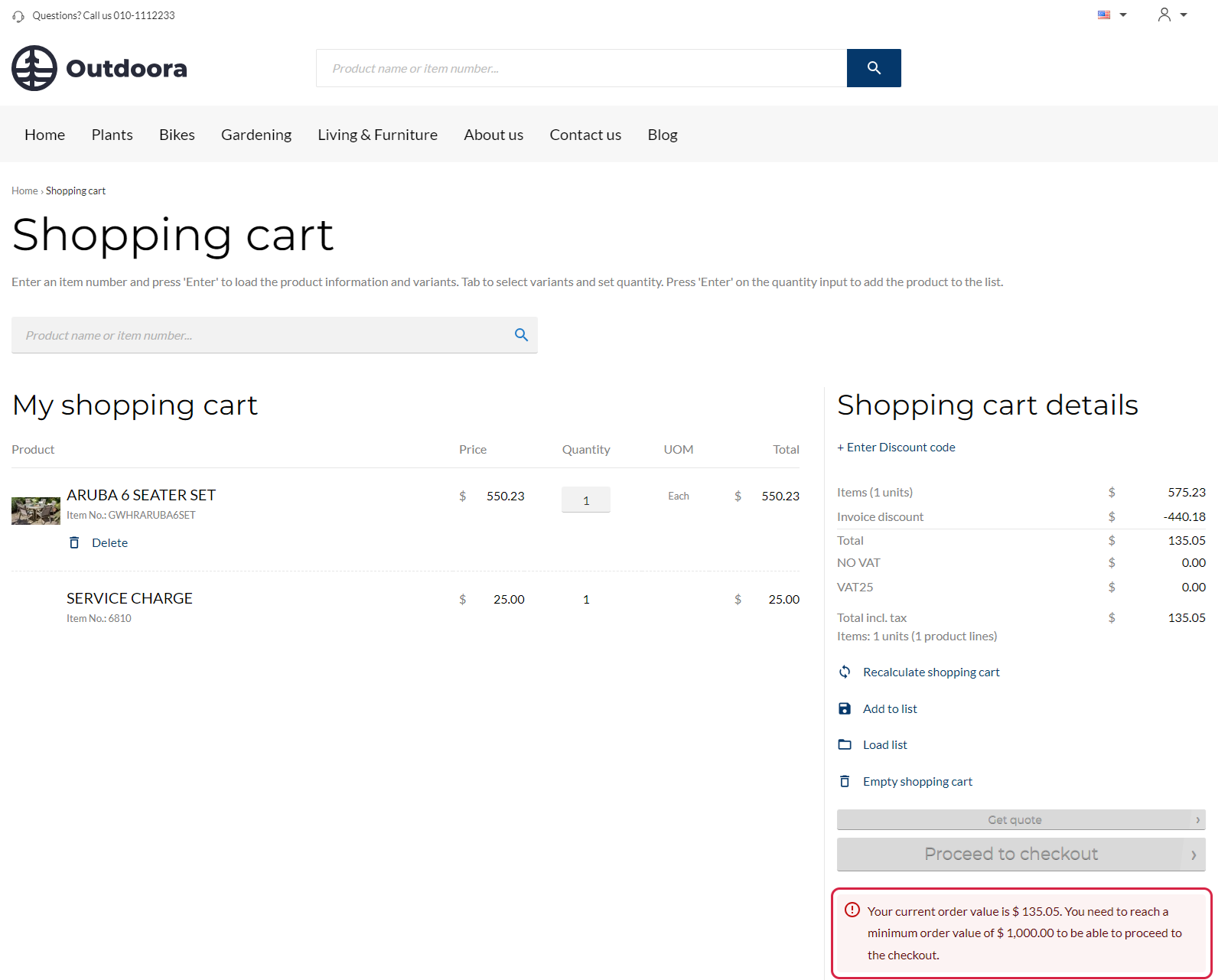
Basket Overview
The Basket overview content element is used to show the shopping cart lines on the Basket page.
Each shopping cart line contains information about products a customer added to the shopping cart, like product number and title, product image, price, discount, quantity, unit of measure, etc.
The information about products added to the shopping cart is taken from the ERP system, that’s why the dummy data is used on the Basket system page in Sana Admin. The real data is shown to a customer in the webstore.
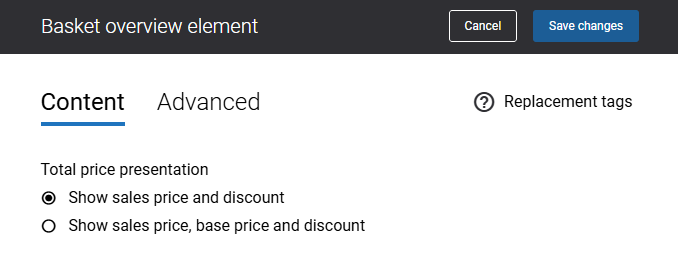
Use the Total price presentation options to adjust how the total price per product is displayed in the shopping cart. Sana Commerce Cloud always shows the sales price and any available discount for a product. Additionally, you can choose to display the base price of a product if needed.
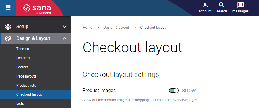
You can also show or hide product image thumbnails in the shopping cart.
In Sana Admin click: Design & Layout > Checkout layout. Use the Product images option to show or hide product images in the shopping cart and on the order overview page.
Promotion Control
The Promotion control content element is used to add the Discount code field and the Apply button to the shopping cart details.
You can create discounts in the ERP system as well as create discounts in Sana Admin. If customers have any discounts, they can enter a discount code in the shopping cart. Only one discount code can be applied to a shopping cart.
Sales Agreement Control
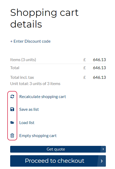
The Sales agreement control is used to show either the link + Use sales agreement or the button Use sales agreement in the shopping cart details.
On the Content tab, you can select how to show the Sales agreement control content element.
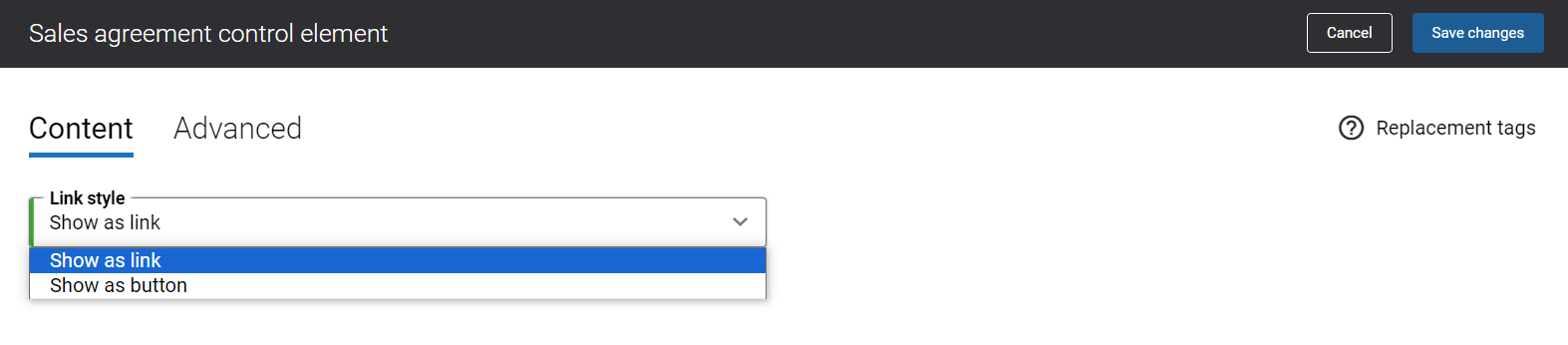
Below you can see an example of the shopping cart details when the Sales agreement control content element is shown as a button.
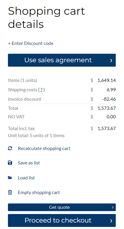
You can set up sales agreements in your ERP system. If customers have any sales agreements, they can open the list of all sales agreements. On the Shopping cart page, customers can see the sales agreement that has been applied to the shopping cart, remove it, change, view details and change the sales agreement term for each line. Only one sales agreement can be applied to a shopping cart.

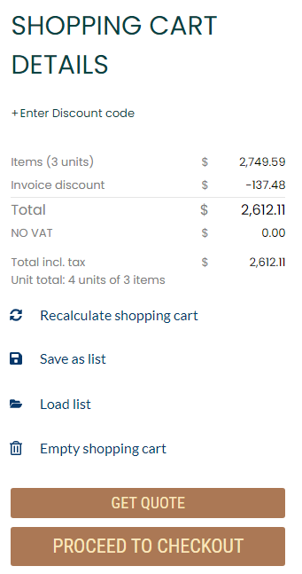
Totals
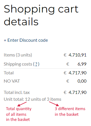
The Totals content element is used to show the number of products and the total price in the shopping cart details. Also, some other costs can be shown in this content element, such as discounts, taxes, shipping and payment costs. All this information is taken from and calculated by ERP real-time.
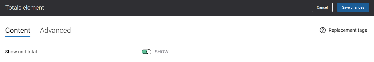
Using the Show unit total option, you can show or hide the unit total information in the shopping cart details.
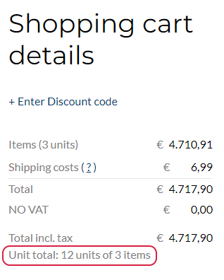
Unit total informs customers how many items are there in the shopping cart and the total quantity of all items.
Basket Fields
Sana Commerce Cloud allows to add extra fields to the last checkout step and to the shopping cart in the Sana webstore.
The Basket fields content element is used to show extra fields in the shopping cart.
Adding extra fields to the shopping cart is crucial for optimizing order processing. When a customer fills in the extra fields in the shopping cart, the entered order data is considered during the shopping cart calculation. This enables more precise calculations for shipping costs, prices, estimated shipment dates, stock, etc., ensuring transparency and fairness in the final pricing and shipment, which can significantly reduce cart abandonment rates and increase overall sales.
For more information, see Checkout Header Fields.

Recalculate Basket Button
The Recalculate basket button content element is used to show the Recalculate shopping cart button in the shopping cart details.

When customers add products or change the product quantity directly on the Shopping cart page, they need to recalculate basket to get correct prices.
Add to List Button
The Add to list button content element is used to show the Add to list button in the shopping cart details.
Customers can save shopping carts for later use. When a customer clicks on the Add to list button, the Add to list pop-up window opens. A customer must enter the list name and click Create list. This allows customers to continue with other orders without losing the details of the current shopping cart, if the order can't be completed at the moment. For more information, see My Lists.
Load List Link
The Load list link content element is used to show the Load list link in the shopping cart details.

Customers can save all products that are currently available in the shopping cart as a list. When a customer clicks on the Load list link, the My lists page opens. A customer can add products from the list to the shopping cart. A customer can add products to the shopping cart from several lists.
Clear Basket Button
The Clear basket button content element is used to show the Empty shopping cart button in the shopping cart details.
Customers can use the Empty shopping cart button to delete all the products from the shopping cart with a single click. When a customer clicks on the Empty shopping cart button, the shopping cart will be cleared.
Quote Link
The Quote link content element is used to show the Get quote button in the shopping cart details.
In the Sana webstore a customer can either create a quote or place an order, or you can give a choice to a customer, whether to place a quote or an order. For more information, see Order Types: Quotes and Orders.
If customers create a quote, they can convert it to a sales order directly from the Sana webstore on the quote details page.
Checkout Link
The Checkout link content element is used to show the Proceed to checkout button in the shopping cart details.

In the Sana webstore customers can create different sales documents – place orders, request quotes, place orders and request quotes. When a customer clicks on the Proceed to checkout button, the checkout process will start. It guides customers through several steps like shipping information, delivery and payment methods, and order review.
Punchout Button
The Punchout button content element is used to show the Transfer shopping cart button in the shopping cart details.
When a buyer initiates a punchout request from their e-procurement system to the supplier’s Sana webstore, browses the catalog, and adds items to the shopping cart, Sana Commerce Cloud replaces the Proceed to checkout button with Transfer shopping cart. It is used to transfer shopping cart data from the supplier’s Sana webstore to the buyer’s e-procurement system.
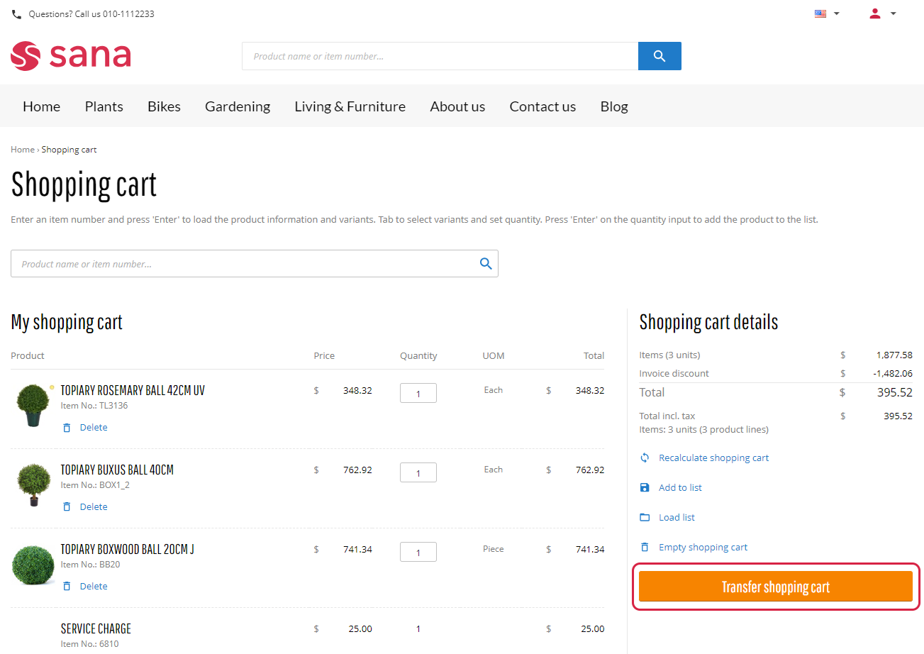
This button is shown in the shopping cart only when Sana Commerce Cloud is connected to the e-procurement system and the buyer initiates a punchout request to the Sana webstore.
For more information, see Punchout.
Basket Minimum Order Value Message
Sana allows to set up the shopping cart minimum order value. The shopping cart minimum order value is calculated based on the total price of products a customer is purchasing. In other words, the shopping cart minimum order value applies to the subtotal of a sales order excluding shipping and payment costs, taxes, any discounts, service charges, etc.
When customers add products to the shopping cart, and the total price of products is lower than the configured in Sana Admin shopping cart minimum order value, they will see a validation message in the shopping cart details, and customers will not be able to get a quote or proceed to checkout till the shopping cart minimum order value is reached.
The Basket minimum order value message content element is used to show a validation message in the shopping cart when a customer adds a product to the shopping cart and the shopping cart minimum order value is not reached.
For more information, see Shopping Cart Settings.
Checkout Offers
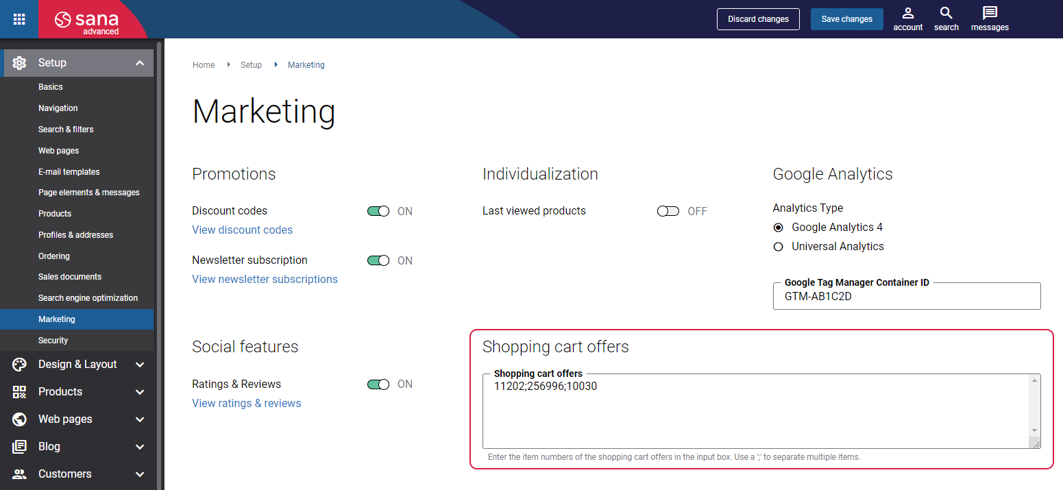
The Checkout offers content element is used to show the shopping cart offers on the Basket page. Shopping cart offers are products that are offered to a customer in the shopping cart.
To add shopping cart offers, in Sana Admin click: Setup > Marketing > Shopping cart offers.
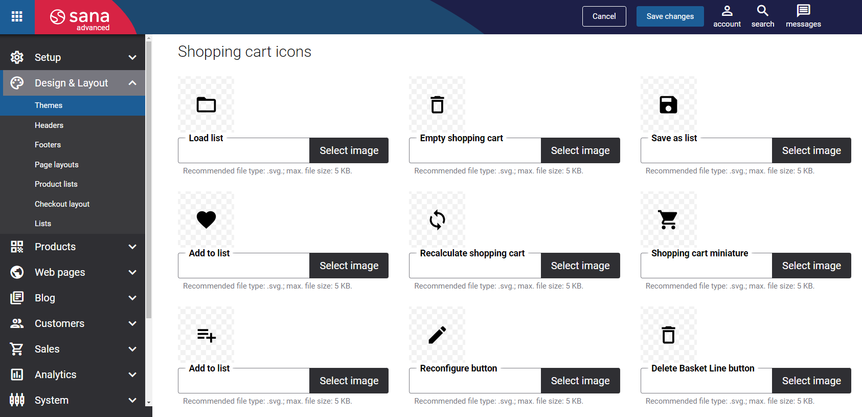
Icons in the Shopping Cart Details
In the Shopping cart details section, there are several default icons used in the Sana webstore user interface, for example Load list  , Recalculate shopping cart
  , etc.
You can change these icons in the webstore theme. In Sana Admin click: Design & Layout > Themes and then click Edit on your webstore theme. On the Icons tab, you can see the default webstore icons and replace any icon you want.
For more information, see Webstore UI Icons.