Page Layouts
In the new page editor, you can only select from the existing layouts. Customizing column layouts using fractions or creating your own layout is not currently supported. We are actively working on this feature and plan to add it in one of the future releases.
When you start creating a page, you must choose one of the predefined column layouts. You can change it at any time, even if you have already added some content.
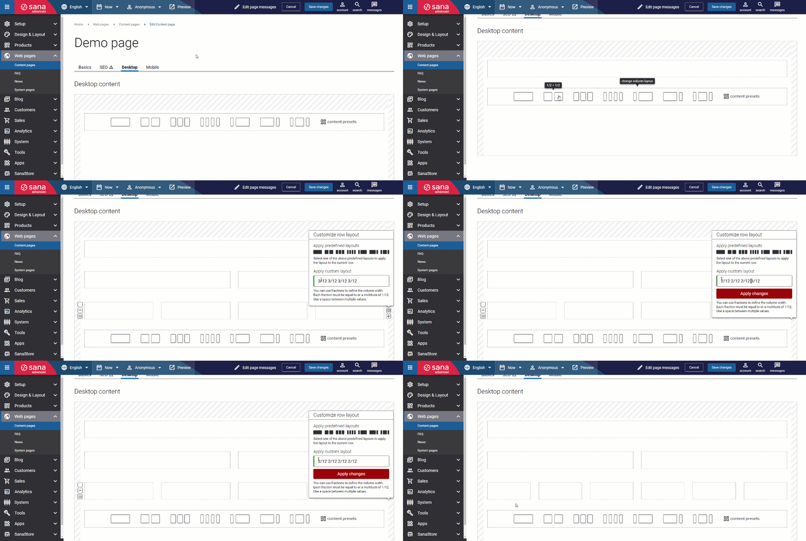
To change the layout, hover the row of your choice and click change column layout on the right.
You can choose one of the existing layouts, or you can also change the column layout using fractions. This way, you can create your own layout using a 12-column grid. You can use fractions to define the number of columns you need in a row and their width. Each fraction must be equal to or a multitude of 1/12. Use a space between multiple values.

Rows and Columns
Rows and columns are at the very core of the Sana content management system and its visual designer. They allow you to work with any page layout and content you need. You can use rows and columns to create the page structure of any complexity and fill it with different content elements.
When you select one of the predefined layouts, the fraction values will be automatically added for this layout.
Examples:
- If you choose a 1-column layout, you will see the fraction 12/12. This means that the column strives to be 100% of the row width.
- If you choose a 2-column layout, you will see the fraction 6/12 6/12. This means that both columns will strive to fit into 100% width – there will be 2 equal columns.
You can also create rows with several columns, each with a different width. There are a few predefined layouts, but you can also use fractions to create your own layout with columns, each sized differently.
Examples:
- There can be a layout with 2 columns of a different size in a row. The first column takes 25% of the width, and the second is 75% of the width. The fraction values of such layout are 3/12 9/12.
- If you add the layout with 3 columns – 2 smaller columns of the same size, one on the left and another one on the right, and the third wider column in the center – the fraction values will be 3/12 6/12 3/12. The columns on the left and on the right will take 25% of the width each, and the column in the center will be 50% of the width.
The same principle as described in the examples above works when you choose a layout with more columns or when you create your own layout using fractions.
You can add a maximum of 12 equal-sized columns. The fraction values for the 12-column grid are 1/12 1/12 1/12 1/12 1/12 1/12 1/12 1/12 1/12 1/12 1/12 1/12.
When the layout (row with columns) is defined, you can:
- Configure row settings, assign customer segment to the row and schedule row visibility. To get started, select the row you want to edit. Its settings will appear in the panel on the right, where you can make the necessary changes.
- Configure column settings. To get started, select the column you want to edit. Its settings will appear in the panel on the right, where you can make the necessary changes.
- Add content elements to the columns. To add a content element to the column, hover over the column of your choice and click add content
 . Then add the necessary content element and configure it. You can adjust its settings anytime in the panel on the right. Each column can include one or several content elements.
What Else Can You Do with Rows and Columns?
- You can add and remove rows and columns. You can add as many rows as you need. The maximum number of columns that you can add to one row is 12.
- You can duplicate rows and columns and reuse them.
- You can rearrange rows and columns across the page layout by dragging and dropping them.
Column Auto Scaling and Responsiveness
When you change the layout on a page (row with columns), the columns scale automatically to fit the width of the page. This means that when you add or delete a column in a row, the width of all columns changes automatically.
Sana’s page builder and visual designer automatically take care of your mobile layout and places columns one under another when you open the page on a smartphone.
For example, if you have a row with 2 identical columns (50% and 50%), on a smartphone, the second column will go under the first one, and both columns will be full-width to fill the row.
The design of all standard content elements and those that are installed from the Sana App Center is responsive.
The pages you create in Sana using the layouts and content elements will always look nice on any device.