Row Settings
Sana Commerce Cloud CMS gives you the option to manipulate row settings. With a few clicks, you can change row height, a background color, add a background image or video, set up border and spacing settings, assign a customer segment to a row, and schedule its visibility, use animation, and change content alignment.
Pay attention that using row settings you can also add some content, such as background image and video, and you can also style the rows using different options. You can do the same in the column settings. You can also add different content elements to rows and columns, such as text, image, video, product set, etc. Therefore, before adding some content, think about what you want to achieve and add the content correctly and thoughtfully. Otherwise, content elements added to the columns in a row can interfere with the row and column settings. Set up only the necessary settings. After adding the necessary content and setting up row and column settings, make sure that your content looks good on the page. To check this, preview the page.
You can move content elements and columns with content horizontally in one row as well as vertically between different rows, by dragging and dropping them. When you move columns vertically between different rows, they scale automatically to fit the width of the page.
Row Actions
When a row is selected in the page editor, its name and a configure button appear in the top-left corner. Clicking this button opens a dropdown with available actions. From there, you can save the row as a preset, override it with a preset, or delete the row. These actions are also available in the floating bottom panel that appears when a row is selected.
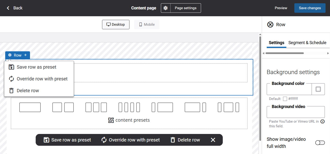
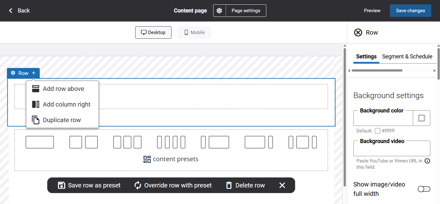
In the same area, there is an add button that opens a dropdown with actions such as adding a row above or below, adding a column to the right, and duplicating the row. The available actions may vary depending on the position of the row.
Settings
When you select a row in the visual designer, its settings appear in the panel on the right.
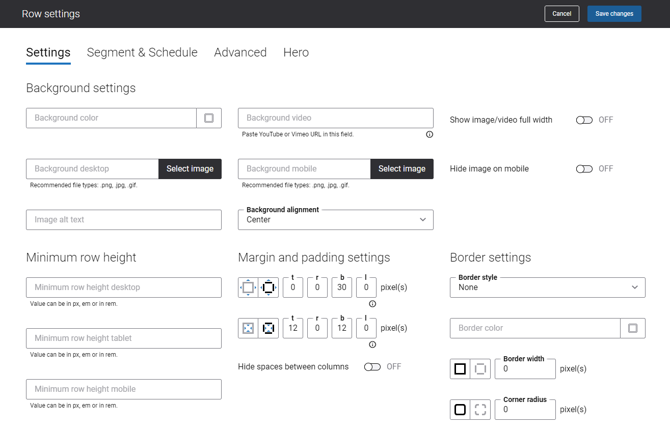
Background Settings
| Settings | Description |
|---|---|
| Background color | Row background color. You can change it using the color picker, or by entering the color hex code, RGB, or HSL values. |
| Background video | Row background video. To add the background video, enter the URL of the video hosted on an online video-sharing portal, such as YouTube or Vimeo.
The video can be shown in the center of the page or full-width. If you want to show the video full page width, enable the option Show image/video full width. |
| Background desktop | Row background image. It is shown on desktop computers and tablets.
The image can be shown in the center of the page or full-width. If you want to show the image full page width, enable the option Show image/video full width. |
| Background mobile | Row background image. It is shown on mobile devices.
The image can be shown in the center of the page or full-width. If you want to show the image full page width, enable the option Show image/video full width. |
| Hide image on mobile | If you enable this option, the background image will not be shown on mobile devices. |
| Image alt text | Background image alt text.
Alt (alternative) text is used to describe the appearance and function of an image on a page. Visually impaired users using screen readers can read the alt text to better understand what is shown on the image. |
| Show image/video full width | By default, the background image and video are shown in the center of the page.
If you enable this option, the image or video will take the full width of the page. |
| Background alignment | Use this option to define which part of the background image or video should be shown in the row, in case the background image or video is bigger than the row. The available background alignment options are:
Some options might not work due to the size of your background image or video. |
Minimum Row Height
The default row height is 1px. If you add a background color, image, or video to the row, you must also specify the minimum row height in pixels.
You can specify the minimum row height for desktop computers, tablets, and mobile devices.
If you add some content element to a column in a row, the row will automatically take the height of the content element.
Margin and Padding Settings
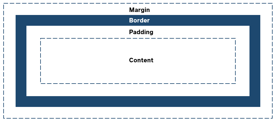
A row is essentially a box that wraps around the content inside it. It consists of: margins, borders, padding, and the actual content. The image below illustrates the box model.
-
Margin: An area outside the border. Each side of a border has a margin size in pixels that you can change individually or specify the same size for all margins.
-
Padding: An area around the content. Each side of a content element has a padding size in pixels that you can change individually or specify the same size for all paddings.
Using margin and padding, you can define space between elements.
There are settings for specifying margin and padding for each side of an element:
- t – top margin or padding
- r – right margin or padding
- b – bottom margin or padding
- l – left margin or padding
If you use a layout with several columns in a row, by default, each column has a padding of 16px on the right and left. Using the option Hide spaces between columns, you can remove this padding, and there will be no space between all columns in the row.
Border Settings
A border is a part of a box that contains content inside it. You can choose to show or hide it.
| Settings | Description |
|---|---|
| Border style | The border style sets the line style for all four sides of a border. You can show or hide the border. If you do not want to show the border, select None. The border can be:
|
| Border color | If you show the border, you can change its color using the color picker or by entering the color hex code, RGB, or HSL values. |
| Border width | Each border has a width in pixels that you can change individually or specify the same width for all borders.
There are settings for specifying the border width for each side:
|
| Corner radius | Each border has a corner radius in pixels that you can change individually or specify the same radius for all corners.
There are settings for specifying each corner radius individually:
|
Segment & Schedule
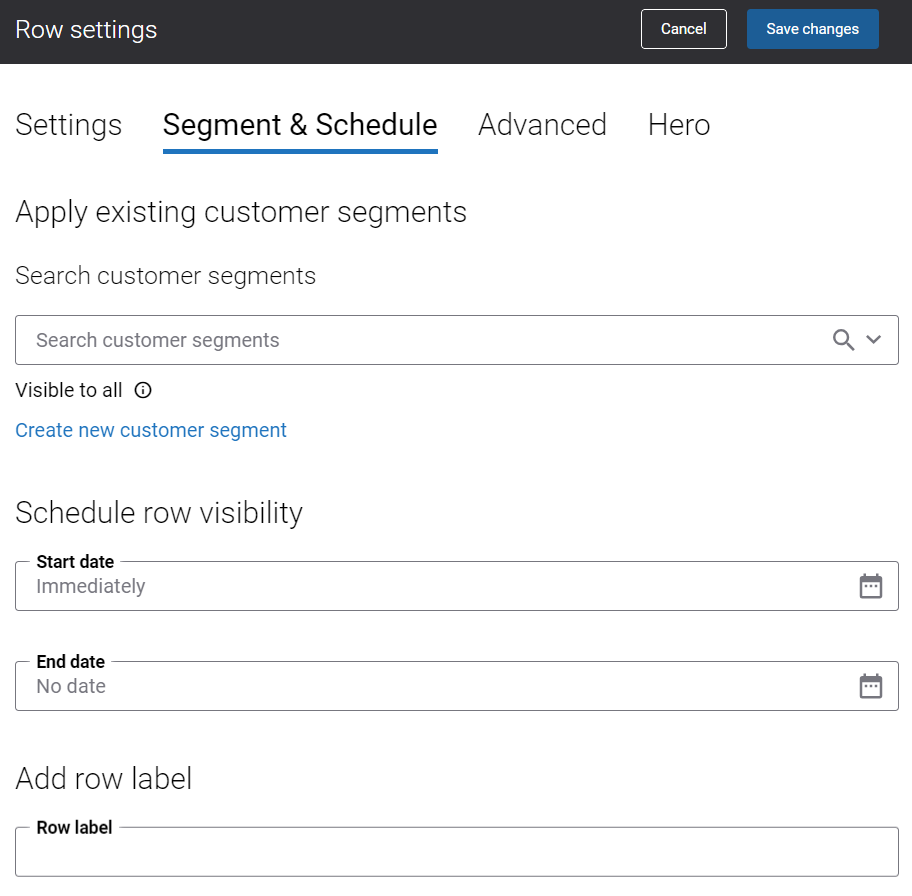
Apply Existing Customer Segments
You can assign one or several customer segments to a row. It allows to show different content elements inside a row on the page to specific customer groups. When you assign customer segments to the row on the page, you can show certain content only to the customers who are in the customer segment. All other customers will not see this content. This way, you can fill your webstore with customer-specific content.
If you assign a customer segment to the row, then you will see the icon in the top left corner of the row  . This way, a user can see the rows on the page to which customer segments are assigned and does not need to check the settings of each row. If the user hovers over the icon, the name of the customer segment will be shown. If you add a row label, it will overwrite the name of the assigned customer segment. For more information about the row label, see below.
Schedule Row Visibility
You can specify the dates when the content in a row should be available in your webstore. Enter the Start date (the start date when the content should be visible) and the End date (the end date when the content should be visible), if you want this row to be available in your webstore for some period of time. Both of these fields are optional, so you can specify either Start date or End date.
This can be useful for marketing campaigns. For example, you can create some content related to special offers on engine components or spare parts beforehand and specify the dates when this content must be shown in your webstore.
If you set up the dates for the row, then you will see the icon  in the top left corner of the row. This way, a user can see the rows on the page that have visibility dates and does not need to check the settings of each row. If the user hovers over the icon, the row visibility dates will be shown.
Add Row Label
You can use the row label to add additional information about a row. If you add the row label, then you will see the icon in the top left corner of the row. If a user hovers over the icon, the row label will be shown. This way, the user can see additional information about the rows on the page and does not need to check the settings of each row.
Advanced
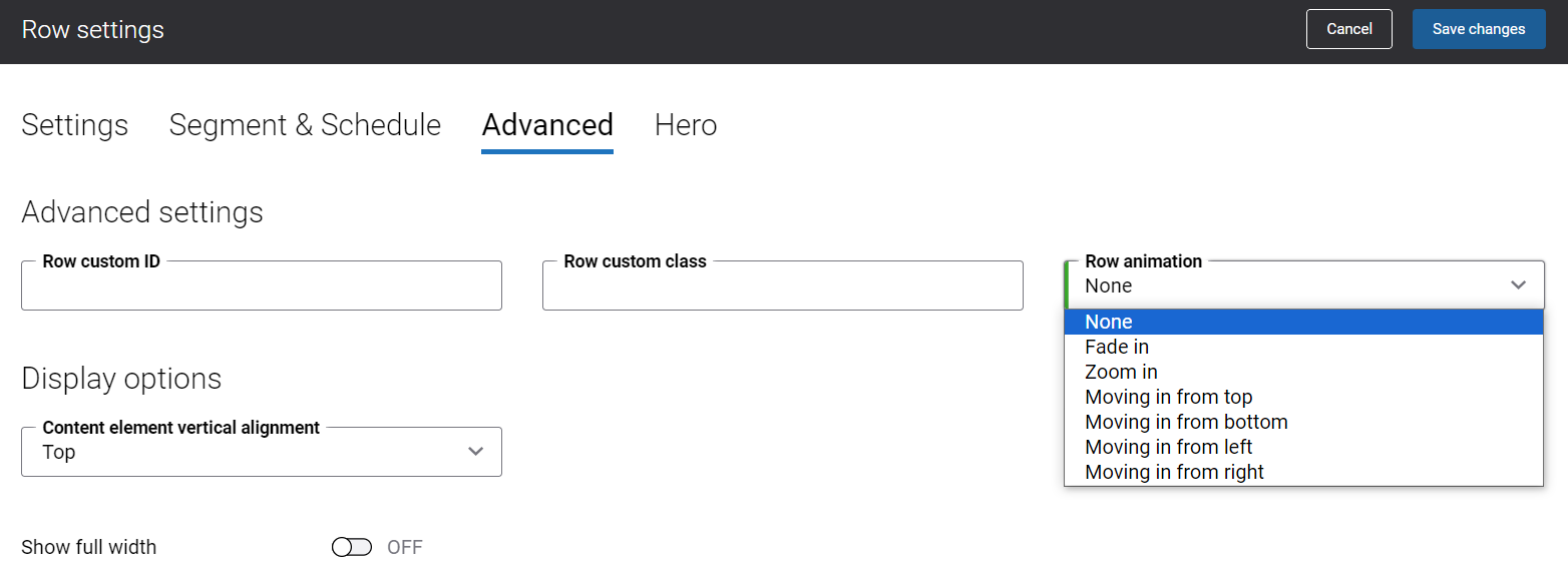
Advanced Settings
| Settings | Description |
|---|---|
| Row custom ID | Row custom ID and class can be used by web developers to add additional styles to the row. |
| Row custom class | |
| Row animation | You can animate the content in a row. Effects can make the content appear, zoom, or move. Animation can help make your content on a page more dynamic and highlight the content you want to draw your customers’ attention to. The available row animation effects are:
|
Display Options
| Settings | Description |
|---|---|
| Content element vertical alignment | Use this option to set the vertical alignment of content in a row. The available vertical alignment options are:
|
| Show full width | Use this option either to center the row content on a page or to expand it to the full width of a page. |