Search Bar
The Search bar content element can be added to a webstore header.
Although you can add the Search bar content element to any page, we recommend to use it in your webstore header.

When you have a content-heavy webstore and it seems nearly impossible to find information, your webstore visitors are very unlikely to decide to browse the webstore looking for the information they need. In fact, they are more likely to leave your webstore. Using the Search bar content element, you can help your customers and webstore visitors to find what they are looking for easier and quicker. Even if your webstore content is organized properly, an efficient Search bar content element is not only helpful, but crucial, even for basic webstore navigation.
The Search bar supports autocomplete which makes it faster to complete searches that your customers are beginning to type. For more information, see Webstore Search.

Content Tab
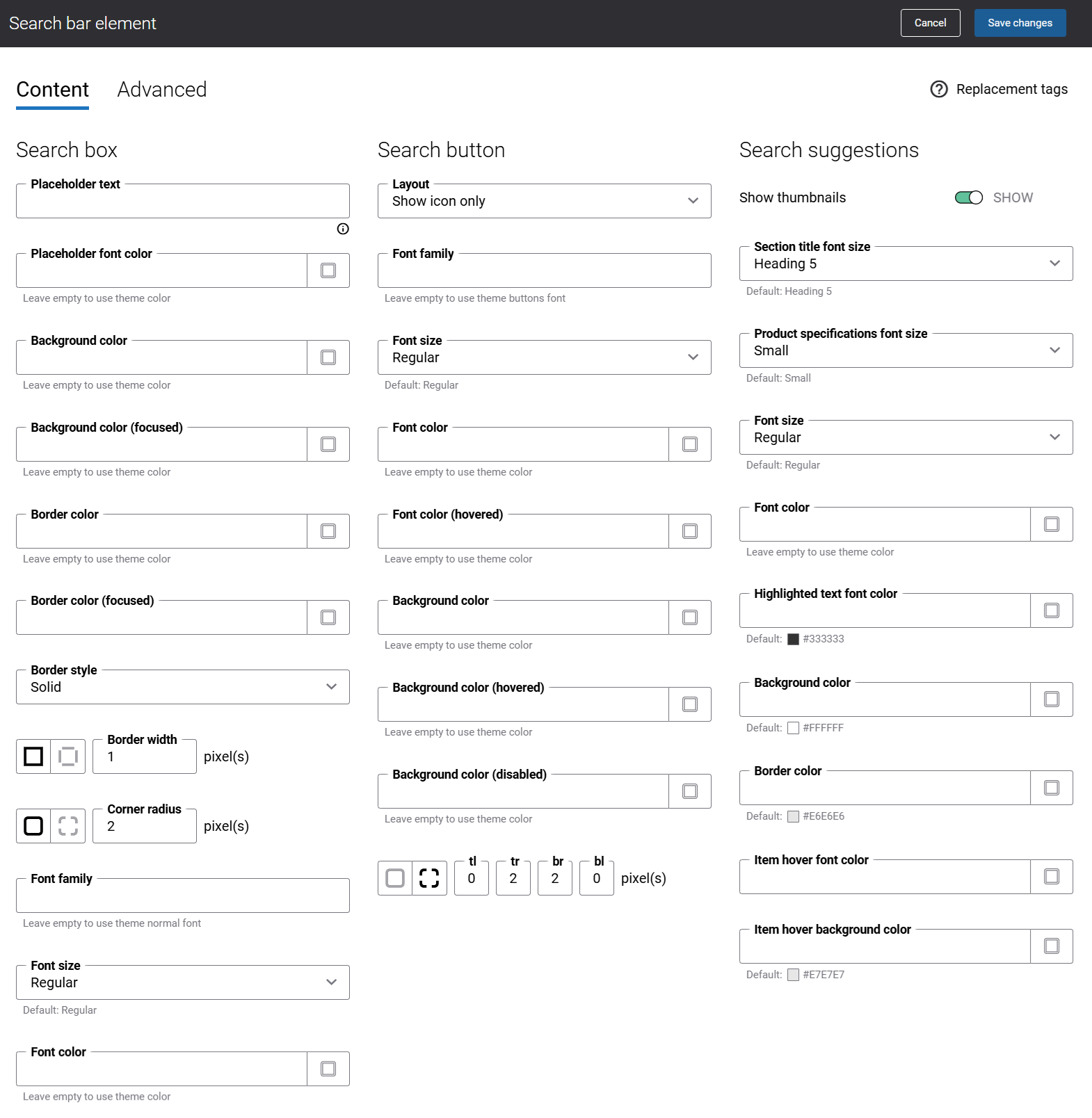
The table below provides the description of the Search bar content element settings on the Content tab.
| Field | Description |
|---|---|
| Search box | |
| Placeholder text | Use this field to enter the text which will be shown inside the search box.
If you leave this field empty, the default text will be used. You can find it in the page elements & messages using the Search_SearchPrefix ID. |
| Placeholder font color |
Specify the font color for the placeholder text shown inside the search box.
You can change it using the color picker, or by entering the color hex code, RGB or HSL values. If you leave this field empty, the default value will be used. |
| Background color |
Specify the background color of the search box.
You can change it using the color picker, or by entering the color hex code, RGB or HSL values. If you leave this field empty, the default value will be used. |
| Background color (focused) | Specify the background color of the search box.
When a user clicks on the search box in the Sana webstore and makes it active, the background color of the search box changes to the one specified in this field. You can change the background color using the color picker, or by entering the color hex code, RGB or HSL values. If you leave this field empty, the default value will be used. |
| Border color | Specify the search box border color.
You can change it using the color picker, or by entering the color hex code, RGB or HSL values. If you leave this field empty, the default value will be used. |
| Border color (focused) | Specify the search box border color.
When a user clicks on the search box in the Sana webstore and makes it active, the border color of the search box changes to the one specified in this field. You can change the border color using the color picker, or by entering the color hex code, RGB or HSL values. If you leave this field empty, the default value will be used. |
| Border style | Specify the border style for the search box.
The border style sets the line style for all four sides of a border. You can show or hide the border. If you do not want to show the border, select None. The border can be:
|
| Border width | Specify the border width for the search box.
Each border has a width in pixels that you can change individually or specify the same width for all borders. There are settings for specifying the border width for each side:
|
| Corner radius | Specify the border corner radius for the search box.
Each border has a corner radius in pixels that you can change individually or specify the same radius for all corners. There are settings for specifying each corner radius individually:
|
| Font family | Enter the name of the font family for the placeholder text shown inside of the search box. |
| Font size | Enter the necessary font size for the placeholder text shown inside of the search box. |
| Font color | Specify the font color for the placeholder text shown inside of the search box.
You can change it using the color picker, or by entering the color hex code, RGB or HSL values. If you leave this field empty, the default value will be used. |
| Search button | |
| Layout | Use this setting to specify how the search icon and text should be presented on the search button. The available options are:
|
| Font family | Enter the name of the font family for the search button text. |
| Font size | Enter the necessary font size for the search button text and icon. |
| Font color | Specify the font color for the search button text and icon.
You can change it using the color picker, or by entering the color hex code, RGB or HSL values. If you leave this field empty, the default value will be used. |
| Font color (hovered) | Specify the hover font color for the search button text and icon.
When a user hovers over the search button icon and text in the Sana webstore, the font color changes to the one specified in this field. You can change the hover font color using the color picker, or by entering the color hex code, RGB or HSL values. If you leave this field empty, the default value will be used. |
| Background color | Specify the background color of the search button.
You can change it using the color picker, or by entering the color hex code, RGB or HSL values. If you leave this field empty, the default value will be used. |
| Background color (hovered) | Specify the hover background color of the search button.
When a user hovers over the search button in the Sana webstore, the background color changes to the one specified in this field. You can change the hover background color using the color picker, or by entering the color hex code, RGB or HSL values. If you leave this field empty, the default value will be used. |
| Background color (disabled) |
Specify the background color of the search button.
If you have a closed or private type of webstore, then the background color specified in this field will be used for the search button. You can change the background color using the color picker, or by entering the color hex code, RGB or HSL values. If you leave this field empty, the default value will be used. |
| Corner radius |
Specify the border corner radius for the search button.
Each border has a corner radius in pixels that you can change individually or specify the same radius for all corners. There are settings for specifying each corner radius individually:
|
| Search suggestions | |
| Show thumbnails | Use this setting to show or hide product image thumbnails in the dropdown. |
| Selection title font size | Select the necessary font size for the section titles Suggestions and Products shown in the search results dropdown list. |
| Product specifications font size | Select the necessary font size for the product specifications shown for the products in the search results dropdown list. |
| Font size | Select the necessary font size for the search suggestions in the dropdown. |
| Font color | Specify the font color for the search suggestions shown in the dropdown.
You can change it using the color picker, or by entering the color hex code, RGB or HSL values. If you leave this field empty, the default value will be used. |
| Highlighted text font color | Specify the highlighted text font color.
When a user starts entering some characters in the search box, the search suggestions are shown in the dropdown and the matching characters are highlighted in color specified in this field. You can change it using the color picker, or by entering the color hex code, RGB or HSL values. If you leave this field empty, the default value will be used. |
| Background color | Specify the background color of the search suggestions dropdown.
You can change it using the color picker, or by entering the color hex code, RGB or HSL values. If you leave this field empty, the default value will be used. |
| Border color | Specify the search suggestions dropdown border color.
You can change it using the color picker, or by entering the color hex code, RGB or HSL values. If you leave this field empty, the default value will be used. |
| Item hover font color | Specify the hover font color for the search suggestions in the dropdown.
When a user hovers over the search suggestion in the dropdown in the Sana webstore, the font color changes to the one specified in this field. You can change the hover font color using the color picker, or by entering the color hex code, RGB or HSL values. If you leave this field empty, the default value will be used. |
| Item hover background color | Specify the hover background color for the search suggestions in the dropdown.
When a user hovers over the search suggestion in the dropdown in the Sana webstore, the background color changes to the one specified in this field. You can change the hover background color using the color picker, or by entering the color hex code, RGB or HSL values. If you leave this field empty, the default value will be used. |
Advanced Tab
On the Advanced tab of the Search bar content element, you can configure height, width, and spacing settings.

For more information about advanced settings, see Content Elements.
Search Icon
If you need to change the search bar icon, you can do this using Themes. In Sana Admin click: Design & Layout > Themes. Click Edit on your webstore theme and open the Icons tab. Find the Search icon. You can change the default icon.
