Multi Column Menu (Desktop)
The Multi column menu content element can be used only in the webstore header and only for the desktop layout.
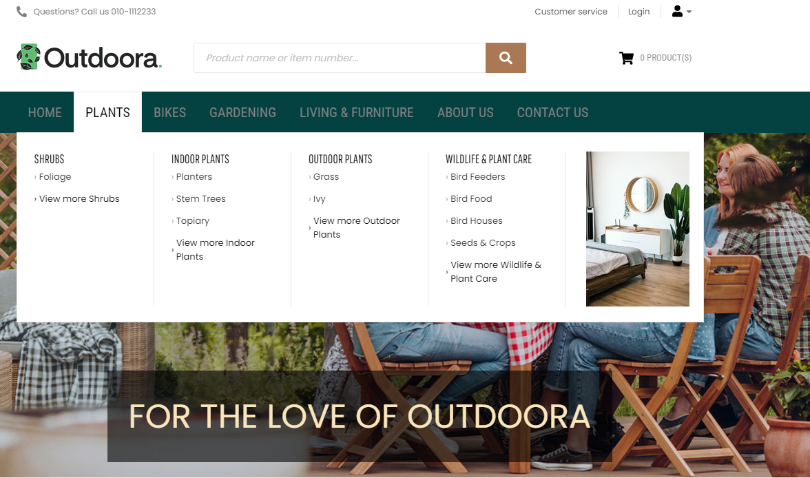
The Multi column menu content element is used to add navigation to the webstore header for the desktop layout. You cannot use it to create webstore navigation, but only to add the menu created in Sana Admin to the webstore header. You can create the menus in Sana Admin at the following location: Setup > Navigation.
Using the Multi column menu content element, you can show your webstore navigation arranged in multiple columns. This way, you can display up to 3 navigation levels in the menu of your Sana webstore. You can also add an image to a menu item, and it will be used as a navigation item in the menu. This way you can promote certain products, collections, attract your customers’ attention with sales or news.
An image in the multi column navigation is shown depending on the number of menu items of the second level. Using the settings Items per row on extra large / large / medium screens, you can specify the number of menu items of the second level per one row. An image is shown if the number of menu items of the second level is lower than the value set in required setting.
Content Tab

The table below provides the description of the Multi column menu content element fields.
| Field | Description |
|---|---|
| Navigation menu | Select the necessary menu. By default the main menu is used, but you can select any other available menu.
You can edit the default menus and create new menus on the Navigation page in Sana Admin. All menus available on the Navigation page can be selected in the Navigation menu field. The menu items from the selected menu will be shown in the webstore navigation. |
| Top level items | |
| Font family | Enter the name of the font family for the top level menu items.
If you leave this field empty, the default value will be used. |
| Font size | Enter the necessary font size for the top level menu items.
If you leave this field empty, the default value will be used. |
| All caps | Enable this option, if you need all top level menu item letters to be capitalized. |
| Font color | Specify the font color for the top level menu items.
You can change it using the color picker, or by entering the color hex code, RGB or HSL values. If you leave this field empty, the default value will be used. |
| Item hover font color | Specify the hover font color for the top level menu items.
When a user hovers over the top level menu item in the Sana webstore, the font color changes to the one specified in this field. You can change it using the color picker, or by entering the color hex code, RGB or HSL values. If you leave this field empty, the default value will be used. |
| Non-hovered item font color | Specify the font color for the non-hovered top level menu items.
When a user hovers over the top level menu item in the Sana webstore, its font color remains the same, but the font color of all other top level menu items changes to the one specified in this field. You can change it using the color picker, or by entering the color hex code, RGB or HSL values. If you leave this field empty, the default value will be used. |
| Show active item underline | Enable this option, if you want to underline an active top level menu item in the Sana webstore. |
| Active item underline color | Specify the underline color for the active top level menu item.
When a user clicks on the top level menu item in the Sana webstore, it is underlined using the color specified in this field. You can change it using the color picker, or by entering the color hex code, RGB or HSL values. If you leave this field empty, the default value will be used. |
| Expanded menu background color | Specify the background color of the expanded top level menu item with its sub items.
When a user hovers over the top level menu item in the Sana webstore, the background color of the expanded menu with sub items changes to the one specified in this field. You can change it using the color picker, or by entering the color hex code, RGB or HSL values. If you leave this field empty, the default value will be used. |
| Expanded menu border color | Specify the border color of the expanded top level menu item and its sub items.
When a user hovers over the top level menu item in the Sana webstore, the border color of the expanded menu with sub items changes to the one specified in this field. You can change it using the color picker, or by entering the color hex code, RGB or HSL values. If you leave this field empty, the default value will be used. |
| Item height | Use this field to set the height of the top level menu item.
The default value is 4.6em. |
| 2nd level items | |
| Font family | Enter the name of the font family for the 2nd level items of the menu.
If you leave this field empty, the default value will be used. |
| Font size | Enter the necessary font size for the 2nd level items of the menu.
If you leave this field empty, the default value will be used. |
| All caps | Enable this option, if you need all 2nd level item letters of the menu to be capitalized. |
| Font color | Specify the font color for the 2nd level items of the menu.
You can change it using the color picker, or by entering the color hex code, RGB or HSL values. If you leave this field empty, the default value will be used. |
| Item hover font color | Specify the hover font color for the 2nd level items of the menu.
When a user hovers over the 2nd level item of the menu in the Sana webstore, the font color changes to the one specified in this field. You can change it using the color picker, or by entering the color hex code, RGB or HSL values. If you leave this field empty, the default value will be used. |
| Items per row on extra large screens | Enter the number of menu items of the second level to be shown on the extra large screens.
The recommended maximum number of items is 7. The default number of items is 5. |
| Items per row on large screens | Enter the number of menu items of the second level to be shown on the large screens.
The recommended maximum number of items is 6. The default number of items is 5. |
| Items per row on medium screens | Enter the number of menu items of the second level to be shown on the medium screens.
The recommended maximum number of items s is 5. The default number of items is 5. |
| Separator line color | Specify the separator line color for the 2nd level items of the menu.
When a user hovers over the top level menu item in the Sana webstore, the separator line between columns of the 2nd level menu items changes its color to the one specified in this field. You can change it using the color picker, or by entering the color hex code, RGB or HSL values. If you leave this field empty, the default value will be used. |
| Show view more link | Enable this option, if you want to show the View more link in the menu. The link is shown under the menu items of the 3rd level and refers to the same link which is specified for the menu item of the 2nd level. |
| View more link color | Specify the View more link font color.
You can change it using the color picker, or by entering the color hex code, RGB or HSL values. If you leave this field empty, the default value will be used. |
| View more link hover color | Specify the color which is used for the View more link, when a user hovers over it.
You can change it using the color picker, or by entering the color hex code, RGB or HSL values. If you leave this field empty, the default value will be used. |
| 3rd level items | |
| Font family | Enter the name of the font family for the 3rd level items of the menu.
If you leave this field empty, the default value will be used. |
| Font size | Enter the necessary font size for the 3rd level items of the menu.
If you leave this field empty, the default value will be used. |
| All caps | Enable this option, if you need all 3rd level item letters of the menu to be capitalized. |
| Font color | Specify the font color for the 3rd level items of the menu.
You can change it using the color picker, or by entering the color hex code, RGB or HSL values. If you leave this field empty, the default value will be used. |
| Item hover font color | Specify the hover font color for the 3rd level items of the menu.
When a user hovers over the 3rd level item of the menu in the Sana webstore, the font color changes to the one specified in this field. You can change it using the color picker, or by entering the color hex code, RGB or HSL values. If you leave this field empty, the default value will be used. |
| Show arrow in front of sub item | Enable this option if you want to show arrow icons in front of the menu items of the 3rd level. |
Advanced Tab
On the Advanced tab of the Multi column menu content element, you can configure height, width and spacing settings.

For more information about advanced settings, see Content Elements.