Image
The Image content element can be added to a content page, product page, product list page and system pages in Sana Admin.

Using the Image content element, you can easily add an image where you want it to appear on the page by selecting the necessary image from the file manager. If it is not there yet, upload the image. This way you can make your content look brighter and more engaging for your customers.
Content Tab
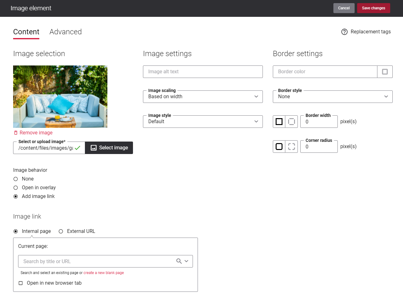
The table below provides the description of the Image content element fields.
| Field | Description |
|---|---|
| Select or upload image | Select an image.
If the image you want to add to the page is not in the file manager yet, upload it first and then select. Supported image extensions are PNG, JPG, GIF, WebP, AVIF. |
| Image alt text | Enter an image alt text.
Alt (alternative) text is used to describe the appearance and function of an image on a page. Visually impaired users using screen readers can read an alt text to better understand what is shown on the image. |
| Image scaling | Use this option to change the size of an image. The following image scaling options are available:
When you select one of the scaling options, make sure that the image fits the column and looks good on the page. You can preview the page to check it. |
| Image style | Select the image style. The following image shapes are available:
|
| Border color | If you show the border, you can change its color using the color picker or by entering the color hex code, RGB or HSL values. |
| Border style | The border style sets the line style for all four sides of a border. You can show or hide the border. If you do not want to show the border, select None. The border can be:
|
| Border width | Each border has a width in pixels that you can change individually or specify the same width for all borders.
There are settings for specifying the border width for each side:
|
| Corner radius | Each border has a corner radius in pixels that you can change individually or specify the same radius for all corners.
There are settings for specifying each corner radius individually:
|
| Image behavior | Select the image behavior. The following options are available:
Clicking on the image will open the linked page. To add a link to the internal webstore page, you can search for it by title or URL. If you add an external URL, specify the full URL of the page. You can also create a blank page that will be automatically linked to the image. You can manage this page later. |
| Image link |
Advanced Tab
On the Advanced tab of the Image content element, you can configure height, width, and spacing settings.

For more information about advanced settings, see Content Elements.