Cascading Menu (Desktop)
The Cascading menu content element can be used only in the webstore header and only for the desktop layout.
The Cascading menu content element is used to add navigation to the webstore header for the desktop layout. You cannot use it to create webstore navigation, but only to add the menu created in Sana Admin to the webstore header. You can create the menus in Sana Admin at the following location: Setup > Navigation.
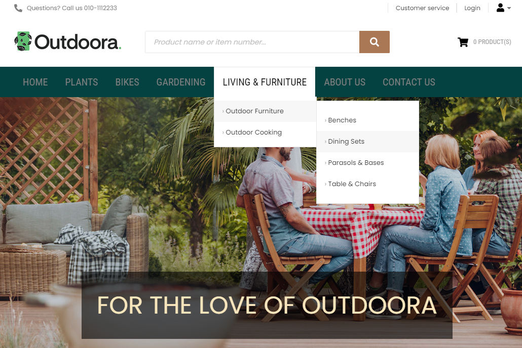
With the cascading menu all levels of navigation are shown. But keep in mind that very deep navigation may not display well in the webstore.
Using the Cascading menu content element, you can show your webstore navigation cascaded to the right side when a menu item is selected. This way you can display menu items with as many levels of hierarchy as you wish.
Content Tab
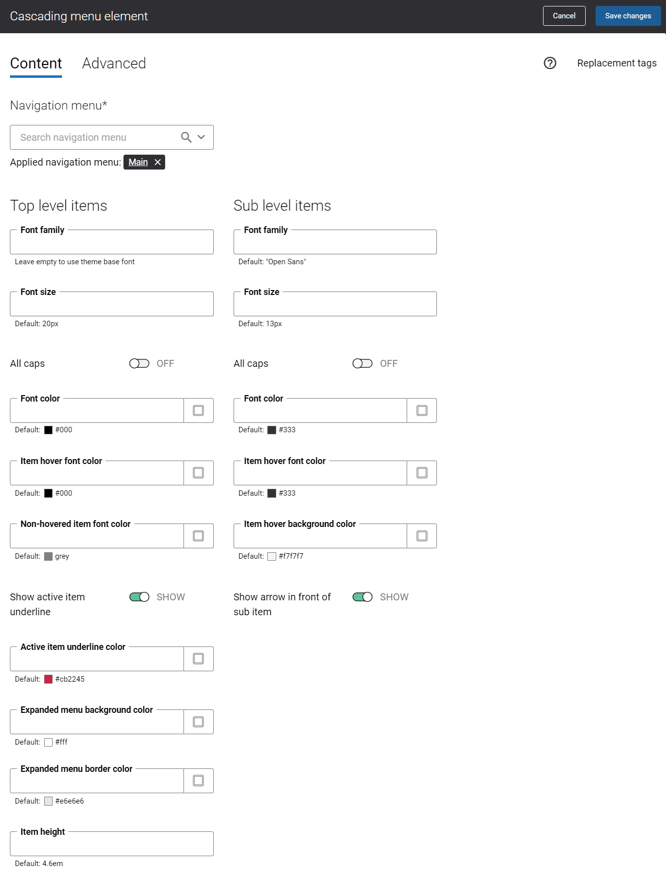
The table below provides description of the Cascading main menu content element settings on the Content tab.
| Field | Description |
|---|---|
|
Navigation menu |
Select the necessary menu. By default the main menu is used, but you can select any other available menu. You can edit the default menus and create new menus on the Navigation page in Sana Admin. All menus available on the Navigation page can be selected in the Navigation menu field. The menu items from the selected menu will be shown in the webstore navigation. |
| Top Level Items | |
|
Font family |
Enter the name of the font family for the top level menu items. If you leave this field empty, the default value will be used. |
|
Font size |
Enter the necessary font size for the top level menu items. If you leave this field empty, the default value will be used. |
|
All caps |
Enable this option, if you need all top level menu item letters to be capitalized. |
|
Font color |
Specify the font color for the top level menu items. You can change it using the color picker, or by entering the color hex code, RGB or HSL values. If you leave this field empty, the default value will be used. |
|
Item hover font color |
Specify the item hover font color for the top level menu items. When a user hovers over the top level menu item in the Sana webstore, the font color changes to the one specified in this field. You can change it using the color picker, or by entering the color hex code, RGB or HSL values. If you leave this field empty, the default value will be used. |
|
Non-hovered item font color |
Specify the non-hovered item font color for the top level menu items. When a user hovers over the top level menu item in the Sana webstore, its font color remains the same, but the font color of all other top level menu items changes to the one specified in this field. You can change it using the color picker, or by entering the color hex code, RGB or HSL values. If you leave this field empty, the default value will be used. |
|
Show active item underline |
Enable this option, if you want to underline an active top level menu item in the Sana webstore. |
|
Active item underline color |
Specify the underline color of the active top level menu item. When a user clicks on the top level menu item in the Sana webstore, it is underlined using the color specified in this field. You can change it using the color picker, or by entering the color hex code, RGB or HSL values. If you leave this field empty, the default value will be used. |
|
Expanded menu background color |
Specify the background color of the expanded top level menu item with its sub items. When a user hovers over the top level menu item in the Sana webstore, the background color of the expanded menu with sub items changes to the one specified in this field. You can change it using the color picker, or by entering the color hex code, RGB or HSL values. If you leave this field empty, the default value will be used. |
|
Expanded menu border color |
Specify the border color of the expanded top level menu item and its sub items. When a user hovers over the top level menu item in the Sana webstore, the border color of the expanded menu with sub items changes to the one specified in this field. You can change it using the color picker, or by entering the color hex code, RGB or HSL values. If you leave this field empty, the default value will be used. |
|
Item height |
Use this field to set the height of the top level menu item. The default value is 4.6em. |
| Sub Level Items | |
|
Font family |
Enter the name of the font family for the menu sub items. If you leave this field empty, the default value will be used. |
|
Font size |
Enter the necessary font size for the menu sub items. If you leave this field empty, the default value will be used. |
|
All caps |
Enable this option, if you need all sub item letters of the menu to be capitalized. |
|
Font color |
Specify the font color for the menu sub items. You can change it using the color picker, or by entering the color hex code, RGB or HSL values. If you leave this field empty, the default value will be used. |
|
Item hover font color |
Specify the hover font color for the menu sub items. When a user hovers over the menu sub item in the Sana webstore, the font color changes to the one specified in this field. You can change it using the color picker, or by entering the color hex code, RGB or HSL values. If you leave this field empty, the default value will be used. |
|
Item hover background color |
Specify the hover background color for the menu sub item. When a user hovers over the menu sub item in the Sana webstore, the sub item hover background color changes to the one specified in this field. You can change it using the color picker, or by entering the color hex code, RGB or HSL values. If you leave this field empty, the default value will be used. |
|
Show arrow in front of sub item |
Enable this option if you want to show arrow icons in front of the menu sub items. |
Advanced Tab
On the Advanced tab of the Cascading menu content element, you can configure height, width and spacing settings.

For more information about advanced settings, see Content Elements.