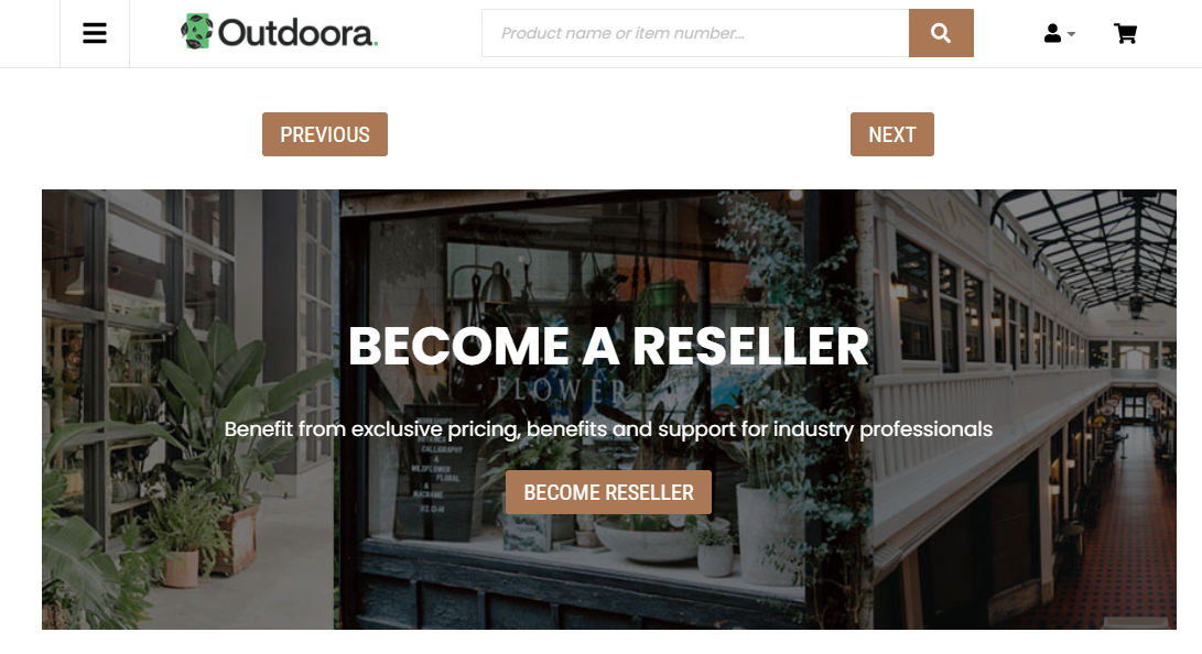
Button
Button is a content element which can be added to the web pages (content pages, product and product list pages) and system pages of the Sana webstore. It allows you to build an extra webstore navigation by adding navigation buttons to the pages of the Sana webstore with linked internal pages or external URLs.
Content Tab
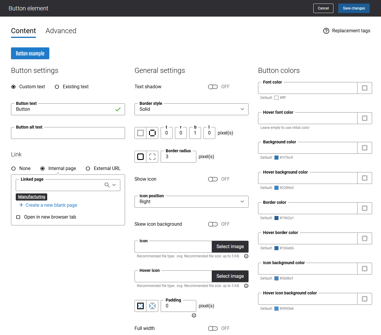
The table below provides description of the Button content element settings.
| Field | Description |
|---|---|
| Button settings | |
| Custom text | You can select whether to create a new custom text for a button, or use an existing Sana text.
If you select the Custom text option, in the Button text field, enter a text which must be shown on the button. The button will be shown only if there is a button text. |
| Sana text | You can select whether to create a new custom text for a button, or use an existing Sana text.
If you select the Sana text option, in the Text or Identifier field, select the default webstore interface text which must be shown on the button. You can search for the necessary text by entering the text or the text identifier. In the Description field, you can change the default Sana text if necessary. If you change the default Sana text, it will be updated in the Page elements & messages as well. For example, if you add a button with the same text to different web pages of your webstore, you can create a Sana text and reuse it instead of creating a button with same text each time. In case you need to change this text for all buttons, you only need to change one Sana text. |
| Button alt text | Navigation button alt text.
Alt (alternative) text is used to describe the function of a button on a page. Visually impaired users using screen readers can read an alt text to better understand which action a button performs. |
| Button link | Add a link either to the internal webstore page or to the external website. Clicking on the button will open the linked page.
To add a link to the internal webstore page, you can search for it by title or URL. If you add an external URL, specify the full URL of the page. You can also create a blank page that will be automatically linked to the button. You can manage this page later. When keyboard users interact with a webstore, they use the Tab key to jump from one link to another. If a link is not added to the Button content element, then this button will be skipped when tabbing is used on the page. |
| General settings | |
| Text shadow | Use this setting to add shadows to the button text. |
| Border style | The border style sets the line style for all four sides of a border. You can show or hide the border of the button. If you do not want to show the border, select None. The border can be:
|
| Border radius | Each border has a corner radius in pixels that you can change individually or specify the same radius for all corners of the button.
There are settings for specifying each corner radius of the button individually:
|
| Show icon | Use this setting to show or hide an icon on the button. |
| Icon position | Use this setting to specify an icon position. The available options are:
|
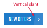
| Skew icon background | Use this setting to skew an icon background.
If the option Skew icon background is enabled, a vertical slant is applied to the icon background.
|
| Icon | Select an icon.
If an icon you want to add to the button is not in the file manager yet, upload it first and then select. Supported icon extension is SVG. It is recommended to add an icon which is less than 5KB. For more information, see Webstore UI Icons. |
| Hover icon | Select a hover icon. It is used instead of the default icon when a customer hovers over the button in the Sana webstore.
If a hover icon you want to add to the button is not in the file manager yet, upload it first and then select. Supported hover icon extension is SVG. It is recommended to add a hover icon which is less than 5KB. |
| Padding | Padding is an area around the button. Each side of the button has a padding size in pixels that you can change individually or specify the same size for all paddings.
Using padding, you can define space between elements. There are settings for specifying padding for each side of the button:
|
| Full width | If you enable the Full width option, the button will take the full width of a column. |
Use the Button colors section to style your button the way you like and check it in preview. Once you select any color, the button automatically changes and you can see how it will look in your Sana webstore.
Advanced Tab
On the Advanced tab of the Button content element, you can configure height, width, and spacing settings.
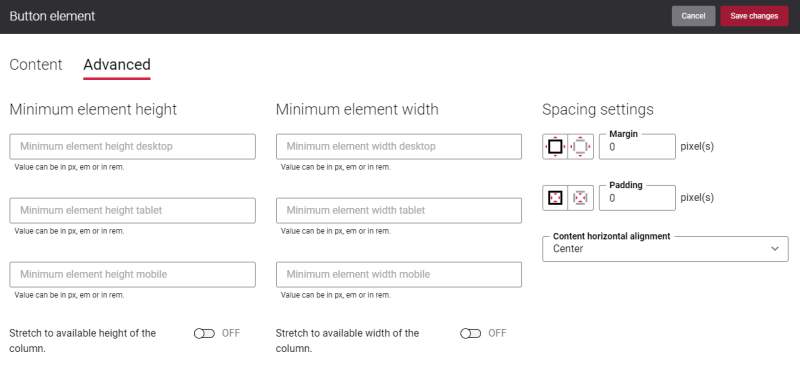
For more information about advanced settings, see Content Elements.