Add Product Set Filter Content Element
The Product set filter content element is available as an app. It can be installed from the Sana App Center. In Sana Admin click: App Center > Apps > Apps Explorer.
The Product set filter content element can be added to the web pages (content pages, product and product list pages) and system pages of the Sana webstore.
For more information about adding, searching, and filtering content elements on pages, see Content Elements.
When you add the Product set filter content element to a page, it comes with a set of default values. Thus, you can see how the Product set filter content element looks, before setting it up and adding your content.
Using the Product set filter content element, you can add one or multiple existing product sets to a page. Each product set is shown on a page as a separate group of products. You can switch between different product sets on a page, by clicking on the product set title at the top of the Product set filter content element. If there are a lot of products in the product set, you can see other products using the navigation at the bottom of the Product set filter content element. Thanks to this, the page is not overloaded with a big number of products shown all at once on the page.
You can specify how many products should be shown in one row on a page, depending on the screen width of the device a customer uses. Thus, you can provide a good user experience.
Content Tab
Product Sets

When you create product sets, take into consideration the following points:
-
At least one product set is required.
-
You can add as many product sets to the Product set filter content element as you need.
-
You cannot delete or make the first product set invisible.
-
You can change the order in which you want product sets to be shown on the page by dragging and dropping them. To change the order of product sets by dragging and dropping them, the product set settings must be collapsed.
The table below provides the description of the product set settings.
| Field | Description |
|---|---|
| Product set title | Enter the product set title. It is shown at the top of the Product set filter content element. If you add several product sets, a user will be able to switch between different product sets on a page, by clicking on the product set title.
It is recommended to add a title which does not exceed two lines. |
| Sort by | Define in which order products should be sorted in the product set.
The Sort fields shown in this dropdown list can be configured in Sana Admin at the following location: Setup > Search & filters > Sort fields. |
| Apply product set | Use this field to add the product set. You can also add a product set with a product group. Product grouping can be configured in Sana Admin: Setup > Products > Product grouping.
If you add a product set with a product group to Product set filter, and product grouping is enabled, then a product group will be shown in Product set filter, but not the individual products. Also, if the option Inherit image from first product per group is enabled, then an image will be inherited from the first product in a group and used for a product group in Product set filter. If you add a product set with a product group to Product set filter, and product grouping is disabled, then the products which are assigned to a product group will be shown in Product set filter, but not a product group itself. |
You can show or hide product sets using the icon  and remove product sets using the icon
  .
.
Animation Settings
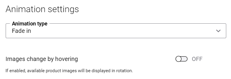
The table below provides the description of the animation settings.
| Field | Description |
|---|---|
| Animation type | Use this option to add effect to the product image. The effect will be shown when the image is loading. The available animation effects are:
|
| Images change by hovering | If this option is enabled, the images will switch when a customer hovers over product image in the Product set filter in the Sana webstore. The images will change on hover only if a product has at least two medium and / or large sized images.
Take into consideration that the Product set filter add-on does not pick up small images. That is why if a product has small image, it might result in showing an empty placeholder instead of an image in the Product set filter. If the Images change by hovering option is disabled, then the default product image is shown in the Product set filter. |
Create a page with the Product set filter content element and play with the animation settings. See the difference to set up animation the way you like.
Layout Settings
Using layout settings, you can specify how many products should be shown in one row on the page on different devices and in this way provide the responsiveness of the Product set filter app.
The layout settings are presented with the default values which can be changed. The minimum number of products you can set for each screen size is 1. It is recommended to use the default values for a better user experience.
How the products are shown on the screens of different sizes also depends on which column layout is used.

The table below provides the description of the layout settings.
| Field | Description |
|---|---|
| Products to display on extra large screens | The number of products which are shown at a time in one row on the extra-large screen (the minimum screen width is 1920px).
The default value is 6. This is the optimal number of products which can be shown on the page, considering the screen width. If you enter the value which is greater than the default one, the products may be displayed not in the best way on the page, affecting user experience. A user can also enter the value which is less than the default one. The specified number of products will be shown in one row on the page. The minimum number of products you can set is 1. |
| Products to display on large screens | The number of products which are shown at a time in one row on the large screen (the screen width is between 1280px - 1919px).
The default value is 4. This is the optimal number of products which can be shown on the page, considering the screen width. If you enter the value which is greater than the default one, the products may be displayed not in the best way on the page, affecting user experience. A user can also enter the value which is less than the default one. The specified number of products will be shown in one row on the page. The minimum number of products you can set is 1. |
| Products to display on medium screens | The number of products which are shown at a time in one row on the medium screen (the screen width is between 960px - 1279px).
The default value is 3. This is the optimal number of products which can be shown on the page, considering the screen width. If you enter the value which is greater than the default one, the products may be displayed not in the best way on the page, affecting user experience. A user can also enter the value which is less than the default one. The specified number of products will be shown in one row on the page. The minimum number of products you can set is 1. |
| Products to display on small screens | The number of products which are shown at a time in one row on the small screen (the screen width is between 600px - 959px).
The default value is 2. This is the optimal number of products which can be shown on the page, considering the screen width. If you enter the value which is greater than the default one, the products may be displayed not in the best way on the page, affecting user experience. A user can also enter the value which is less than the default one. In this way, one product will be shown on the page. The minimum number of products you can set is 1. |
| Products to display on extra small screens | The number of products which are shown at a time in one row on the extra small screen (the maximum screen width is 599px).
The default value is 1. This is the optimal number of products which can be shown on the page, considering the screen width. If you enter the value which is greater than the default one, the products may be displayed not in the best way on the page, affecting user experience. |
Accessibility Settings
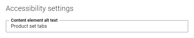
The table below provides the description of the accessibility setting.
| Field | Description |
|---|---|
| Content element alt text | Enter the Product set filter content element alt text.
Alt (alternative) text is used to describe the function and content of the Product set filter content element on a page. Visually impaired users using screen readers can read an alt text to better understand the content shown in the product set filter. |
Many users with motor disabilities rely on a keyboard.
-
To navigate through the Product set filter tabs, they must use the Right and Left arrow keys.
-
To open the necessary tab, a user must press Enter.
-
To focus on the first product in the product set, click on the Tab button.
-
To move to the next content element on a page, a user must go through all products on a Product set filter tab using the Tab key.
Tab Settings
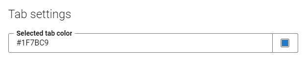
In the Selected tab color field, select a color that is used to highlight the active tab.
Advanced Tab
On the Advanced tab of the Product set filter content element, you can configure height, width, and spacing settings.

For more information about advanced settings, see Content Elements.