Add Parallax Content Element
The Parallax content element is available as an app. It can be installed from the Sana App Center. In Sana Admin click: App Center > Apps > Apps Explorer.
The Parallax content element can be added to the web pages (content pages, product and product list pages) and system pages of the Sana webstore. Using the Parallax content element, you can add impressive background images and create wonderful design effect to make you webstore look more stunning. The Parallax content element can be added to different positions on a page together with other content elements. You can add as many Parallax content elements to a page as you need, to enhance your webstore design with a striking parallax scrolling effect. You must add several Parallax content elements to see the parallax scrolling effect.
To add a content element to a page, you must first choose a column layout, then, hover over a column and click the button  (add content). Find the necessary content element, hover over it, and click Add to page. If the content element is not installed yet, click Install & add to page to install the content element and add it to the page.
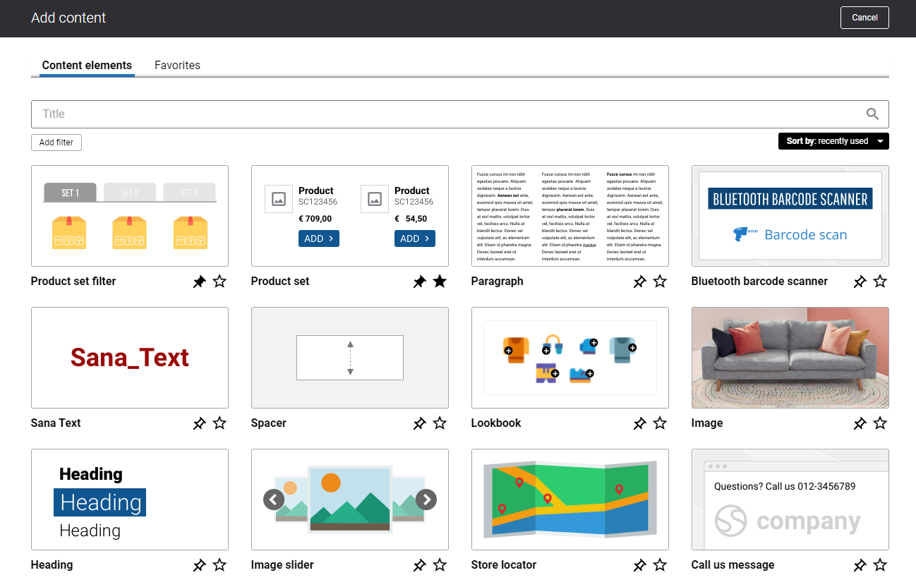
For quicker and more comfortable usage, you can search and filter content elements.
The Parallax content element consists of a background image and text which overlays an image. This can be a plain text, or a text with formatting and styling using the HTML editor entered in the Title and Subtitle text fields, and a button.
When you add it to a page, it is already predefined with the default image, so you can preview the page to see how the content element looks like. Then you can configure it the way you need.
Content Tab
Below you can see the detailed description of the Parallax content element settings.
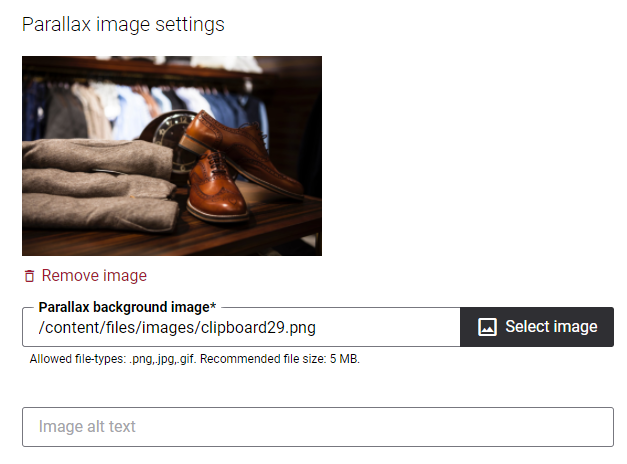
Parallax Image Settings
|
Field |
Description |
|---|---|
|
Parallax background image |
Use this field to select a background image for the parallax scrolling effect.
|
|
Image alt text |
Enter the background image alt text. Alt (alternative) text is used to describe the appearance and function of an image on a page. Visually impaired users using screen readers can read an alt text to better understand what is shown on the image. |
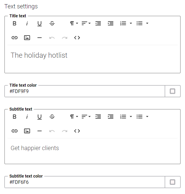
Text Settings
|
Field |
Description |
|---|---|
|
Title text |
Use this field to add a parallax title which is shown on a background image.
|
|
Title text color |
Use this field to define the title color. You can change it using the color picker, or by entering the color hex code, RGB or HSL values. If you leave this field empty, the default color from the webstore theme will be used. |
|
Subtitle text |
Use this field to add a parallax subtitle. It is shown under the title on the background image. You can apply some styles to the subtitle, but do not add other images to the subtitle using the editor.
|
|
Subtitle text color |
Use this field to define the subtitle text color. You can change it using the color picker, or by entering the color hex code, RGB or HSL values. If you leave this field empty, the default color from the webstore theme will be used. |
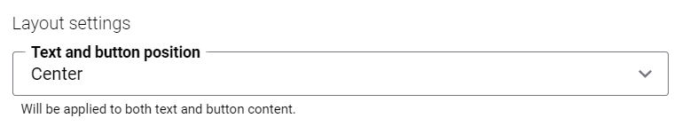
Layout Settings
|
Field |
Description |
|---|---|
|
Text and button position |
Use this field to define the position of the parallax text and button. The available options are:
|
Button Settings
|
Field |
Description |
|---|---|
|
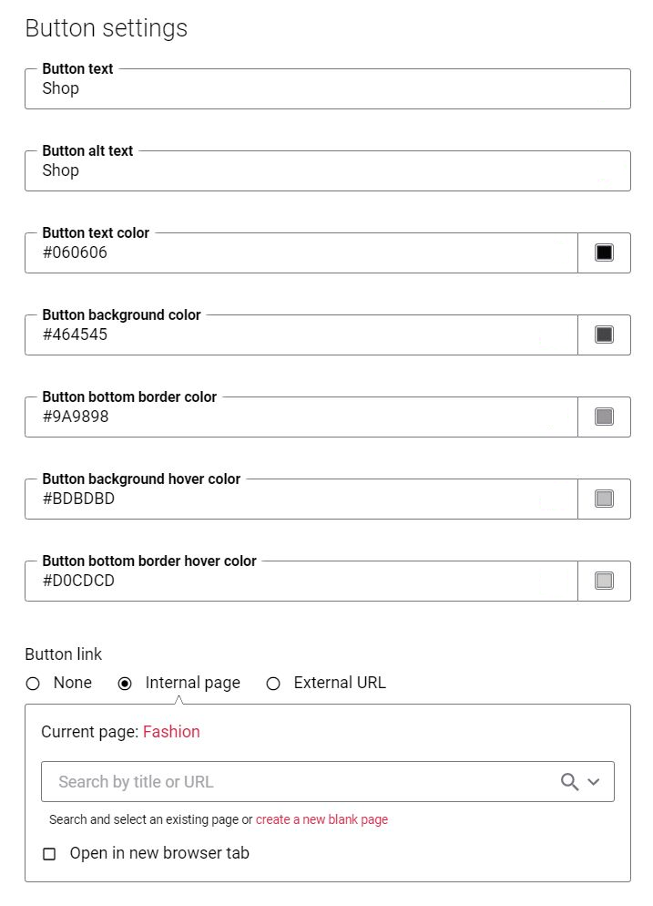
Button text |
Add the text which will be shown on the button.
|
|
Button alt text |
Navigation button alt text. Alt (alternative) text is used to describe the function of a button on a page. Visually impaired users using screen readers can read an alt text to better understand which action a button performs. NOTE
When both button alt text and button text are added to the Parallax content element, the screen readers will read only the button alt text. |
|
Button text color |
Select the button text color. You can change it using the color picker, or by entering the color hex code, RGB or HSL values. If you leave this field empty, the default color from the webstore theme will be applied. |
|
Button background color |
Select the button background color. You can change it using the color picker, or by entering the color hex code, RGB or HSL values. If you leave this field empty, the default color from the webstore theme will be applied. |
|
Button bottom border color |
Select the button bottom border color. You can change it using the color picker, or by entering the color hex code, RGB or HSL values. If you leave this field empty, the default color from the webstore theme will be applied. |
|
Button background hover color |
Select the button background hover color. You can change it using the color picker, or by entering the color hex code, RGB or HSL values. When the user hovers over the button of the parallax, the button color will change to the button background hover color. If you leave this field empty, the default color from the webstore theme will be applied. |
|
Button bottom border hover color |
Select the button bottom border hover color. You can change it using the color picker, or by entering the color hex code, RGB or HSL values. When the user hovers over the button of the parallax, the button bottom border color will change to the button bottom border hover color. If you leave this field empty, the default color from the webstore theme will be applied. |
|
Button link |
Add a link either to the internal webstore page or to the external website. Clicking on the link on the image will open the linked page. To add a link to the internal webstore page, you can search for it by title or URL. If you add an external URL, specify the full URL of the page. You can also create a blank page that will be automatically linked to the image. You can manage this page later. The button link can be added only if there is a button text. |
Advanced Tab
On the Advanced tab of the Parallax content element, you can configure height, width, and spacing settings.
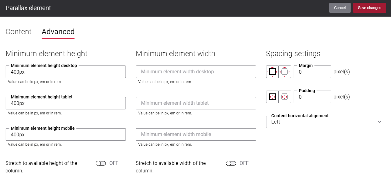
For more information about advanced settings, see Content Elements.