Add Image Slider Content Element
The Image slider content element is available as an app. It can be installed from the Sana App Center. In Sana Admin click: App Center > Apps > Apps Explorer.
The Image slider content element can be added to the web pages (content pages, product and product list pages) and system pages of the Sana webstore. For example, you can add Image slider to the home page of your webstore informing customers and webstore visitors about the latest news, discounts and offers.
For more information about adding, searching, and filtering content elements on pages, see Content Elements.
Content Tab
Read the detailed description of all Image slider settings below and set up it the way you need.
The tables below provide description of the Image slider settings.
Slider Images
When you add the Image slider content element to a content page, you can edit the content separately on the Desktop and Mobile tabs. Thus, you can style the page differently for the desktop and mobile devices.
When you add an image to the slider, take into consideration the following points:
-
The image slider already contains two default images, thus you can see how the Image slider looks, before setting it up and adding your content.
-
At least one image is required.
-
You can add as many images to the Image slider as you need.
-
You cannot delete or make the first image invisible.
-
You can change the order in which you want images to be shown in the Image slider by dragging and dropping them. To change the order of images by dragging and dropping them, the image settings must be collapsed.
-
Mouse dragging does not work inside the Image component. For example, you cannot drag the mouse in the color picker to select some color or the text in the text field.
The following tables provide the description of the image settings.
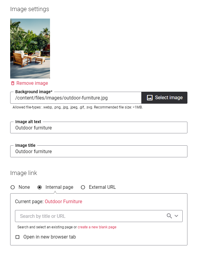
Image Settings
| Field | Description |
|---|---|
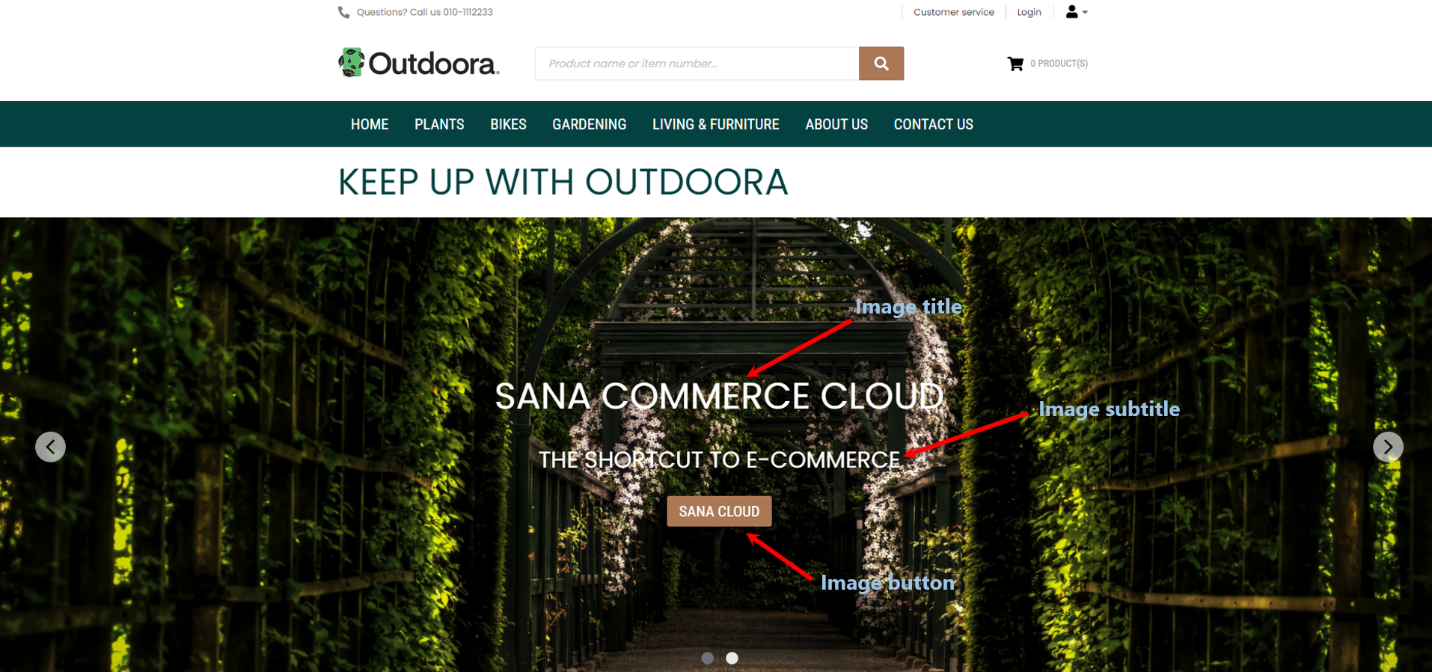
| Background image | Add an image to the Image slider. This image will be shown in the Image slider on the desktop devices.
You must add images to the Image slider of the proper size and aspect ratio. The recommended aspect ratio of an image for the desktop devices is 16:9. The recommended image format is WebP, as it optimizes the performance of image sliders and offers better compression without compromising quality. Additionally, reducing image dimensions will further improve loading times and enhance the overall user experience. You can also add online image by entering the image URL. When you add an image to the Image slider take into consideration that the size of an image also depends on the values you set in the Minimum element height desktop and Minimum element height mobile fields. |
| Image alt text | Enter an image slider alt text.
Alt (alternative) text is used to describe the appearance and function of an image on a page. Visually impaired users using screen readers can read an alt text to better understand what is shown on the image. |
| Image title | Use this field to give a name to an image for its better presentation in Sana Admin.
You can use this to have a better overview of images on a page and find the one you need faster. |
| Image link | Add a link either to an internal webstore page or an external website. Clicking on the link on the image will open the linked page.
To add a link to the internal webstore page, you can search for it by title or URL. If you add an external URL, specify the full URL of the page. You can also create a blank page that will be automatically linked to the image. You can manage this page later. |
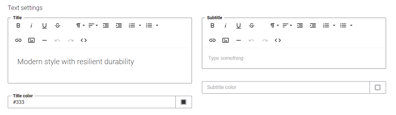
Text Settings
| Field | Description |
|---|---|
| Title | Add an image title. It is not recommended to add images to the title using the editor.
|
| Title color | Specify the title color. You can change it using the color picker, or by entering the color hex code, RGB or HSL values.
If you leave this field empty the default color from the webstore theme will be applied. |
| Subtitle | Add an image subtitle. It is not recommended to add other images to the subtitle using the editor.
|
| Subtitle color | Specify the subtitle color. You can change it using the color picker, or by entering the color hex code, RGB or HSL values.
If you leave this field empty the default color from the webstore theme will be applied. |
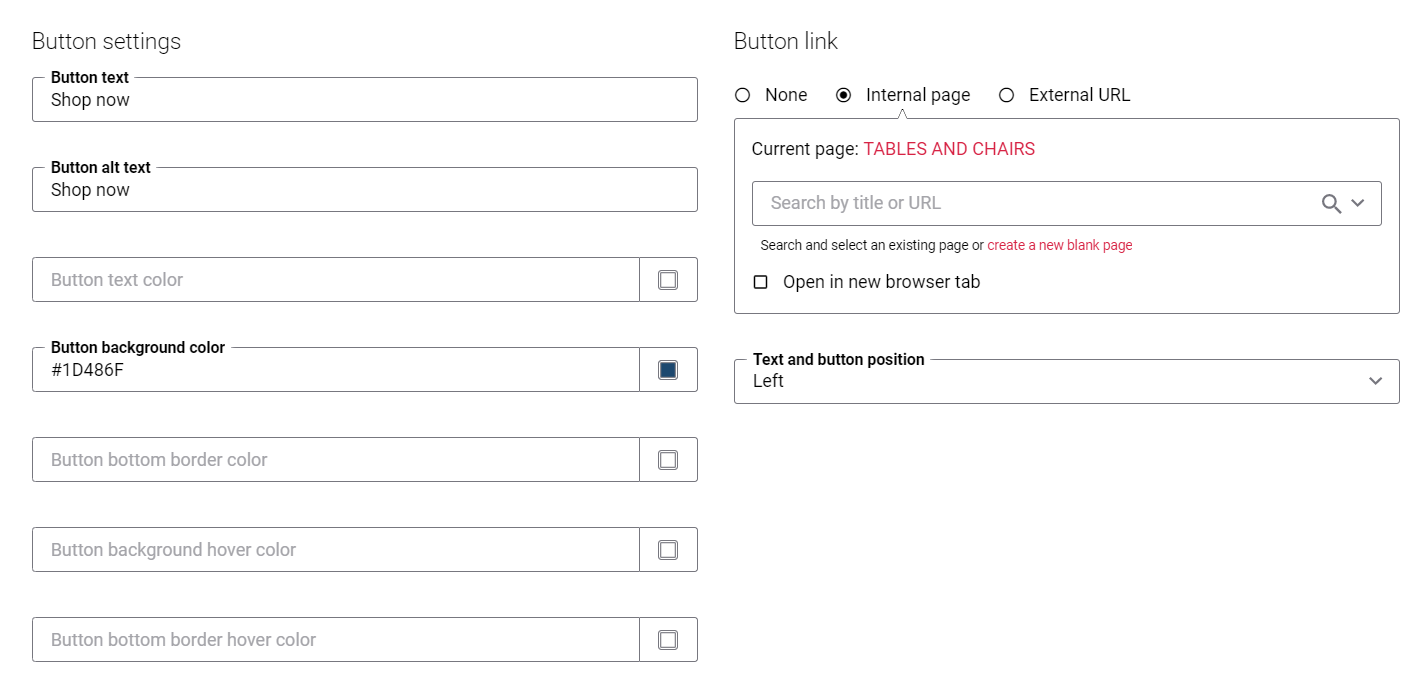
Button Settings
| Field | Description |
|---|---|
| Button text | Add the text which will be shown on the button.
|
| Button alt text | Enter button alt text.
Alt (alternative) text is used to describe the function of a button on a page. Visually impaired users using screen readers can read an alt text to better understand which action a button performs. |
| Button text color | Specify the button text color. You can change it using the color picker, or by entering the color hex code, RGB or HSL values.
If you leave this field empty the default color from the webstore theme will be applied. |
| Button background color | Specify the color of the button. You can change it using the color picker, or by entering the color hex code, RGB or HSL values.
If you leave this field empty the default color from the webstore theme will be applied. |
| Button bottom border color | Specify the color of the bottom border of the button. You can change it using the color picker, or by entering the color hex code, RGB or HSL values.
If you leave this field empty the default color from the webstore theme will be applied. |
| Button background hover color | Specify the color which will be used for the button when a user hovers over it. You can change it using the color picker, or by entering the color hex code, RGB or HSL values.
If you leave this field empty the default color from the webstore theme will be applied. |
| Button bottom border hover color | Specify the color which will be used for the bottom border of the button when a user hovers over it. You can change it using the color picker, or by entering the color hex code, RGB or HSL values.
If you leave this field empty the default color from the webstore theme will be applied. |
| Button link | Add an internal web store page or an external URL to the button. Clicking on the button will open the linked page.
If you add an external URL, specify the full URL of the page. |
| Text and button position | Define the alignment of the title, subtitle and button. The available options are:
|
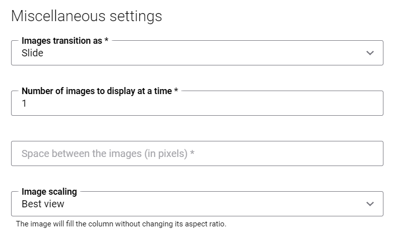
Miscellaneous Settings
| Field | Description |
|---|---|
| Images transition as | Use this field to define image transition that occurs in slide show view when you move from one image to the next. There are two types of transitions:
|
| Number of images to display at a time | Enter the number of images which must be shown simultaneously in the image slider. The default number of images is set to 1.
This applies only to the desktop layout. On mobile, only one image is shown at a time to make the best use of the available screen space. If you select Fade in the field Images transition as, this field will be disabled. You can also use this option to create image carousel. This might be useful when you need to show logos of different brands you are selling, for example.
If the number of images set in this field equals the number of images added to the Image slider, then all images will be shown simultaneously in the Image slider on a page. |
| Space between the images (in pixels) | Use this field to define space between images in pixels, if you set up to show several images at once in the Image slider.
If you select Fade in the field Images transition as, this field will be disabled. |
| Image scaling | Use this field to change the size of an image. The following image scaling options are available:
When you select one of the scaling options, make sure that the image fits the column and looks good on the page. You can preview the page to check it. |

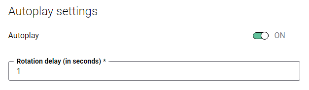
Autoplay Settings
| Field | Description |
|---|---|
| Autoplay | Use this option to enable and disable the autoplay of images. When this option is enabled, the images are changing automatically as a slide show.
You should enable this option, if you need to set up autoplay settings and if you have several images in the Image slider. |
| Rotation delay (in seconds) | Specify time interval in seconds to switch between images automatically, when the option Autoplay is enabled. |
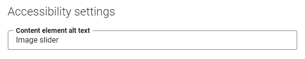
Accessibility Settings
| Field | Description |
|---|---|
| Content element alt text | Enter the Image slider content element alt text.
Alt (alternative) text is used to describe the function and content of an Image slider on a page. Visually impaired users using screen readers can read an alt text to better understand the content shown in the image slider. |
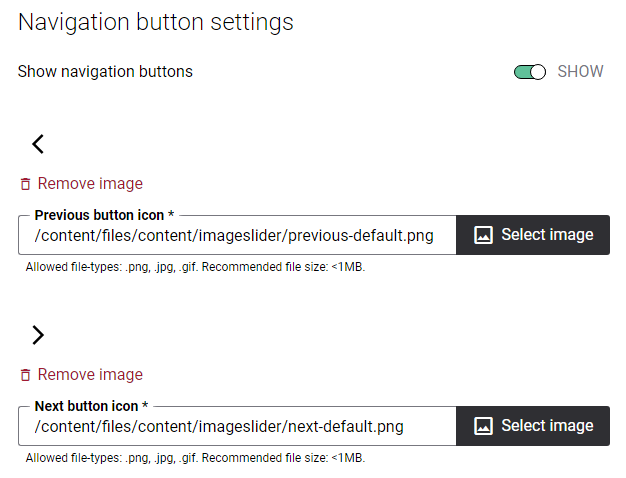
Navigation Button Settings
| Field | Description |
|---|---|
| Show navigation buttons | Use this option to show or hide navigation buttons in the Image slider. Navigation buttons enable user to switch between images.
You should enable this option, if you need to set up navigation button settings and if you have several images in the Image slider. |
| Previous button icon | This field is used to add an icon for the previous navigation button.
You can also add online image by entering the image URL. In order to provide and maintain accessible web content to people with disabilities and interact with different types of accessibility assistive technology, for example screen readers, you can find the default text of the previous navigation button in Sana Admin and change it. In Sana Admin click: Setup > Page elements & messages. To find the necessary text, on the All texts tab, in the Text or Identifier field, enter ImageSliderContentBlock__PrevArrow ID, then click Edit. Here you can change the default text of an icon for the previous navigation button. This text can be easily changed in the English language and any other installed webstore language. |
| Next button icon | This field is used to add an icon for the next navigation button.
You can also add online image by entering the image URL. In order to provide and maintain accessible web content to people with disabilities and interact with different types of accessibility assistive technology, for example screen readers, you can find the default text of the next navigation button in Sana Admin and change it. In Sana Admin click: Setup > Page elements & messages. To find the necessary text, on the All texts tab, in the Text or Identifier field, enter ImageSliderContentBlock__NextArrow ID, then click Edit. Here you can change the default text of an icon for the next navigation button. This text can be easily changed in the English language and any other installed webstore language. |
Dot Navigator Settings
| Field | Description |
|---|---|
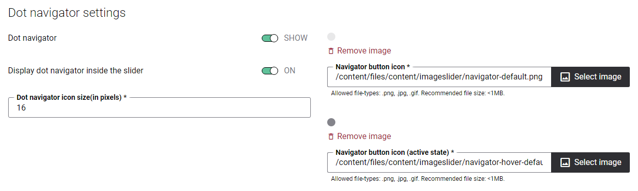
| Dot navigator | Use this option to show or hide dot navigator for the Image slider.
You should enable this option, if you need to set up dot navigator settings and if you have several images in the Image slider. In order to provide and maintain accessible web content to people with disabilities and interact with different types of accessibility assistive technology, for example screen readers, you can find the default text of the dot navigator in Sana Admin and change it. In Sana Admin click: Setup > Page elements & messages. To find the necessary text, on the All texts tab, in the Text or Identifier field, enter ImageSliderContentBlock__DotNavigatorItem ID, then click Edit. Here you can change the default text of an icon for the dot navigator. This text can be easily changed in the English language and any other installed webstore language. |
| Display dot navigator inside the slider | Use this option to show the dot navigator inside the Image slider. When it is disabled, the dot navigator is shown under the Image slider. When this option is enabled, the dot navigator is shown inside the Image slider. |
| Dot navigator icon size (in pixels) | Use this field to set the size of the dot navigator icon in pixels. 16 pixels is the recommended size. |
| Navigator button icon | This field is used to add an icon for the dot navigator. The selected navigator button icon will be used to indicate any slide which is not shown currently. Meaning that the slide is not active now.
You can also add online image by entering the image URL. |
| Navigator button icon (active state) | This field is used to add an icon for the dot navigator. The selected navigator button icon will be used to indicate the slide which is currently shown.
Also, this button icon will be used when a user hovers over any dot navigator which is not selected (not active) now. You can also add online image by entering the image URL. |
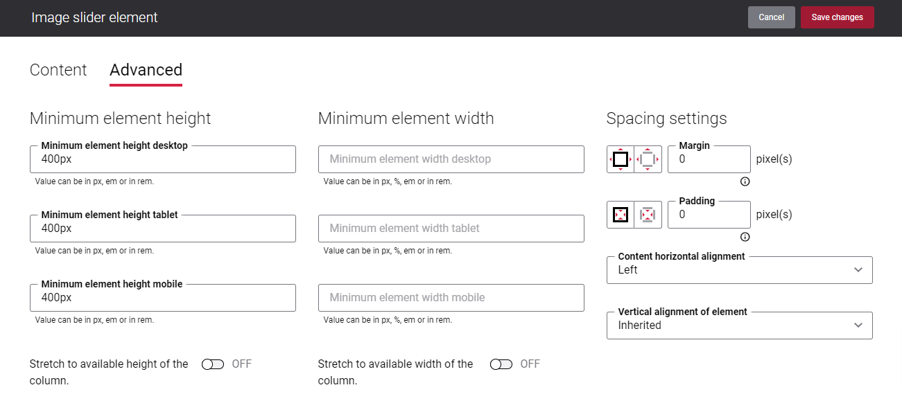
Advanced Tab
On the Advanced tab of the Image slider content element, you can configure height, width, and spacing settings.
For more information about advanced settings, see Content Elements.