Add Hover Tile Content Element
The Hover tile content element is available as an app. It can be installed from the Sana App Center. In Sana Admin click: App Center > Apps > Apps Explorer.
The Hover tile content element can be added to the web pages (content pages, product and product list pages) and system pages of the Sana webstore.
When you add a content element to a page, it is already predefined with the default values, so you can preview the page to see how the content element looks like. Then you can configure it the way you need.
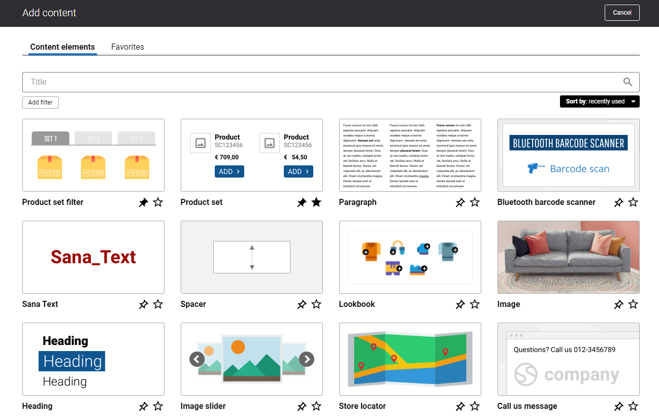
To add a content element to a page, you must first choose a column layout, then, hover over a column and click the button  (add content). Find the necessary content element, hover over it, and click Add to page. If the content element is not installed yet, click Install & add to page to install the content element and add it to the page.
For quicker and more comfortable usage, you can search and filter content elements.
Content Tab
Below you can see the detailed description of the Hover tile content element settings.
Hover Tile Settings

| Field | Description |
|---|---|
| Default tile image | Use this field to add the default image to the Hover tile content element. This field is mandatory.
It is recommended to add an image which is less than 2MB. |
| Default tile image alt text | Enter the default tile image alt text.
Alt (alternative) text is used to describe the appearance and function of an image on a page. Visually impaired users using screen readers can read an alt text to better understand what is shown on the image. |
| Default text | Use this field to add the text to the default image. |
| Default font color | Specify the default text color. You can change it using the color picker, or by entering the color hex code, RGB or HSL values. |
| Image scaling | Use this field to change the size of an image. The available options are:
When you select one of the scaling options, make sure that the image fits the column and looks good on the page. You can preview the page to check it. |
| Hover tile image | Use this field to add the hover tile image. It is used instead of the default image when a customer hovers over the image in the Sana webstore.
It is recommended to add an image which is less than 2MB. |
| Hover tile image alt text | Enter the hover tile image alt text.
Alt (alternative) text is used to describe the appearance and function of an image on a page. Visually impaired users using screen readers can read an alt text to better understand what is shown on the image. |
| Hover text | Use this field to add the hover text.
The text will be shown when a customer hovers over the default image in the Sana webstore. |
| Hover font color | Specify the hover text color. You can change it using the color picker, or by entering the color hex code, RGB or HSL values. |
| Hover background color | Specify the hover background color. You can change it using the color picker, or by entering the color hex code, RGB or HSL values.
The background is half transparent and it covers the image when a customer hovers over it in the Sana webstore. |
| Button text | Add the text which will be shown on the button. The button is shown only if there is a button text.
The button appears when a customer hovers over an image in the Sana webstore. |
| Button alt text | Navigation button alt text.
Alt (alternative) text is used to describe the function of a button on a page. Visually impaired users using screen readers can read an alt text to better understand which action a button performs. When both button alt text and button text are added to the Hover tile content element, the screen readers will read only the button alt text. |
| Button link | Add an internal webstore page or an external URL to the button. Clicking on the button will open the linked page.
If you add an external URL, specify the full URL of the page. |
When you add images to the Hover tile content element, make sure that they have the same aspect ratio, otherwise the images might not look good.
Hover Animation Settings
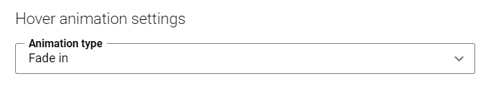
| Field | Description |
|---|---|
| Animation type | Select an overlay effect for an image which will be shown when a customer hovers over an image in the Sana webstore. The available overlay effects are:
|
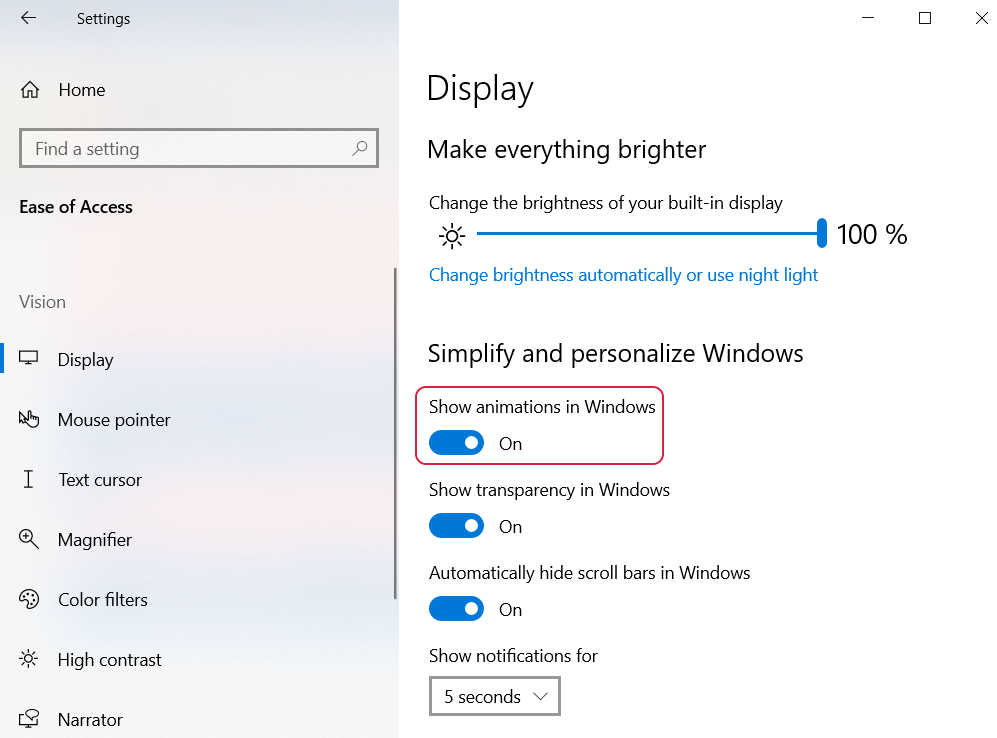
The animation effects work only if animation is enabled in Microsoft Windows. If animation is disabled in Microsoft Windows, nothing happens when a user hovers over an image tile.
On the screenshot below you can see the animation setting in Windows 10. Note that the location of the animation setting and its name can differ depending on the Windows version.
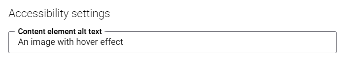
Accessibility Settings
| Field | Description |
|---|---|
| Content element alt text | Enter the Hover tile content element alt text.
Alt (alternative) text is used to describe the function and content of the Hover tile content element on a page. Visually impaired users using screen readers can read an alt text to better understand the content shown in the Hover tile content element. |
Advanced Tab
On the Advanced tab of the Hover tile content element, you can configure height, width, and spacing settings.
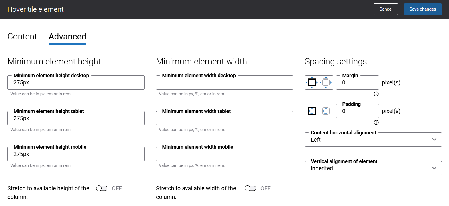
For more information about advanced settings, see Content Elements.