Media Gallery
Product media is unquestionably one of the most important factors when you are selling online. You can add product images and videos in the Sana webstore to make your content look brighter and more engaging for your customers. Your customers can be sure that the product they are considering matches their expectations by checking product images and videos.
-
Product images can be added both in your ERP system and Sana Admin. For more information, see Product Images.
-
Product videos can be added in Sana Admin. For more information, see Product Videos.
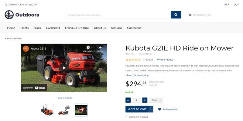
The Media gallery content element is used to show the product images and videos on the product details page.
Content Tab
Below see the description of the Media gallery content element settings on the Content tab.
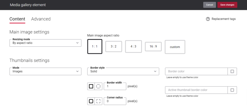
Main Image Settings
If you change the column layout where the media gallery is located on a page or the default size of the media gallery, you need to think about this at the design stage and prepare all images of the appropriate size so that there are no problems with their display and performance. For more information, see Custom Product Image Sizes.
In the Resizing mode field, select how the product images will be resized. The available options are:
-
By height: In the Height field, enter the product image height in pixels which will be used for a product
-
By aspect ratio: Select the main image aspect ratio according to which product images will be resized. For example, if you select 1:1, product images will be cropped into a square. You can also set a custom aspect ratio by setting the width and height of a product image.
Thumbnails Settings
Using the Mode field, you can specify how thumbnails under the product image should be presented. The following options are available:
-
Images: The thumbnail images are shown under the product image.
-
Dots: The thumbnail dots are shown under the product image.
You can configure the thumbnail images and thumbnail dots settings separately. The settings will change depending on the option you select in the Mode field.
The table below provides the description of the Images mode settings.
| Field | Description |
|---|---|
|
Border style |
Specify the border style for the thumbnail images. The border style sets the line style for all four sides of a border. You can show or hide the border. If you do not want to show the border, select None. The border can be:
|
|
Border width |
Specify the border width for the thumbnail images. Each border has a width in pixels that you can change individually or specify the same width for all borders. There are settings for specifying the border width for each side:
|
|
Corner radius |
Specify the border corner radius for the thumbnail images. Each border has a corner radius in pixels that you can change individually or specify the same radius for all corners. There are settings for specifying each corner radius individually:
|
|
Border color |
Specify the thumbnail images border color. You can change it using the color picker, or by entering the color hex code, RGB or HSL values. If you leave this field empty, the default value will be used. |
|
Active thumbnail border color |
Specify the thumbnail image border color. When a user clicks on one of the thumbnail images on the product page in the Sana webstore and makes it active, the border color of this image changes to the one specified in this field. You can change the border color using the color picker, or by entering the color hex code, RGB or HSL values. If you leave this field empty, the default value will be used. |
The table below provides the description of the Dots mode settings.
| Field | Description |
|---|---|
|
Color |
Specify the thumbnail dots color. You can change it using the color picker, or by entering the color hex code, RGB or HSL values. If you leave this field empty, the default value will be used. |
|
Active color |
Specify the thumbnail dot color. When a user clicks on one of the thumbnail dots on the product page in the Sana webstore and makes it active, the color of this dot changes to the one specified in this field. You can change it using the color picker, or by entering the color hex code, RGB or HSL values. If you leave this field empty, the default value will be used. |
Change the Text of the Media Gallery Content Element
Many webstores provide their customers with a possibility to add images and videos to the products to highlight product quality, features, benefits and show them in action. In the Sana webstore customers can zoom in the image for close inspection, and watch videos of the product before buying it.
You can easily change the text of the + Hover to zoom | Click to enlarge link in the English language or any other installed webstore language. There are two ways to change the default text of the link.
-
You can use the built-in Sana tool In-site editor.
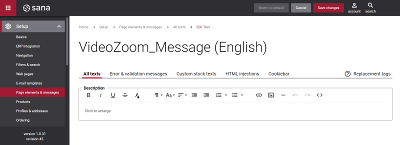
In Sana Admin click: Setup > Page elements & messages. On the All texts tab, click the button Browse in webstore. This way you can edit the text of the link directly on the webstore.
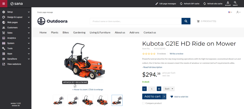
-
You can find the default texts of the links in Sana Admin and change them. For more information, see Webstore UI Texts.
In Sana Admin click: Setup > Page elements & messages. To find the necessary text, on the All texts tab, search for ImageZoom_Message ID. Here you can change the default text of the + Hover to zoom | Click to enlarge link.

If you want to edit the default text of the + Click to enlarge link, search for VideoZoom_Message ID.
Advanced Tab
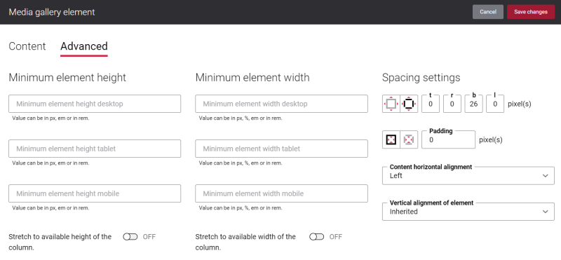
On the Advanced tab of the Media gallery content element, you can configure height, width, and spacing settings.
For more information about advanced settings, see Content Elements.
Related Articles
Microsoft Dynamics NAV: Item Images
Microsoft Dynamics AX: Product Images
Microsoft Dynamics 365 Business Central: Item Images
Microsoft Dynamics 365 for Finance and Operations: Product Images
SAP Business One: Item Images
SAP ECC: Product Images
SAP S/4HANA: Product Images
