Creating and Editing Webstore Pages
Pages in Sana Admin are created and edited using the visual designer — a page editor that lets you build and style webstore pages directly, with changes reflected in real time. This article covers the key things you need to know to work confidently in the visual designer.
Page Settings
Two places hold your page settings. Page settings are available in the panel on the left when no elements are selected. These include the Page messages tab, where you can edit page messages, and the Page setup tab, where you can configure settings such as language, page layout, and other page-specific settings depending on the page type.

You can also configure page settings using the Page settings button at the top of the page, where you can manage details such as the page title, URL, SEO settings, and other settings that vary depending on the page type.


Content Elements
Content elements are building blocks such as text, images, banners, videos, product sets, and more that can be added to content pages, system pages, and product pages in Sana Admin. Sana Commerce Cloud includes a set of standard content elements out of the box, with additional elements available as apps through the Sana App Center. Content elements are placed within columns of a page layout and can be freely rearranged by dragging and dropping them. Each content element can be configured individually to control its content and appearance, allowing you to build and customize pages without touching a single line of code.
Managing Content Elements: New vs. Old Visual Designer
Sana Admin currently provides both the new and old visual designers. While the core functionality remains the same, the two versions differ in how content elements are added, displayed, and managed.
New Visual Designer

In the new visual designer, all available content elements are displayed in the panel on the left. To add a content element, simply drag it from the panel and drop it into the necessary column. Once dropped, a configuration window will open where you can adjust the settings and save your changes immediately, or proceed without making any changes. Afterwards, the content element can be selected in the visual designer at any time to review or modify its settings, which will appear in the panel on the right.
Old Visual Designer

In the old visual designer, hover over a column and click the add content button  that appears. A window will open displaying all content elements available in Sana. Find the necessary content element and click Add to page, after which a configuration window will open. You can configure the content element immediately or add it to the column and return to the configuration later. To review or modify the settings of an already added content element, click edit element in the visual designer.
Previewing Your Page
At any point, you can use the Preview button in the right toolbar to see how your page will look in the webstore. This helps you verify your changes before saving.

Desktop and Mobile Layouts
You can switch between desktop and mobile layouts using the buttons at the top of the page. Each layout can be configured separately. Note that changes made to the desktop layout are automatically applied to the mobile layout as well.

Saving Changes
When you finish editing, click Save changes in the right toolbar to store your updates. The page stays open after saving, so you can continue editing. Note that the page will not save if any required fields or settings are missing.

Core Tips for Navigating the Page Editor
-
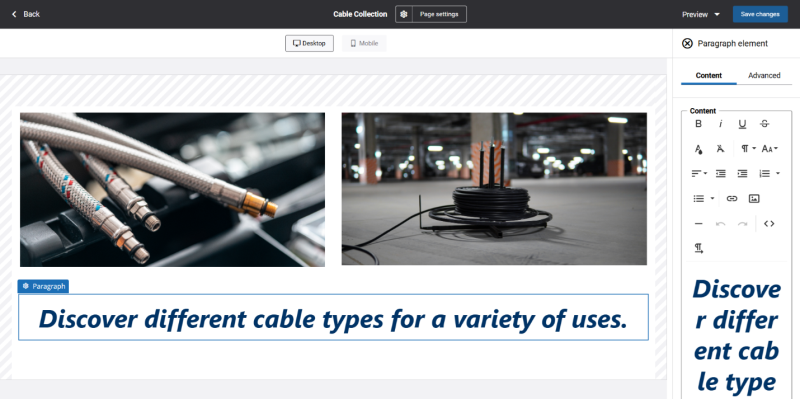
When you add a content element, a pop-up window with the Content and Advanced tabs is displayed. You can configure the settings immediately or add the element and return to it later. Once added, select the element to view and edit its settings in the panel on the right, with changes reflected in real time.

-
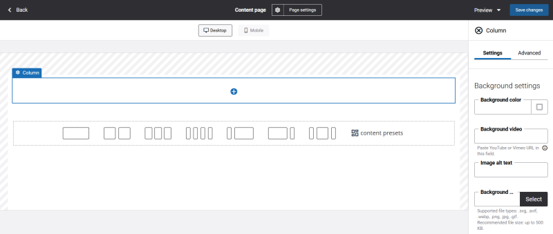
When you select a column or row, its settings are displayed in the panel on the right.

-
You can move elements by selecting them and using drag-and-drop.
-
You can select a content element, column, or row by clicking on it. Double-clicking allows you to switch between levels (content element → column → row → content element).
-
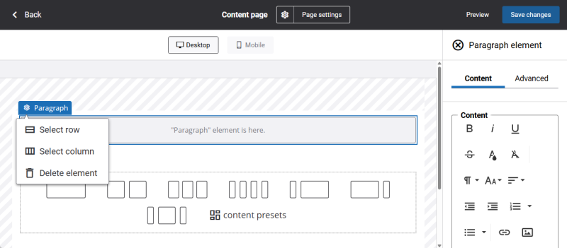
When an element is selected, its name and a configure button appear in the top-left corner. Clicking this button opens a dropdown with actions depending on the selected element:
-
Content element: You can select the parent column or row, or delete the element.
-
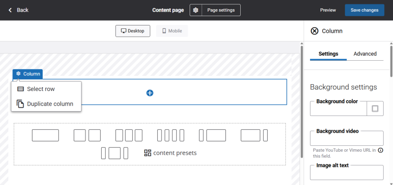
Column: You can select the parent row or duplicate the column.
-
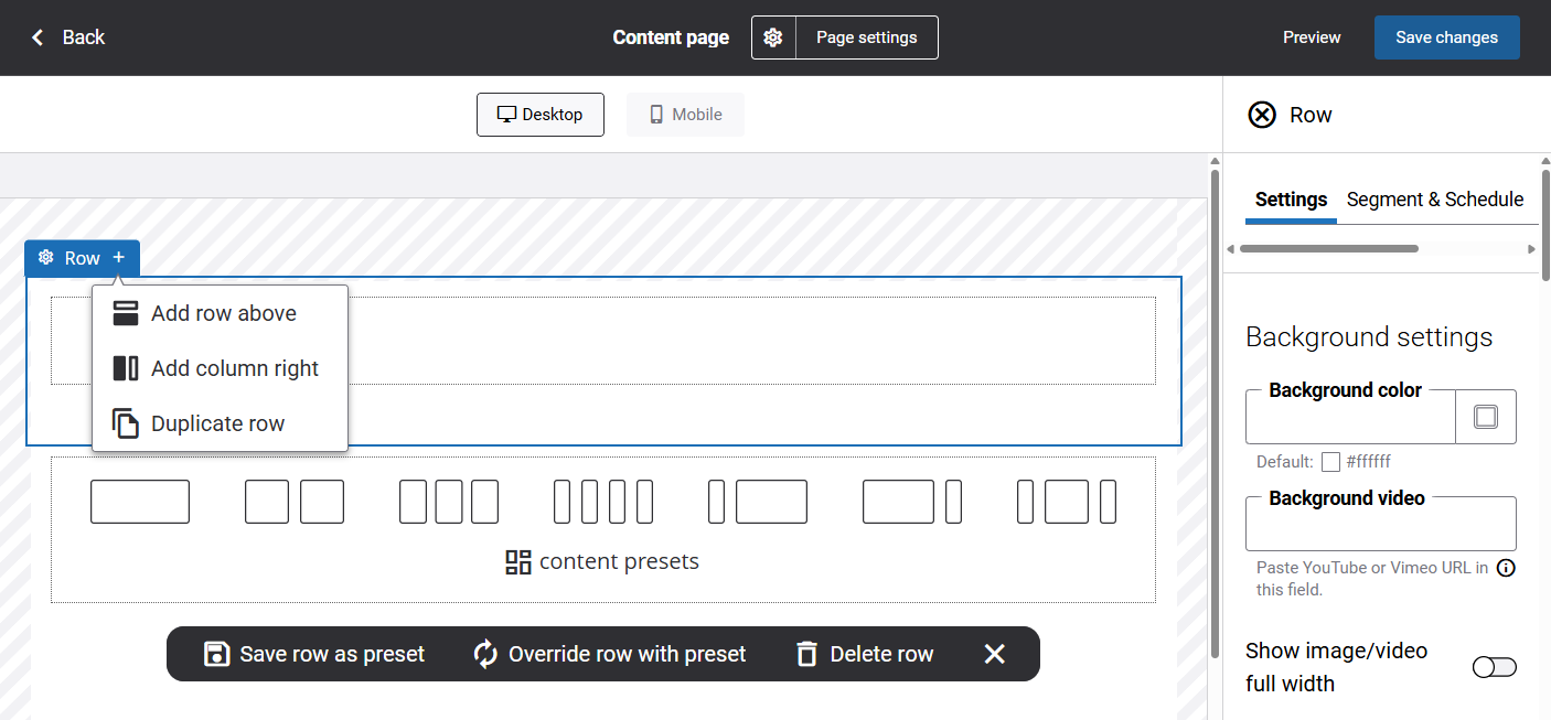
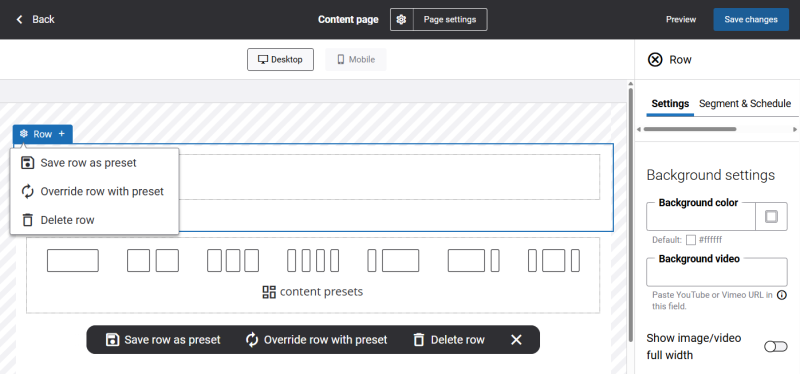
Row: You can save the row as a preset, override it with a preset, or delete it. These actions are also available in the floating bottom panel that appears when a row is selected.
-
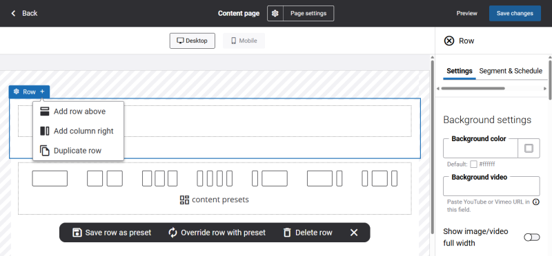
In the same area, there is an add button that opens a dropdown with actions such as adding a row above or below, adding a column to the right, or duplicating the row. The available actions may vary depending on the position of the row.
-