Miniature Basket (Desktop and Tablet)
This content element is used in the webstore header only for the desktop and tablet layouts, including desktop and tablet sticky headers.
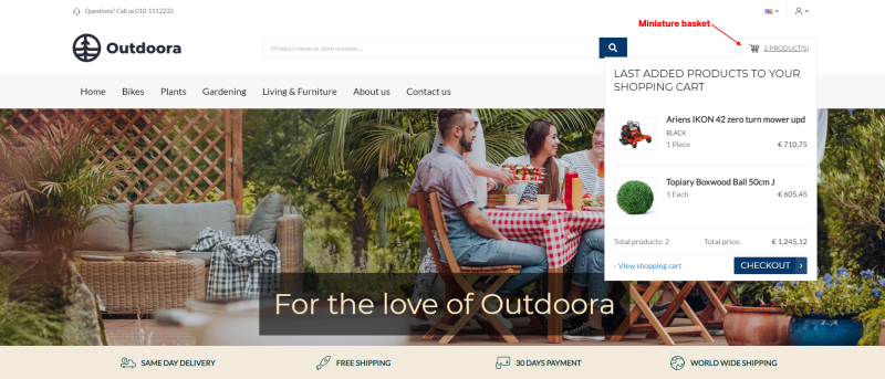
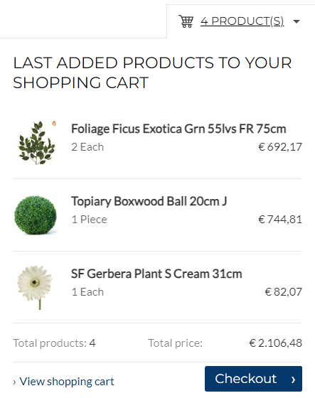
The Miniature basket content element is used to add basket miniature to the webstore header for the desktop and tablet layouts. Customers can see the basket icon and the number of products in the basket. They can click on it to open the basket. When customers hover over it, they can see the first three products in the basket, total price, and the Checkout button.
Although you can add the Miniature basket content element to any page, we recommend to use it in your webstore header.
Content Tab
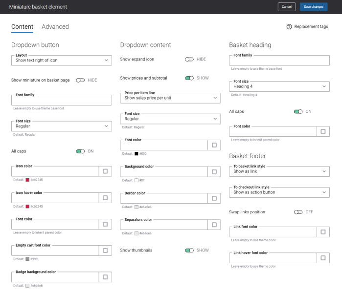
The table below provides the description of the Miniature basket content element settings on the Content tab.
|
Field |
Description |
|---|---|
|
Dropdown button |
|
|
Layout |
Use this setting to specify how the basket miniature icon and text should be presented in the webstore header. The available options are:
|
|
Show miniature on basket page |
Use this setting to show or hide basket miniature on the basket page. |
|
Font family |
Enter the name of the font family for the basket miniature link text. If you leave this field empty, the default value will be used. |
|
Font size |
Enter the necessary font size for the basket miniature link text. If you leave this field empty, the default value will be used. |
|
All caps |
Enable this option, if you need all letters in the basket miniature link text to be capitalized. |
|
Icon color |
Specify the basket miniature icon color. You can change it using the color picker, or by entering the color hex code, RGB or HSL values. If you leave this field empty, the default value will be used. |
|
Icon hover color |
Specify the basket miniature icon hover color. When a user hovers over the basket miniature icon in the Sana webstore, the icon color changes to the one specified in this field. You can change it using the color picker, or by entering the color hex code, RGB or HSL values. If you leave this field empty, the default value will be used. |
|
Font color |
Specify the font color for the basket miniature link text. This color will be used for the basket miniature link text, when there are some products in the shopping cart. You can change it using the color picker, or by entering the color hex code, RGB or HSL values. If you leave this field empty, the default value will be used. |
|
Empty cart font color |
Specify the font color for the basket miniature link text. This color will be used for the basket miniature link text, when the shopping cart is empty. You can change it using the color picker, or by entering the color hex code, RGB or HSL values. If you leave this field empty, the default value will be used. |
|
Badge background color |
Specify the background color of the basket miniature badge. The badge with the number of products added to the shopping cart is shown at the top right corner of the basket miniature icon. You can enable the basket miniature badge using the Layout setting. The badge is not shown if the shopping cart is empty. You can change the badge background color using the color picker, or by entering the color hex code, RGB or HSL values. If you leave this field empty, the default value will be used. |
|
Dropdown content |
|
|
Show expand icon |
Enable this option if you want to show the expand icon in the basket miniature. |
|
Show prices and subtotal |
Use this option to show or hide the subtotal of the order amount in the shopping cart miniature. If this option is enabled, every time a customer adds a product to the shopping cart, the basket miniature appears in the upper right corner of a Sana webstore. |
|
Price per item line |
NOTE
It is applicable only if the option Show prices and subtotal is enabled. Use this setting to specify how to show product prices in the shopping cart miniature. The available options are:
|
|
Font size |
Enter the necessary font size for the texts in the basket miniature dropdown. |
|
Font color |
Specify the font color for the texts in the basket miniature dropdown. You can change it using the color picker, or by entering the color hex code, RGB or HSL values. If you leave this field empty, the default value will be used. |
|
Background color |
Specify the background color of the basket miniature dropdown. You can change it using the color picker, or by entering the color hex code, RGB or HSL values. If you leave this field empty, the default value will be used. |
|
Border color |
Specify the color of the basket miniature dropdown border. You can change it using the color picker, or by entering the color hex code, RGB or HSL values. If you leave this field empty, the default value will be used. |
|
Separators color |
Specify the color of the separators in the basket miniature dropdown. Separators are used to separate product lines and texts in the basket miniature dropdown. You can change the separators color using the color picker, or by entering the color hex code, RGB or HSL values. If you leave this field empty, the default value will be used. |
|
Show thumbnails |
Use this setting to show or hide the product thumbnails in the basket miniature dropdown. |
|
Basket heading |
|
|
Font family |
Enter the name of the font family for the basket miniature heading shown at the top of the dropdown. If you leave this field empty, the default value will be used. |
|
Font size |
Enter the necessary font size for the basket miniature heading shown at the top of the dropdown. If you leave this field empty, the default value will be used. |
|
All caps |
Enable this option, if you need all letters of the basket miniature heading to be capitalized. |
|
Font color |
Specify the font color for the basket miniature heading shown at the top of the dropdown. You can change it using the color picker, or by entering the color hex code, RGB or HSL values. If you leave this field empty, the default value will be used. |
|
Basket footer |
|
|
To basket link style |
Use this setting to style the link shown at the bottom of the basket miniature dropdown. This link opens the basket page in the Sana webstore. The available options are:
|
|
To checkout link style |
Use this setting to style the link shown at the bottom of the basket miniature dropdown. This link opens the checkout page in the Sana webstore. The available options are:
|
|
Swap links position |
Use this option to interchange position of the basket and checkout links. |
|
Link font color |
Specify the font color of the basket and checkout links. The font color is applied, only if the Show as link option is selected in the link style setting for the basket and checkout links. You can change it using the color picker, or by entering the color hex code, RGB or HSL values. If you leave this field empty, the default value will be used. |
|
Link hover font color |
Specify the hover font color of the basket and checkout links. The hover font color is applied, only if the Show as link option is selected in the link style setting for the basket and checkout links. When a user hovers over the basket or checkout link in the basket miniature dropdown in the Sana webstore, the font color changes to the one specified in this field. You can change it using the color picker, or by entering the color hex code, RGB or HSL values. If you leave this field empty, the default value will be used. |
Advanced Tab
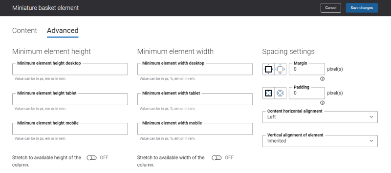
On the Advanced tab of the Miniature basket content element, you can configure height, width and spacing settings.
For more information about advanced settings, see Content Elements.
Change the Miniature Basket Icon
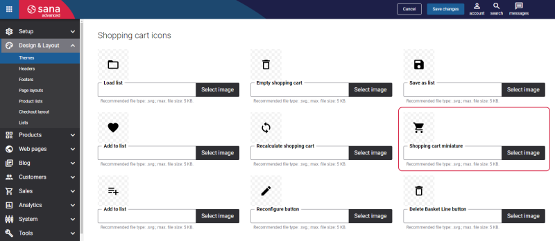
The Miniature basket icon can be changed in Themes. In Sana Admin click: Design & Layout > Themes. Click Edit on your webstore theme and open the Icons tab. In the Shopping cart icons section, find the Shopping cart miniature icon. You can change the default icon.
