Product Group Pages Design and Content
Using product groups in case you are selling a lot of identical items is already a very smart decision, since it makes your customers’ shopping experience much easier and more enjoyable. But, with the possibilities Sana provides, you can go even far. A product group page is completely customizable, it consists of some default content elements and also you can add some other content elements available in Sana to it and in this way, you can create your ideal product group page. A well-designed product group page can help you to make a good first impression on your customers and ensure the success of your business.
System Page and Individual Product Group Page
There is a Product group details system page that is used as a template for all product group pages, but you can also change any specific product group page if you want it to look different. If you change anything on the Product group details system page, these changes will be applied to all existing product group pages. But if you want a particular product group page to look different, you can style any product group page individually.
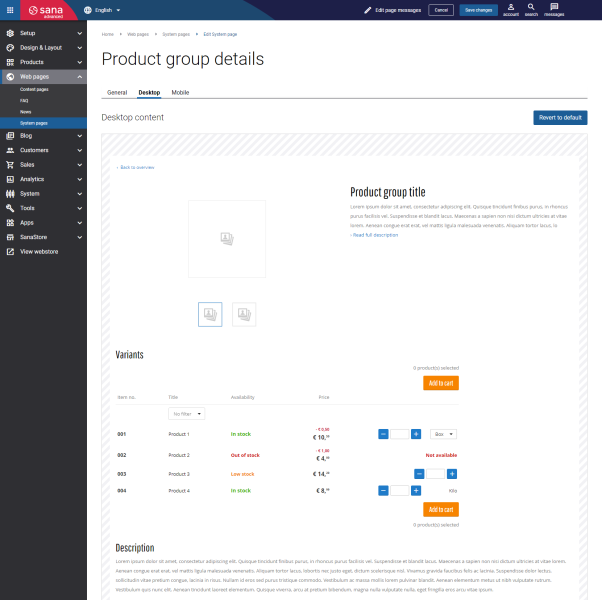
To style the Product group details system page, in Sana Admin click: Web pages > System pages. On the System pages page, you can see all available system pages. Find the Product group details system page and click Edit.
The Desktop and Mobile tabs hold the content elements of the product group pages that are shown on the desktop and mobile devices. Thus, the product group pages can be styled differently for desktop and mobile devices.
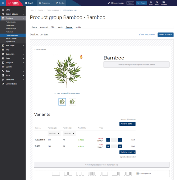
The same Desktop and Mobile tabs you can see on the individual product group pages. If you want to use other content elements for a particular product group page or make it look different from other product group pages, in Sana Admin click: Products > Product group pages. Find the necessary product group and edit it.
You can add and remove various content elements on the system page and on the individual product group page as well as use the content management system of Sana with the page layouts, row and column settings to create high quality and impressive design for the product group pages.
The product group page has 6 standard content elements that can be placed anywhere on the page. The standard content elements are present on the product group page by default. You can add and remove any standard content elements on the product group page and those that are available as add-ons.
When you add, edit or remove the content elements on the product group page, you can also preview a page in your webstore. To see how the product group page will look like when you are done, click Preview in the header of Sana Admin. For more information, see Page Preview.
Using the Edit default layout button, you can view the settings of the Product group details system page that serves as a template for all product group pages.
Using the Revert to default button, you can revert any changes you have made to the page and start from scratch.
Product Group Page Content Elements
To easily find the product group page specific content elements, you can use filters in the content element explorer. When you add a content element to the page, in the content element explorer, click the Add filter button and select the necessary filter options to find what you need. Also, you can sort content elements, search for the necessary content element and add them to favorites.
Some standard content elements available on the product group page cannot be added to other pages.
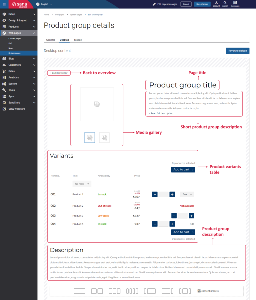
See the list of content elements which are used for the product group pages:
-
Back to overview
-
Page title
-
Media gallery
-
Short product group description
-
Product group description
-
Product variants table
Besides the above-mentioned content elements, you can also use any other content elements available in Sana to enrich your product group pages. For example, you can add text, images, banners, sliders, videos, tiles, etc.
Back to Overview
The Back to overview content element is used to show a back link on the product group page which returns a customer to the previous page.
The Back to overview is one of the elements that is used to improve webstore navigation and browsing the catalog. When a customer opens, for example, a product list page and then navigates to a specific product group, there will be a Back to overview link. Clicking on this link redirects a customer back to the product list page.
It is possible to change the icon of the Back to overview link using Themes.
Page Title
The Page title content element is used to show the title of the product group page.
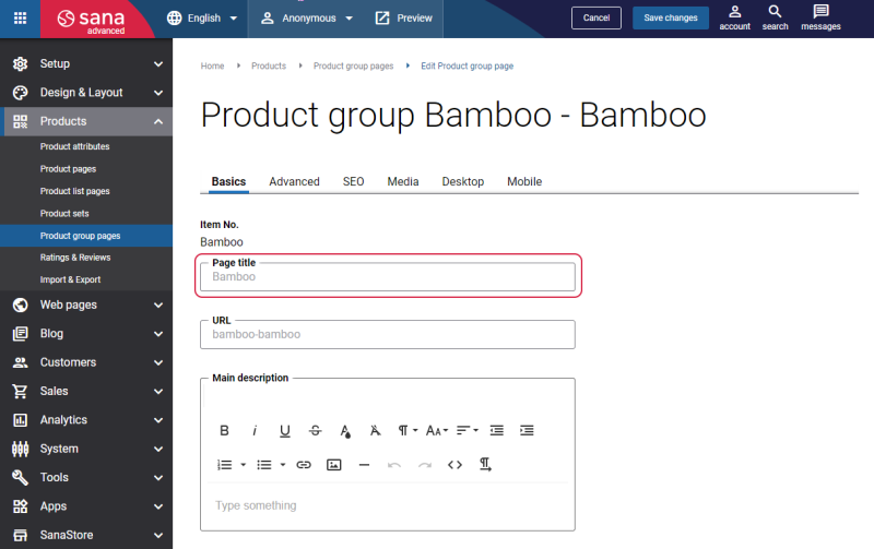
By default, the product group title of the first product in a group from ERP is used for the product group page title. You can change it in Sana Admin at the following location: Products > Product group pages. You can enter the product group page title on the Basics tab, in the Page title field.
If you enter the page title, it will override the product name from the ERP system. The product name from ERP will be redefined only on the product details page. In all other places the product name from ERP will be still used.
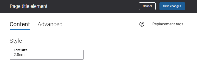
Using the Font size field on the Content tab of the Page title content element, you can specify the necessary font size for the page title.
For more information, see Basic Settings.
Product Group Description
Product group description is shown on the product group pages in the Sana webstore using the Product description and Short product description content elements.
-
The Product group description content element is used to show the full product group description on the product group page.
-
The Short product group description content element is used to show the short product group description on the product group page.
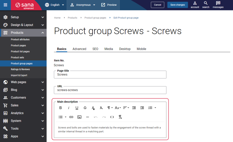
You can add the product group description in Sana Admin at the following location: Products > Product group pages. You can enter the product group description on the Basics tab, in the Main description field.
Using the setting Show heading on the Content tab of the Product group description content element, you can show or hide the Product group description heading on the product group page.

There are no specific settings for the Short product group description content element.
For more information, see Basic Settings.
Media Gallery
Product media is unquestionably one of the most important factors when you are selling online. You can add images and videos in the Sana webstore to make your content look brighter and more engaging for your customers.
The Media gallery content element is used to show the images and videos on the product group page.
There are two ways to add product images and videos to the product group pages:
-
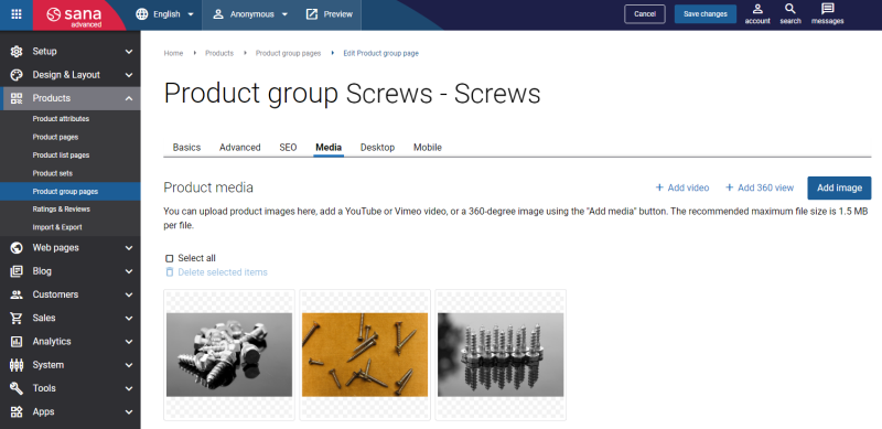
Directly on the product group page on the Media tab in Sana Admin.
-
Inherit images from the first product in a group.
To inherit product images and videos from the first product in a group, in Sana Admin click: Setup > Products > Product grouping. Enable the option Inherit image from first product per group.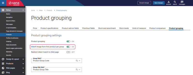
When this option is enabled, Sana will inherit all product images and videos from the first product in a group and show them on the product group page. But if you add images and videos manually to the product group page on the Media tab, they will override those inherited from the first product in the group.
For more information, see Media (Images, Video, and 360 View).
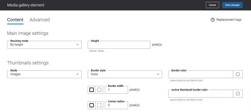
Below see the description of the Media gallery content element settings on the Content tab.
Using the Mode field, you can specify how thumbnails under the product group image should be presented. The available options are:
-
Images: The thumbnail images are shown under the product group image.
-
Dots: The thumbnail dots are shown under the product group image.
You can configure the thumbnail images and thumbnail dots settings separately. The settings will change depending on the option you select in the Mode field.
The table below provides the description of the Images mode settings.
|
Field |
Description |
|---|---|
|
Border style |
Specify the border style for the thumbnail images. The border style sets the line style for all four sides of a border. You can show or hide the border. If you do not want to show the border, select None. The border can be:
|
|
Border width |
Specify the border width for the thumbnail images. Each border has a width in pixels that you can change individually or specify the same width for all borders. There are settings for specifying the border width for each side:
|
|
Corner radius |
Specify the border corner radius for the thumbnail images. Each border has a corner radius in pixels that you can change individually or specify the same radius for all corners. There are settings for specifying each corner radius individually:
|
|
Border color |
Specify the thumbnail images border color. You can change it using the color picker, or by entering the color hex code, RGB or HSL values. If you leave this field empty, the default value will be used. |
|
Active thumbnail border color |
Specify the thumbnail image border color. When a user clicks on one of the thumbnail images on the product group page in the Sana webstore and makes it active, the border color of this image changes to the one specified in this field. You can change the border color using the color picker, or by entering the color hex code, RGB or HSL values. If you leave this field empty, the default value will be used. |
The table below provides the description of the Dots mode settings.
|
Field |
Description |
|---|---|
|
Color |
Specify the thumbnail dots color. You can change it using the color picker, or by entering the color hex code, RGB or HSL values. If you leave this field empty, the default value will be used. |
|
Active color |
Specify the thumbnail dot color. When a user clicks on one of the thumbnail dots on the product group page in the Sana webstore and makes it active, the color of this dot changes to the one specified in this field. You can change it using the color picker, or by entering the color hex code, RGB or HSL values. If you leave this field empty, the default value will be used. |
Product Variants Table
The Product variants table content element is used to show the list of products which belong to a product group on the product group page. In this table, a customer can see product details, for example, item number, stock availability, product price, unit of measure. Also, a customer can specify the product quantity and add products to the shopping cart.
Using the setting Show heading on the Content tab of the Product variants table content element, you can show or hide the Product variants table heading on the product group page.

Content Element Advanced Settings
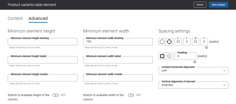
On the Advanced tab of each Product group page content element, you can configure height, width, and spacing settings. These settings are the same for all content elements.
For more information about advanced settings, see Content Elements.
Change the Default Texts of the Product Group Page
You can easily change the standard texts of the Product group page in the English language or any other installed webstore language. You can do this either in the Page elements & messages or using In-site editor.
