Webstore Design
WATCH THE VIDEO
With the staggering growth of mobile devices like smartphones and tablets, and mobile device usage, it is essential that your website is mobile friendly, so that your clients and prospects can easily browse and find information, regardless of what type of device (phone, tablet, desktop) they are using.
The design of a Sana webstore is responsive. Responsive design is a web design that expands and compresses nicely on different devices, whether you view the website on a desktop computer, smartphone or tablet. To make Sana accessible on whatever device the customers decide to use, we implemented a responsive design that is optimized for desktop and mobile browsing.
Customers can quickly and easily browse the catalog and make purchases anytime and anywhere. When customers go to the Sana webstore using a smartphone, its design automatically changes to use a specially designed mobile layout. The mobile layout includes the same features as if you open the Sana webstore on your desktop computer. A responsive webstore design gives customers a better user experience and potentially lead to more sales.
Depending on whether you open the Sana webstore on desktop computer, tablet or smartphone, and also depending on screen resolution, the appropriate webstore layout will be used.
|
Screen resolution |
Content container max width |
Device |
|---|---|---|
|
320 - 599 px |
none (full width) |
Mobile |
|
600 - 959 px |
none (full width) |
Mobile or Tablet |
|
960 - 1279 px |
none (full width) |
Tablet or Desktop Computer |
|
1280 - 1919 px |
1600 px |
Desktop Computer |
|
1920 px and above |
1600 px |
Desktop Computer |
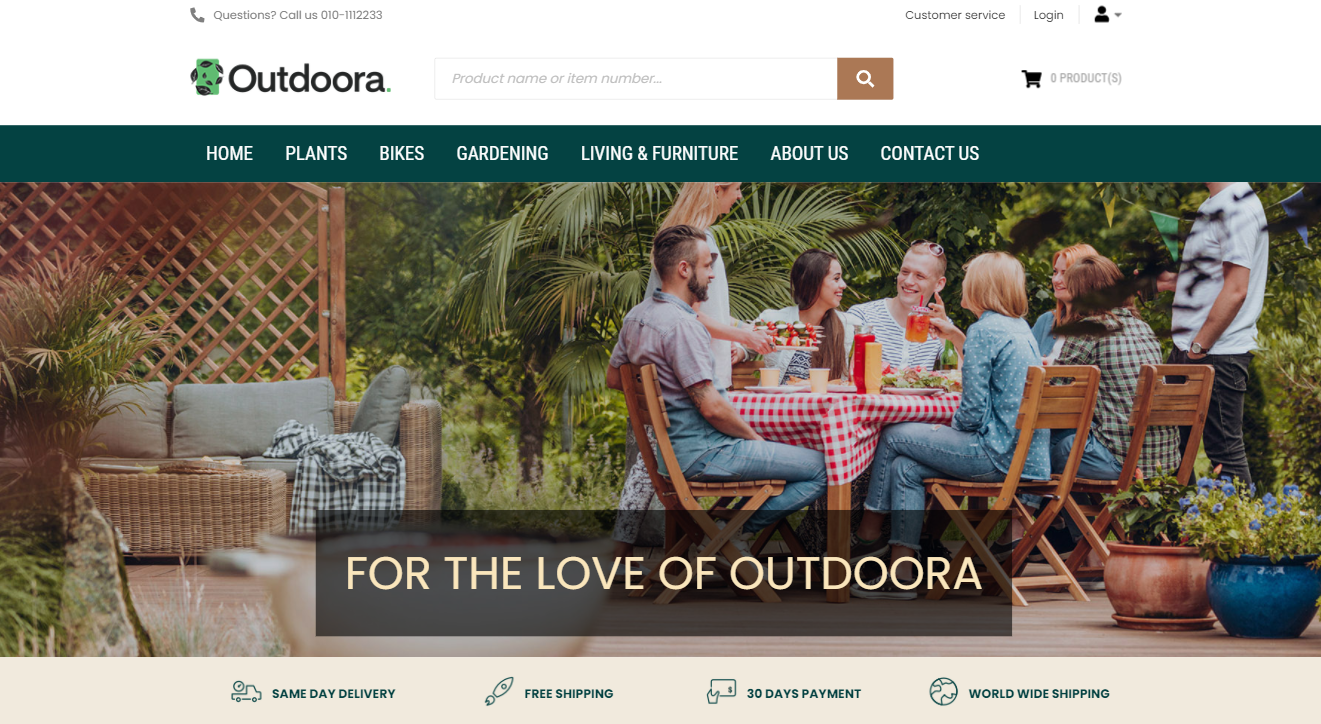
Desktop Layout
Tablet Layout

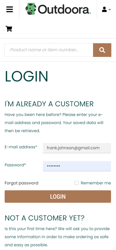
Mobile Layout
The responsive design has several crucial benefits:
-
Super flexible - your content is flexible enough to move seamlessly from one screen to another with responsive design. This means that users have the flexibility to access the webstore on any device without distorted content or slow page load time.
-
Cost effective - the advantage of having a single site that conforms to the need of all devices is significant when compared to having two separate websites. One website costs less than two, and the savings can be substantial.
-
Easy to manage - having separate websites for desktop and mobile browsing requires separate SEO (Search Engine Optimization) campaigns. Managing one site and one SEO campaign is far easier than managing two sites and two SEO campaigns.
-
Faster page speed - websites that are mobile responsive load faster, resulting in a more positive user experience and ranking boost.
-
Higher conversion rate - responsive design means that your users can make purchases directly through your secure website on any device instead of using some application, which is often available for one mobile operation system.
You can have several webstores on a single Sana Commerce platform with a similar or completely different design. Sana provides different options of how you can change the look and feel of your webstore - themes, page layouts, HTML injections, software development kit (SDK).