Form Elements
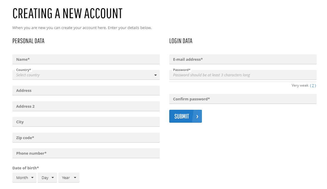
Forms can have a powerful impact on a business. Online web forms using your brand's design and an interactive form structure can help you create a worthwhile connection with visitors. Forms are a great tool for different reasons, for example, on the Registration form, customers can register in the webstore online, on the Contact us page, they can communicate directly with the webstore administrator at any time. Webstore forms vary in length, format, appearance, thus there is no style that fits all businesses.
In the Sana webstore there are a lot of different forms, for example, customer profile, shipping address, registration form, prospect and guest details, contact us form. We provide you with a possibility to build the forms you need in minutes, create different designs of different form elements. Sana Commerce Cloud is flexible in setting up form elements the way you need – you can customize the style of your webstore forms that will definitely match your brand’s personality.
In Sana Admin click: Design & Layout > Themes. Edit the webstore theme.
Open the necessary theme and on the Form elements tab, you can change the design of all forms in the Sana webstore.
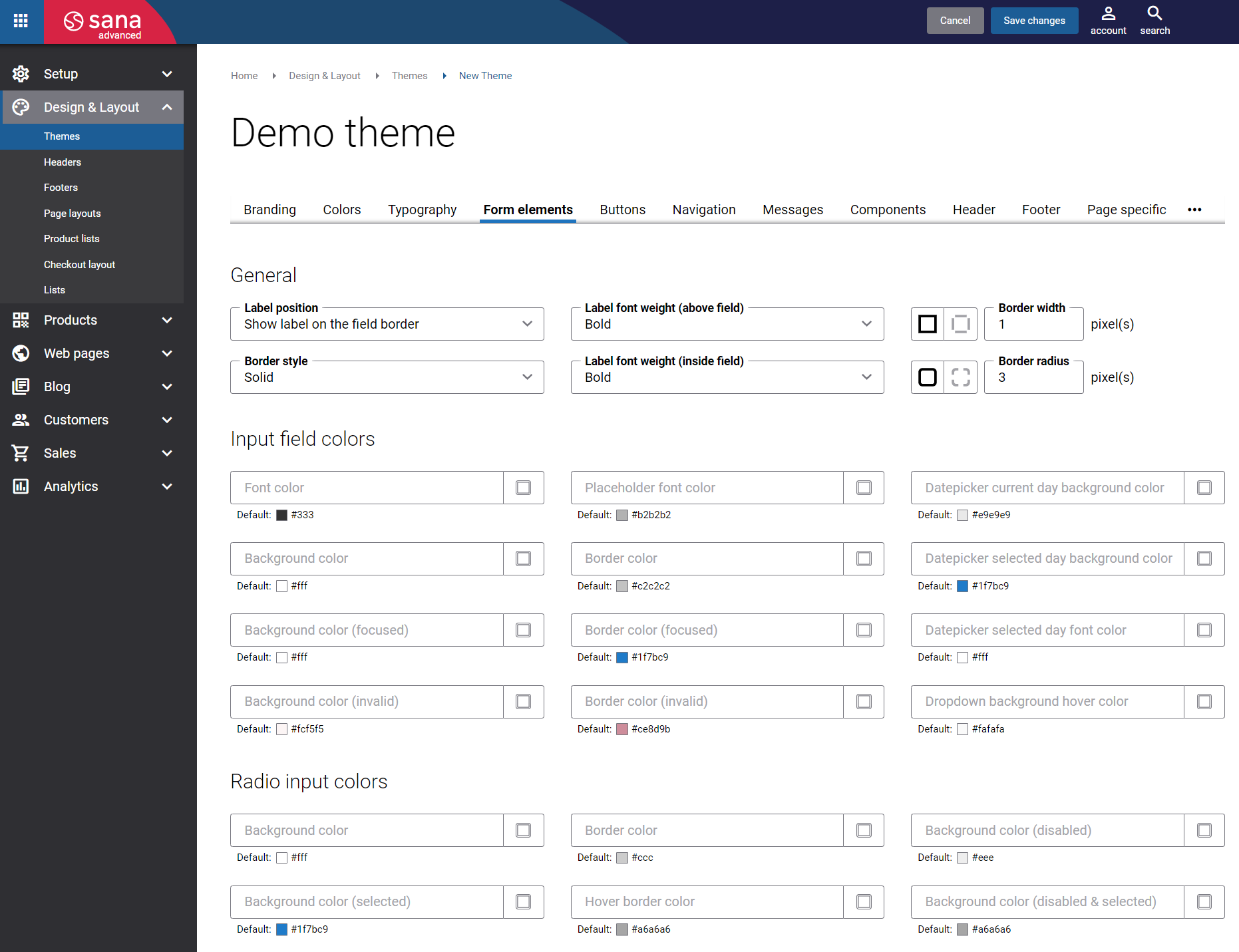
General
The table below provides the description of the General settings to configure form elements in the Sana webstore.
| Settings | Description |
|---|---|
| Label position | Select the label position of the field. The available options are:
|
| Border style | The border style sets the line style for all four sides of a border. You can show or hide the border. If you do not want to show the border, select None. The border can be:
|
| Label font weight | Select the font weight of label. The available options are:
|
| Border width | Each border has a width in pixels that you can change individually or specify the same width for all borders.
There are settings for specifying the border width for each side:
|
| Border radius | Each border has a corner radius in pixels that you can change individually or specify the same radius for all corners.
There are settings for specifying each corner radius individually:
|
Input Field Colors and Radio Input Colors
In the Input field colors and Radio input colors sections, you can change colors of different elements of the form fields, for example, font, border, background color, datepicker color, dropdown color and many other colors.